\n
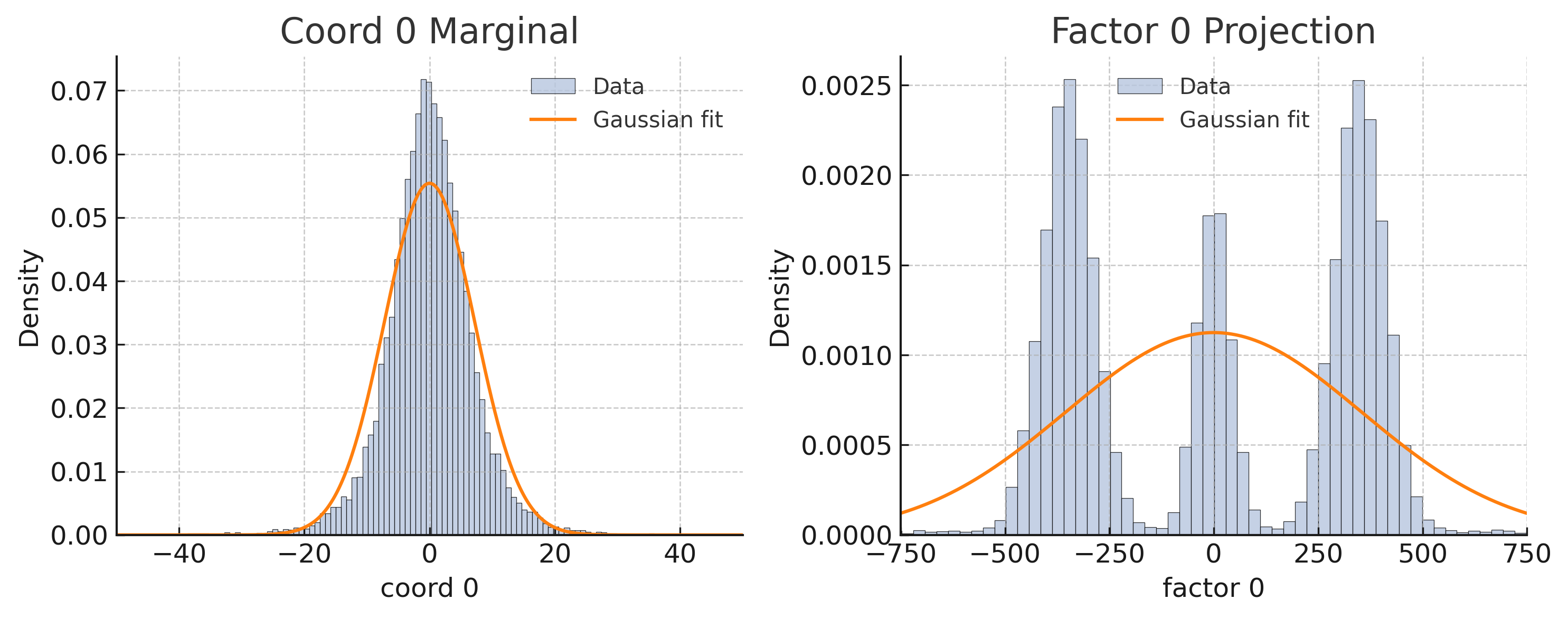
## Histograms with Gaussian Fits: Coord 0 Marginal & Factor 0 Projection
### Overview
The image displays two side-by-side histograms, each overlaid with a Gaussian fit curve. The left plot is titled "Coord 0 Marginal" and the right plot is titled "Factor 0 Projection." Both plots visualize the density distribution of a dataset along a single dimension ("coord 0" and "factor 0," respectively) and compare the empirical data to a fitted normal distribution.
### Components/Axes
**Left Plot: "Coord 0 Marginal"**
* **Title:** "Coord 0 Marginal" (centered at top).
* **X-axis:** Label is "coord 0". The axis spans from approximately -50 to 50, with major tick marks labeled at -40, -20, 0, 20, and 40.
* **Y-axis:** Label is "Density". The axis spans from 0.00 to approximately 0.075, with major tick marks labeled at 0.00, 0.01, 0.02, 0.03, 0.04, 0.05, 0.06, and 0.07.
* **Legend:** Positioned in the top-right corner of the plot area. It contains two entries:
* A light blue rectangle labeled "Data".
* An orange line labeled "Gaussian fit".
* **Grid:** A light gray dashed grid is present.
**Right Plot: "Factor 0 Projection"**
* **Title:** "Factor 0 Projection" (centered at top).
* **X-axis:** Label is "factor 0". The axis spans from approximately -800 to 800, with major tick marks labeled at -750, -500, -250, 0, 250, 500, and 750.
* **Y-axis:** Label is "Density". The axis spans from 0.0000 to approximately 0.0027, with major tick marks labeled at 0.0000, 0.0005, 0.0010, 0.0015, 0.0020, and 0.0025.
* **Legend:** Positioned in the top-right corner of the plot area. It contains the same two entries as the left plot:
* A light blue rectangle labeled "Data".
* An orange line labeled "Gaussian fit".
* **Grid:** A light gray dashed grid is present.
### Detailed Analysis
**Left Plot: "Coord 0 Marginal"**
* **Data Distribution (Light Blue Bars):** The histogram shows a unimodal, symmetric distribution centered very close to `coord 0 = 0`. The distribution is relatively narrow, with the vast majority of data points falling between -20 and 20. The peak density (the tallest bar) is located at `coord 0 ≈ 0` and reaches a density value of approximately `0.072`.
* **Gaussian Fit (Orange Line):** The fitted Gaussian curve is also unimodal and centered at `coord 0 ≈ 0`. Its peak density is approximately `0.056`, which is lower than the peak of the histogram data. The fit appears to slightly underestimate the central peak and overestimate the tails of the empirical distribution.
**Right Plot: "Factor 0 Projection"**
* **Data Distribution (Light Blue Bars):** The histogram shows a **multimodal** distribution with three distinct, prominent peaks.
1. **Left Peak:** Centered around `factor 0 ≈ -350`. This is the tallest peak, with a maximum density of approximately `0.0025`.
2. **Central Peak:** Centered around `factor 0 ≈ 0`. This peak is shorter, with a maximum density of approximately `0.0018`.
3. **Right Peak:** Centered around `factor 0 ≈ 350`. This peak is similar in height to the central peak, with a maximum density of approximately `0.0025`.
The valleys between these peaks drop to very low density (near 0.0000).
* **Gaussian Fit (Orange Line):** The fitted Gaussian curve is unimodal and centered at `factor 0 ≈ 0`. Its peak density is approximately `0.0011`. This single Gaussian provides a very poor fit to the underlying multimodal data. It fails to capture any of the three distinct clusters, instead presenting a broad, low-amplitude curve that averages over the entire range.
### Key Observations
1. **Fundamental Distribution Difference:** The variable "coord 0" follows an approximately normal (Gaussian) distribution, while the variable "factor 0" follows a clearly non-Gaussian, multimodal distribution.
2. **Fit Quality Discrepancy:** The Gaussian fit is a reasonable, though imperfect, model for the "Coord 0 Marginal" data. In stark contrast, the Gaussian fit is entirely inappropriate for the "Factor 0 Projection" data, as it cannot model the three separate modes.
3. **Scale Difference:** The x-axis scales differ by an order of magnitude. "coord 0" ranges over tens of units, while "factor 0" ranges over hundreds of units.
4. **Density Scale Difference:** The y-axis density scales also differ significantly. The peak density for "coord 0" (~0.07) is about 30 times larger than the peak density for "factor 0" (~0.0025), indicating the "coord 0" data is much more concentrated.
### Interpretation
This visualization demonstrates a critical concept in data analysis: the danger of assuming a normal distribution without examining the data.
* **"Coord 0 Marginal"** likely represents a well-behaved, single underlying process or population where measurements cluster around a mean value with symmetric variance. The Gaussian fit, while not perfect, is a useful simplification.
* **"Factor 0 Projection"** reveals a more complex underlying structure. The three distinct peaks strongly suggest the presence of **three separate subpopulations or clusters** within the data. Applying a single Gaussian fit here is misleading; it obscures the true multimodal nature of the data. A proper analysis would involve identifying these clusters (e.g., via mixture modeling) and analyzing them separately.
* **The Juxtaposition:** Placing these plots side-by-side serves as a powerful diagnostic. It highlights that while one dimension ("coord 0") of the data may appear simple and normally distributed, another dimension ("factor 0") can reveal hidden complexity and structure. This is common in techniques like Principal Component Analysis (PCA) or factor analysis, where the first few components/factors may capture simple variance, while later ones reveal more nuanced groupings. The poor Gaussian fit on the right is not a failure of fitting, but a successful revelation of the data's true, non-normal character.