## Line Chart: AUROC vs. Number Explanations
### Overview
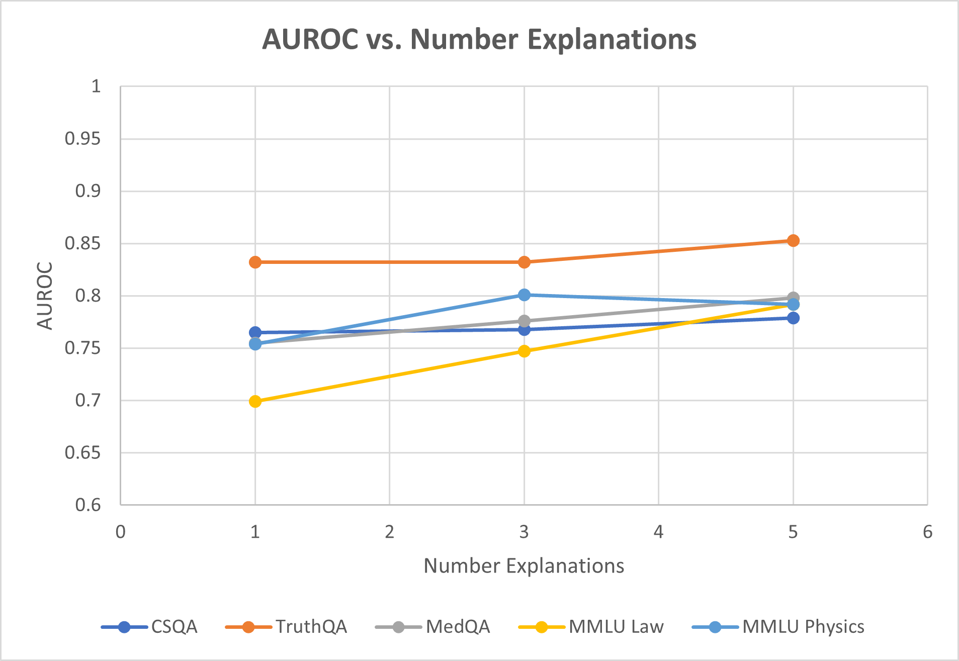
This is a line chart illustrating the relationship between the number of explanations provided (x-axis) and the AUROC (Area Under the Receiver Operating Characteristic curve) performance metric (y-axis) for five different question-answering or reasoning datasets. The chart suggests an analysis of how model performance, as measured by AUROC, changes when the model is given 1, 3, or 5 explanations.
### Components/Axes
* **Chart Title:** "AUROC vs. Number Explanations"
* **Y-Axis:**
* **Label:** "AUROC"
* **Scale:** Linear, ranging from 0.6 to 1.0.
* **Major Gridlines/Ticks:** 0.6, 0.65, 0.7, 0.75, 0.8, 0.85, 0.9, 0.95, 1.0.
* **X-Axis:**
* **Label:** "Number Explanations"
* **Scale:** Linear, with major ticks at integers from 0 to 6.
* **Data Points:** Plotted at x-values of 1, 3, and 5.
* **Legend:** Located at the bottom center of the chart. It defines five data series:
1. **CSQA:** Dark blue line with circular markers.
2. **TruthQA:** Orange line with circular markers.
3. **MedQA:** Gray line with circular markers.
4. **MMLU Law:** Yellow line with circular markers.
5. **MMLU Physics:** Light blue line with circular markers.
### Detailed Analysis
**Data Series Trends and Points:**
1. **TruthQA (Orange Line):**
* **Trend:** Consistently the highest-performing series. Shows a very slight upward trend.
* **Data Points:**
* At 1 Explanation: AUROC ≈ 0.83
* At 3 Explanations: AUROC ≈ 0.83 (appears nearly flat from 1)
* At 5 Explanations: AUROC ≈ 0.85
2. **MMLU Physics (Light Blue Line):**
* **Trend:** Increases from 1 to 3 explanations, then slightly decreases at 5.
* **Data Points:**
* At 1 Explanation: AUROC ≈ 0.755
* At 3 Explanations: AUROC ≈ 0.80
* At 5 Explanations: AUROC ≈ 0.795
3. **MedQA (Gray Line):**
* **Trend:** Shows a steady, moderate upward trend.
* **Data Points:**
* At 1 Explanation: AUROC ≈ 0.755 (overlaps with MMLU Physics start)
* At 3 Explanations: AUROC ≈ 0.775
* At 5 Explanations: AUROC ≈ 0.80
4. **CSQA (Dark Blue Line):**
* **Trend:** Very slight upward trend, nearly flat.
* **Data Points:**
* At 1 Explanation: AUROC ≈ 0.765
* At 3 Explanations: AUROC ≈ 0.77
* At 5 Explanations: AUROC ≈ 0.78
5. **MMLU Law (Yellow Line):**
* **Trend:** Shows the steepest and most consistent upward trend of all series.
* **Data Points:**
* At 1 Explanation: AUROC ≈ 0.70
* At 3 Explanations: AUROC ≈ 0.745
* At 5 Explanations: AUROC ≈ 0.79
### Key Observations
* **Performance Hierarchy:** TruthQA maintains the highest AUROC across all explanation counts. MMLU Law starts as the lowest but shows the greatest improvement, nearly catching up to the middle cluster by 5 explanations.
* **General Trend:** Four out of five datasets (TruthQA, MedQA, CSQA, MMLU Law) show a positive correlation between the number of explanations and AUROC score. The improvement is most dramatic for MMLU Law.
* **Exception:** MMLU Physics is the only series that does not show a net improvement from 3 to 5 explanations, exhibiting a slight decline.
* **Clustering at Start:** At 1 explanation, the datasets form three distinct clusters: high (TruthQA ~0.83), middle (CSQA, MedQA, MMLU Physics ~0.755-0.765), and low (MMLU Law ~0.70).
* **Convergence:** By 5 explanations, the middle cluster (MedQA, MMLU Physics, CSQA) and the rising MMLU Law converge within a narrow band between approximately 0.78 and 0.80 AUROC.
### Interpretation
The data suggests that providing multiple explanations generally enhances a model's discriminative ability (as measured by AUROC) across various knowledge domains. The benefit is not uniform:
* **Domain Sensitivity:** The steep rise for **MMLU Law** indicates that legal reasoning tasks may be particularly sensitive to, and benefit greatly from, additional explanatory context. In contrast, **TruthQA** (likely focused on factual verification) starts with high performance and sees marginal gains, suggesting a ceiling effect or that its core task is less dependent on multiple explanations.
* **The "3-Explanation" Peak for Physics:** The slight dip for **MMLU Physics** from 3 to 5 explanations could indicate noise introduction, overfitting to explanations, or that for physics problems, a moderate amount of explanation is optimal, with more becoming counterproductive. This is an outlier trend worth investigating.
* **Practical Implication:** The chart argues for a tailored approach. For domains like law, investing in generating more explanations yields clear performance returns. For domains like factual QA or physics, the cost-benefit analysis of generating 5 versus 3 explanations needs careful consideration. The overall positive trend supports the hypothesis that rationale-augmented training or inference can improve model reliability.