## Probability Density Function Plots: Comparison of Distributions
### Overview
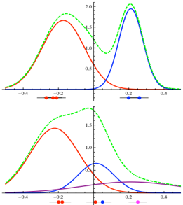
The image displays two vertically stacked plots, each showing multiple probability density functions (PDFs) or similar bell-shaped curves. The plots appear to compare different distributions or the same distributions under varying parameters. The top plot shows curves with higher peaks and narrower spreads, while the bottom plot shows broader, lower curves. All text in the image is in English.
### Components/Axes
**Top Plot:**
* **X-Axis:** Linear scale. Major tick marks and labels at -0.4, -0.2, 0, 0.2, 0.4.
* **Y-Axis:** Linear scale. Major tick marks and labels at 0, 0.5, 1.0, 1.5, 2.0.
* **Legend:** Positioned at the bottom center of the plot area. Contains four entries:
* A green dashed line segment labeled "0.2".
* A red solid line segment labeled "0.2".
* A blue solid line segment labeled "0.2".
* A green solid line segment labeled "0.2".
* **Data Series (Curves):**
1. **Green Dashed Line:** A symmetric, bell-shaped curve.
2. **Red Solid Line:** A symmetric, bell-shaped curve.
3. **Blue Solid Line:** A symmetric, bell-shaped curve.
4. **Green Solid Line:** A symmetric, bell-shaped curve that closely follows the green dashed line but with a slightly lower peak.
**Bottom Plot:**
* **X-Axis:** Linear scale. Major tick marks and labels at -0.4, -0.2, 0, 0.2, 0.4.
* **Y-Axis:** Linear scale. Major tick marks and labels at 0, 0.5, 1.0, 1.5.
* **Legend:** Positioned at the bottom center of the plot area. Contains four entries:
* A green dashed line segment labeled "0.2".
* A red solid line segment labeled "0.2".
* A blue solid line segment labeled "0.5".
* A purple solid line segment labeled "0.5".
* **Data Series (Curves):**
1. **Green Dashed Line:** A broad, bell-shaped curve.
2. **Red Solid Line:** A broad, bell-shaped curve.
3. **Blue Solid Line:** A broad, bell-shaped curve.
4. **Purple Solid Line:** A very broad, low-amplitude curve.
### Detailed Analysis
**Top Plot Analysis:**
* **Trend Verification:** All four curves are unimodal and symmetric, resembling Gaussian distributions. They are centered at different points along the x-axis.
* **Green Dashed Line (Legend: 0.2):** Peaks at approximately x = 0.1, y ≈ 2.0. The full width at half maximum (FWHM) is approximately 0.2 units (from x≈0.0 to x≈0.2).
* **Red Solid Line (Legend: 0.2):** Peaks at approximately x = -0.1, y ≈ 1.7. FWHM ≈ 0.2 units.
* **Blue Solid Line (Legend: 0.2):** Peaks at approximately x = 0.2, y ≈ 1.8. FWHM ≈ 0.15 units.
* **Green Solid Line (Legend: 0.2):** Peaks at approximately x = 0.1, y ≈ 1.9. It is slightly lower and possibly slightly wider than the green dashed line.
**Bottom Plot Analysis:**
* **Trend Verification:** All four curves are unimodal and symmetric, but are broader and lower in amplitude compared to the top plot.
* **Green Dashed Line (Legend: 0.2):** Peaks at approximately x = 0.0, y ≈ 1.5. FWHM ≈ 0.4 units.
* **Red Solid Line (Legend: 0.2):** Peaks at approximately x = -0.1, y ≈ 1.2. FWHM ≈ 0.35 units.
* **Blue Solid Line (Legend: 0.5):** Peaks at approximately x = 0.1, y ≈ 0.8. FWHM ≈ 0.3 units.
* **Purple Solid Line (Legend: 0.5):** Peaks at approximately x = 0.2, y ≈ 0.2. This is a very low, broad distribution.
### Key Observations
1. **Parameter Change:** The primary difference between the two plots is the spread (variance) of the distributions. The top plot shows narrow distributions (high precision), while the bottom plot shows broad distributions (low precision).
2. **Legend Discrepancy:** In the bottom plot, the blue and purple lines are associated with the label "0.5", while the green and red lines are associated with "0.2". This suggests the label may represent a parameter (like standard deviation) that is different for the blue/purple series in the bottom plot.
3. **Curve Relationships:** In both plots, the green dashed and green solid lines are very similar, suggesting they might represent a theoretical vs. empirical distribution, or a model with slightly different parameters.
4. **Amplitude vs. Width:** There is a clear inverse relationship between the peak height (amplitude) and the width of the curves. Narrower curves have higher peaks, conserving the total area under the curve (which must equal 1 for a PDF).
### Interpretation
These plots are likely demonstrating the effect of a parameter (such as standard deviation, σ) on the shape of a probability distribution, possibly a Gaussian. The labels "0.2" and "0.5" in the legends most plausibly refer to this parameter value.
* **Top Plot (All labels ≈ 0.2):** Shows distributions with a smaller parameter value (e.g., σ=0.2), resulting in tall, narrow peaks. The different colors (red, blue, green) likely represent distributions with different means (μ), as their peaks are centered at different x-values (-0.1, 0.1, 0.2).
* **Bottom Plot (Mixed labels 0.2 and 0.5):** Shows the effect of increasing the parameter for some distributions. The green and red curves (label 0.2) are broader than their counterparts in the top plot, which is inconsistent if the label is σ. This suggests the label might represent a different parameter, or the plots compare different models. The blue and purple curves (label 0.5) are significantly broader and lower, demonstrating how a larger parameter value (e.g., σ=0.5) flattens and widens the distribution. The purple curve is the most extreme example.
**Underlying Message:** The visualization effectively communicates how a single parameter controls the concentration of probability mass. A smaller value leads to high certainty (peaked distribution), while a larger value leads to high uncertainty (flat distribution). The multiple colored curves in each plot allow for comparison of this effect across different central values (means). The side-by-side (top-bottom) comparison starkly highlights the impact of changing the scale parameter.