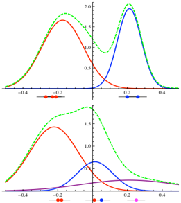
## Chart/Diagram Type: Probability Density Function Plots
### Overview
The image contains two plots, each displaying probability density functions (PDFs). The top plot shows a bimodal distribution formed by the sum of two normal distributions, while the bottom plot shows a more complex distribution formed by the sum of three normal distributions. Each normal distribution is represented by a different colored line, and the sum of these distributions is represented by a dashed green line. The x-axis represents the variable, and the y-axis represents the probability density.
### Components/Axes
**Top Plot:**
* **X-axis:** Ranges approximately from -0.5 to 0.5. No explicit labels are provided, but the axis represents the variable for which the probability density is being plotted.
* **Y-axis:** Ranges from 0 to 2.0. No explicit labels are provided, but the axis represents the probability density.
* **Red Line:** Represents one normal distribution.
* **Blue Line:** Represents another normal distribution.
* **Green Dashed Line:** Represents the sum of the red and blue distributions.
* **Markers:** Red markers are placed near x = -0.2, and blue markers are placed near x = 0.2.
**Bottom Plot:**
* **X-axis:** Ranges approximately from -0.5 to 0.5. No explicit labels are provided, but the axis represents the variable for which the probability density is being plotted.
* **Y-axis:** Ranges from 0 to 2.0. No explicit labels are provided, but the axis represents the probability density.
* **Red Line:** Represents one normal distribution.
* **Blue Line:** Represents another normal distribution.
* **Purple Line:** Represents a third normal distribution.
* **Green Dashed Line:** Represents the sum of the red, blue, and purple distributions.
* **Markers:** Red markers are placed near x = -0.2, blue markers are placed near x = 0, and purple markers are placed near x = 0.2.
### Detailed Analysis or ### Content Details
**Top Plot:**
* **Red Distribution:** Centered around x = -0.2, with a peak probability density of approximately 1.4. The distribution is unimodal and roughly symmetric.
* **Blue Distribution:** Centered around x = 0.2, with a peak probability density of approximately 1.9. The distribution is unimodal and roughly symmetric.
* **Green Distribution:** The sum of the red and blue distributions, resulting in a bimodal distribution with peaks near x = -0.2 and x = 0.2. The peak probability density is approximately 2.0.
**Bottom Plot:**
* **Red Distribution:** Centered around x = -0.2, with a peak probability density of approximately 1.7. The distribution is unimodal and roughly symmetric.
* **Blue Distribution:** Centered around x = 0, with a peak probability density of approximately 0.3. The distribution is unimodal and roughly symmetric.
* **Purple Distribution:** Centered around x = 0.2, with a peak probability density of approximately 0.2. The distribution is unimodal and roughly symmetric.
* **Green Distribution:** The sum of the red, blue, and purple distributions. The peak probability density is approximately 1.8, and the distribution is less distinctly bimodal than in the top plot.
### Key Observations
* The green dashed line in each plot represents the sum of the individual distributions.
* The top plot shows a bimodal distribution formed by two normal distributions, while the bottom plot shows a more complex distribution formed by three normal distributions.
* The markers on the x-axis indicate the approximate centers of the individual normal distributions.
### Interpretation
The plots illustrate how complex probability distributions can be constructed by summing simpler distributions, specifically normal distributions. The top plot demonstrates a bimodal distribution, which can arise when two distinct populations or processes are present. The bottom plot shows a more complex distribution, which could arise from three distinct populations or processes. The relative heights and positions of the individual distributions determine the shape of the resulting distribution. The markers on the x-axis provide a visual indication of the mean values of the individual normal distributions. The green dashed line represents the overall probability density function, which is the sum of the individual probability density functions.