\n
## Chart: Gaussian Distribution Comparison
### Overview
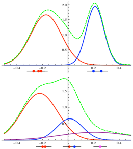
The image presents a comparison of Gaussian (normal) distributions, visualized as curves. There are two distinct panels, each displaying a different set of distributions. The x-axis represents a numerical scale ranging from approximately -0.5 to 0.5, while the y-axis represents the probability density, ranging from 0 to 2.0. Each panel shows multiple curves, each representing a different Gaussian distribution with varying means and standard deviations. Points are marked on the x-axis to indicate the mean of each distribution.
### Components/Axes
* **X-axis:** Ranges from approximately -0.5 to 0.5. Labeled with tick marks at -0.4, -0.2, 0, 0.2, and 0.4.
* **Y-axis:** Ranges from 0 to 2.0. Labeled with tick marks at 0, 0.5, 1.0, 1.5, and 2.0.
* **Curves:**
* Green dashed curve: Represents a Gaussian distribution.
* Red solid curve: Represents a Gaussian distribution.
* Blue solid curve: Represents a Gaussian distribution.
* Magenta solid curve: Represents a Gaussian distribution (only present in the bottom panel).
* **Markers:** Small colored dots on the x-axis indicate the mean of each distribution.
* Red dots
* Blue dots
* Magenta dot
### Detailed Analysis or Content Details
**Top Panel:**
* **Green Curve:** This curve is centered around approximately -0.2. It has a relatively wide spread, with a peak value of approximately 1.9 at x = -0.2.
* **Red Curve:** This curve is centered around approximately 0. It has a narrower spread than the green curve, with a peak value of approximately 1.7 at x = 0.
* **Blue Curve:** This curve is centered around approximately 0.2. It has a similar spread to the red curve, with a peak value of approximately 1.8 at x = 0.2.
**Bottom Panel:**
* **Green Curve:** Identical to the green curve in the top panel. Centered around approximately -0.2, with a peak value of approximately 1.9 at x = -0.2.
* **Red Curve:** Identical to the red curve in the top panel. Centered around approximately 0, with a peak value of approximately 1.7 at x = 0.
* **Blue Curve:** Identical to the blue curve in the top panel. Centered around approximately 0.2, with a peak value of approximately 1.8 at x = 0.2.
* **Magenta Curve:** This curve is centered around approximately 0.3. It has a very narrow spread and a low peak value of approximately 0.2 at x = 0.3.
### Key Observations
* The top and bottom panels share the same green, red, and blue curves, suggesting a comparison across different scenarios or with the addition of a new distribution.
* The magenta curve in the bottom panel is significantly different from the other distributions, having a much smaller amplitude and a different mean.
* All curves are unimodal and symmetric, characteristic of Gaussian distributions.
* The distributions have varying means and standard deviations, resulting in different shapes and positions.
### Interpretation
The image demonstrates the effect of changing the mean and standard deviation on the shape of a Gaussian distribution. The green, red, and blue curves illustrate how shifting the mean (the center of the curve) changes the distribution's position along the x-axis. The varying widths of the curves represent different standard deviations, with smaller standard deviations resulting in narrower, more peaked distributions.
The addition of the magenta curve in the bottom panel suggests a scenario where a different distribution with a significantly smaller amplitude and a different mean is being considered. This could represent a rare event or a distribution with a much lower probability density.
The repetition of the green, red, and blue curves in both panels suggests a baseline comparison, with the bottom panel introducing a new element (the magenta curve) for analysis. The image is likely used to illustrate concepts in statistics, probability, or data analysis, specifically related to Gaussian distributions and their properties. The curves are likely representing probability density functions.