## Line Charts: Distribution Curves Comparison
### Overview
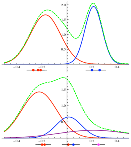
The image contains two vertically stacked line charts comparing probability distributions across four color-coded curves (red, blue, green, purple). Both charts share identical axes ranges (-0.4 to 0.4 on x-axis, 0 to 2.0 on y-axis) but differ in curve configurations and data point placements.
### Components/Axes
- **X-axis**: Ranges from -0.4 to 0.4 (unitless)
- **Y-axis**: Ranges from 0 to 2.0 (unitless)
- **Legends**:
- Top chart: Red (●), Blue (○), Green (□)
- Bottom chart: Red (●), Blue (○), Green (□), Purple (●●)
- **Data Points**:
- Top chart: Red (-0.2), Blue (0.2), Green (-0.2, 0.2)
- Bottom chart: Red (-0.2), Blue (0), Green (0.2), Purple (0.2)
### Detailed Analysis
**Top Chart**:
- **Red Curve**: Peaks at ~1.5 at x=0.2, with a secondary peak at ~1.0 at x=-0.2
- **Blue Curve**: Highest peak at 2.0 at x=0.2, with a gradual decline toward x=-0.4
- **Green Curve**: Bimodal distribution with peaks at ~1.8 (x=0.2) and ~1.2 (x=-0.2)
**Bottom Chart**:
- **Red Curve**: Single peak at ~1.5 at x=-0.2, declining toward x=0.4
- **Blue Curve**: Lowest peak at ~0.5 at x=0, with symmetrical decline
- **Green Curve**: Peak at ~1.8 at x=0.2, with a secondary rise at x=-0.4
- **Purple Curve**: Lowest peak at ~0.3 at x=0.2, with minimal spread
### Key Observations
1. **Peak Positioning**:
- Top chart: All curves peak at x=0.2 except red (secondary peak at x=-0.2)
- Bottom chart: Peaks distributed across x=-0.2 (red), x=0 (blue), and x=0.2 (green/purple)
2. **Magnitude Differences**:
- Blue curve dominates in top chart (2.0 vs. 1.8/1.5)
- Purple curve in bottom chart is consistently the lowest (0.3 vs. 0.5-1.8)
3. **Symmetry**:
- Blue curve in bottom chart shows perfect symmetry around x=0
- Green curve in top chart exhibits asymmetry between left/right peaks
### Interpretation
The charts appear to compare distribution characteristics across different conditions:
- **Top Chart**: Likely represents distributions with shared central tendency (x=0.2) but varying dispersion/variance (blue > green > red)
- **Bottom Chart**: Demonstrates distributions with distinct central tendencies (red left-skewed, blue centered, green/purple right-skewed) and differing magnitudes
- **Purple Curve Anomaly**: Its significantly lower peak (0.3) suggests either a different scaling factor or a distinct population subset with reduced probability density
The data points marked with colored dots likely represent specific quantiles or critical values for each distribution. The consistent use of x=0.2 as a peak location in the top chart suggests a common reference point, while the bottom chart's distributed peaks indicate comparative analysis across multiple reference points.