\n
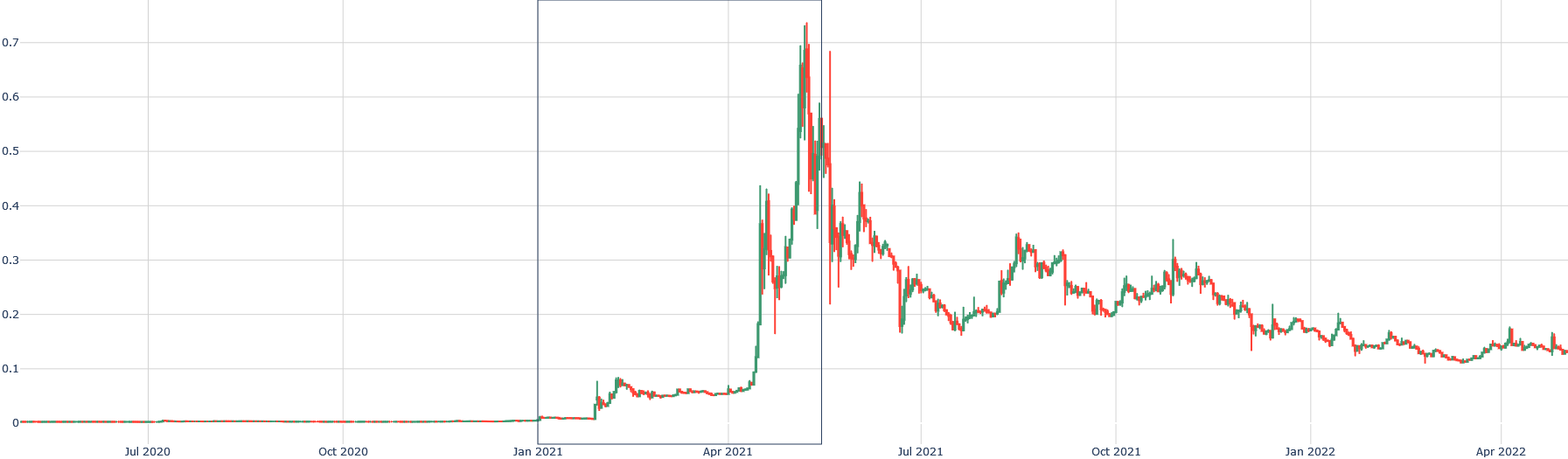
## Candlestick Chart: Financial Price Movement (Approx. July 2020 - April 2022)
### Overview
The image displays a financial candlestick chart plotting a numerical value (likely a price or index) over a period of approximately 22 months. The chart shows a period of low, stable values followed by a dramatic, volatile spike and a subsequent gradual decline. No chart title, asset name, or legend is present within the visible frame.
### Components/Axes
* **X-Axis (Horizontal):** Represents time. The visible date markers are: `Jul 2020`, `Oct 2020`, `Jan 2021`, `Apr 2021`, `Jul 2021`, `Oct 2021`, `Jan 2022`, `Apr 2022`. The axis appears to be linear.
* **Y-Axis (Vertical):** Represents a numerical value. The visible scale markers are: `0`, `0.1`, `0.2`, `0.3`, `0.4`, `0.5`, `0.6`, `0.7`. The axis is linear. No unit or label is provided.
* **Data Series:** The data is represented using standard financial candlesticks.
* **Green Candlesticks:** Indicate the closing value was higher than the opening value for that period (price increase).
* **Red Candlesticks:** Indicate the closing value was lower than the opening value for that period (price decrease).
* The thin vertical lines (wicks/shadows) show the high and low values for the period.
* **Grid:** A light gray grid is present, with vertical lines aligning with the date markers and horizontal lines aligning with the Y-axis scale markers.
* **Highlighted Region:** A faint, vertical rectangular box is drawn, spanning from approximately `Jan 2021` to `Apr 2021` on the X-axis. This likely highlights a specific period of interest.
### Detailed Analysis
**Trend Verification & Data Points:**
1. **Phase 1: Stability (Jul 2020 - Jan 2021):** The line is nearly flat, hovering just above the `0` mark. Candlesticks are very small, indicating minimal price movement and volatility. Values are consistently below `0.05`.
2. **Phase 2: Initial Rise (Jan 2021 - Mar 2021):** A gradual upward trend begins. Values climb from near `0` to approximately `0.08` by early March 2021. Volatility increases slightly, as seen in larger candlestick bodies.
3. **Phase 3: Parabolic Spike (Mar 2021 - Mid-Apr 2021):** This is the most dramatic phase. The value experiences an explosive, near-vertical ascent.
* It breaks through `0.1`, `0.2`, `0.3`, and `0.4` in rapid succession.
* The peak occurs in mid-April 2021. The highest wick reaches approximately **`0.73`** (above the `0.7` grid line). The highest closing value (top of a green body) is near **`0.68`**.
* This period is characterized by extremely large candlesticks (both green and red), indicating massive intraday volatility.
4. **Phase 4: Volatile Decline (Mid-Apr 2021 - Apr 2022):** Following the peak, the trend reverses into a choppy, downward trajectory.
* **Initial Crash (Apr-May 2021):** A sharp drop from the peak to below `0.3`.
* **Lower Highs & Lows:** The chart forms a series of lower peaks and lower troughs. Notable secondary peaks occur around `0.35` (Jul 2021), `0.3` (Oct 2021), and `0.25` (Jan 2022).
* **Final Value (Apr 2022):** The chart ends with values fluctuating in the **`0.12` to `0.16`** range, significantly below the peak but above the pre-spike levels.
### Key Observations
* **Extreme Asymmetry:** The chart is defined by one massive, speculative-looking bubble (the spike to 0.73) followed by a prolonged decline.
* **Volatility Clustering:** Volatility (candlestick size) is extremely low during the stable phase, explodes during the spike and initial crash, and remains elevated but gradually decreases during the long decline.
* **Highlighted Period:** The boxed area from Jan 2021 to Apr 2021 encapsulates the entire parabolic move from the initial breakout to the absolute peak.
* **Lack of Context:** The chart lacks a title, Y-axis label, or legend, making it impossible to identify the specific asset (e.g., stock, cryptocurrency, commodity) or the unit of measurement (e.g., USD, EUR, index points).
### Interpretation
This chart visually narrates a classic "boom and bust" or speculative bubble pattern. The data suggests an asset that was relatively obscure or stable until early 2021, when it attracted significant buying interest, leading to a self-reinforcing parabolic price increase. The peak in April 2021 represents a point of maximum optimism or frenzy. The subsequent decline, while volatile, shows a gradual loss of momentum and a search for a new, lower equilibrium price. The pattern is highly characteristic of assets driven by speculative manias, such as certain cryptocurrencies, "meme stocks," or other hyped financial instruments during the 2020-2021 period. The highlighted box draws analytical attention to the critical accumulation and blow-off top phase of this cycle. Without external labels, the chart serves as a pure, anonymized study in market psychology and volatility dynamics.