## Time Series Chart: Price Fluctuation Over Time
### Overview
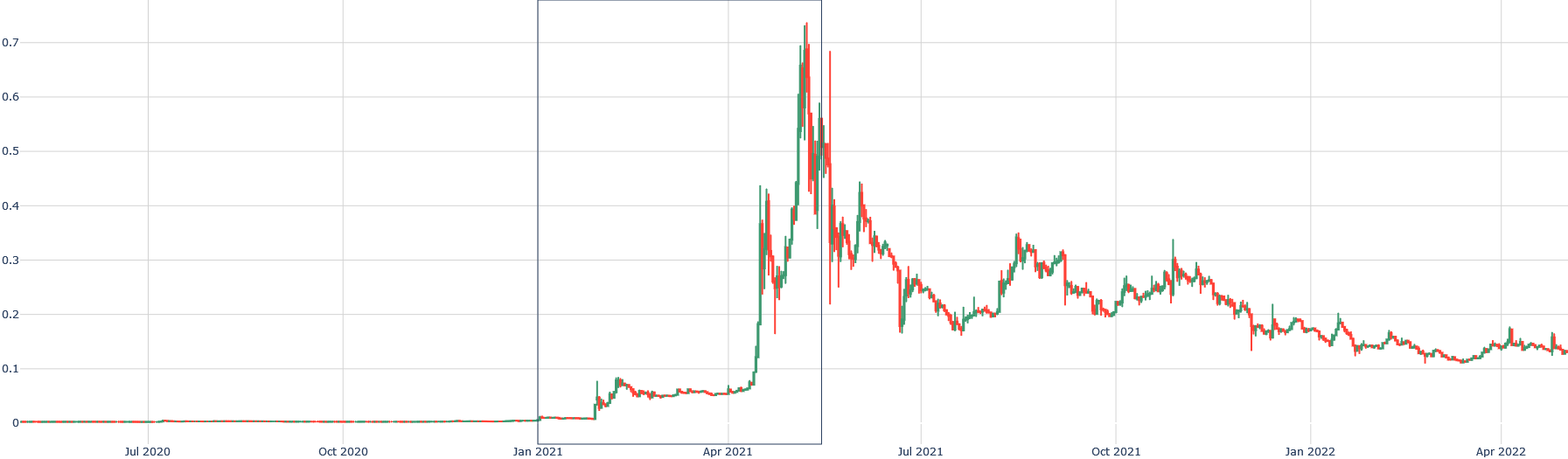
The image is a time series chart displaying price fluctuations over a period from July 2020 to April 2022. The chart shows a significant price increase around April 2021, followed by volatility and a subsequent decline.
### Components/Axes
* **X-axis (Horizontal):** Time, labeled with months and years. Markers are present at:
* Jul 2020
* Oct 2020
* Jan 2021
* Apr 2021
* Jul 2021
* Oct 2021
* Jan 2022
* Apr 2022
* **Y-axis (Vertical):** Price, with numerical markers.
* 0
* 0.1
* 0.2
* 0.3
* 0.4
* 0.5
* 0.6
* 0.7
* **Data Series:** A single line, alternating between green and red, representing the price. Green indicates an increase in price, while red indicates a decrease.
### Detailed Analysis
* **Jul 2020 - Jan 2021:** The price remains relatively stable near 0.
* **Jan 2021 - Apr 2021:** A gradual increase in price begins.
* **Apr 2021 - Jul 2021:** A sharp, rapid increase in price, followed by high volatility with rapid oscillations between green (price increase) and red (price decrease). The price peaks around 0.7.
* **Jul 2021 - Oct 2021:** The price decreases from its peak, with continued volatility.
* **Oct 2021 - Apr 2022:** A gradual decline in price, with decreasing volatility. The price stabilizes around 0.1.
### Key Observations
* The most significant price movement occurs between April 2021 and July 2021.
* The period after the peak shows a clear downward trend.
* Volatility is highest immediately after the price peak.
### Interpretation
The chart illustrates a period of significant price speculation and correction. The initial stable period suggests low interest or activity. The rapid increase in price around April 2021 indicates a surge in demand or speculative investment. The subsequent volatility suggests market uncertainty and price correction, eventually leading to a lower, more stable price point. The data suggests a "pump and dump" scenario, where an asset's price is artificially inflated, followed by a rapid sell-off.