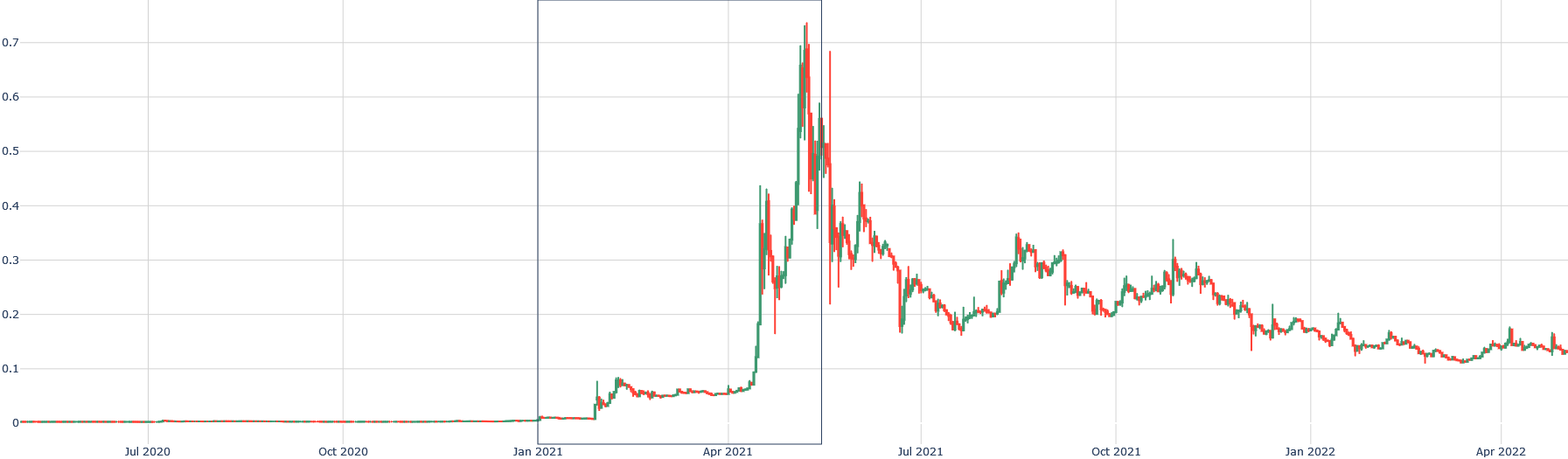
## Line Chart: Time Series Data
### Overview
The image presents a line chart displaying time series data from approximately July 2020 to April 2022. The chart shows two distinct lines representing different data series plotted against time. There are two vertical gray bands highlighting specific periods, likely indicating events or periods of interest. The y-axis represents a value ranging from 0 to 0.7, while the x-axis represents time, with labels for July 2020, October 2020, January 2021, April 2021, July 2021, October 2021, January 2022, and April 2022.
### Components/Axes
* **X-axis:** Time, labeled with months and years from July 2020 to April 2022.
* **Y-axis:** Value, ranging from 0 to 0.7, with increments of 0.1.
* **Line 1 (Red):** Represents one data series.
* **Line 2 (Green):** Represents another data series.
* **Vertical Bands (Gray):** Two vertical bands are present, one spanning approximately from March 2021 to May 2021, and another from September 2021 to November 2021. These bands likely highlight periods of significant change or events.
* **No Legend:** There is no explicit legend identifying what the red and green lines represent.
### Detailed Analysis
**Line 1 (Red):**
The red line starts at approximately 0 in July 2020 and remains relatively flat until around January 2021. From January 2021, the line begins to increase, showing a steep upward trend until approximately April 2021, reaching a peak value of around 0.6. Following the peak, the line experiences a sharp decline, returning to a value of approximately 0.2 by July 2021. After July 2021, the line fluctuates, generally trending downwards, reaching a value of approximately 0.1 by April 2022.
* July 2020: ~0
* October 2020: ~0
* January 2021: ~0.02
* April 2021: ~0.6
* July 2021: ~0.2
* October 2021: ~0.25
* January 2022: ~0.15
* April 2022: ~0.1
**Line 2 (Green):**
The green line also starts at approximately 0 in July 2020 and remains flat until around January 2021. It then exhibits a similar upward trend to the red line, peaking around April 2021 at a value of approximately 0.7. The green line also experiences a sharp decline after April 2021, but its decline is more pronounced than the red line, reaching a value of around 0.15 by July 2021. From July 2021 to April 2022, the green line fluctuates, generally trending downwards, and ending at approximately 0.1.
* July 2020: ~0
* October 2020: ~0
* January 2021: ~0.01
* April 2021: ~0.7
* July 2021: ~0.15
* October 2021: ~0.2
* January 2022: ~0.12
* April 2022: ~0.1
### Key Observations
* Both lines exhibit a similar pattern of increase and decrease, peaking around April 2021.
* The green line shows a more dramatic decline after the peak in April 2021 compared to the red line.
* The vertical gray bands highlight periods of significant volatility or change in both data series.
* Both lines converge towards a value of approximately 0.1 by April 2022.
### Interpretation
The chart likely represents the performance of two related assets or metrics over time. The initial flat period suggests a period of stability, followed by a period of growth leading up to April 2021. The subsequent sharp decline could indicate a market correction, a significant event, or a change in underlying conditions. The gray bands likely mark periods where these events occurred. The convergence of the lines towards the end of the period suggests a stabilization or a shared trend. Without knowing what the lines represent, it's difficult to provide a more specific interpretation. However, the data suggests a period of growth, followed by a correction, and eventual stabilization. The differing magnitudes of the decline between the two lines suggest that the two assets or metrics were affected differently by the event causing the decline.