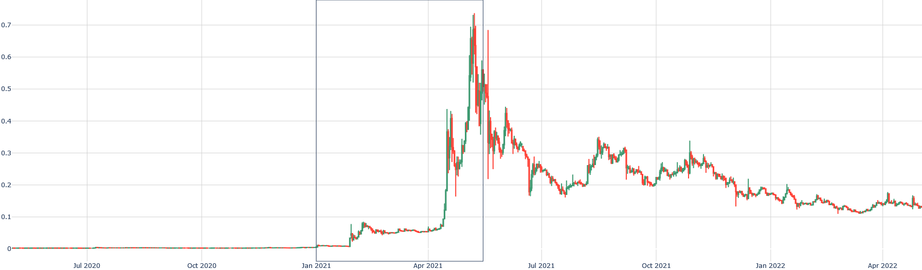
## Line Chart: Metric Value Over Time
### Overview
The chart displays two time-series data sets (red and green lines) tracking a metric value from July 2020 to April 2022. The y-axis represents "Metric Value" (0–0.7), and the x-axis shows dates. A vertical inset box highlights activity in April 2021. The red line ("Series A") shows extreme volatility, while the green line ("Series B") exhibits gradual growth followed by decline.
### Components/Axes
- **Y-Axis**: Labeled "Metric Value" with increments of 0.1 from 0.0 to 0.7.
- **X-Axis**: Dates from July 2020 to April 2022, with monthly labels (Jul 2020, Oct 2020, Jan 2021, Apr 2021, Jul 2021, Oct 2021, Jan 2022, Apr 2022).
- **Legend**: Located on the right, outside the chart. Red = "Series A", Green = "Series B".
- **Inset Box**: A zoomed-in view of April 2021 activity, positioned above the main chart.
### Detailed Analysis
- **Series A (Red Line)**:
- **July 2020–January 2021**: Flat at ~0.01.
- **April 2021**: Spikes to ~0.7 (peak), then declines to ~0.2 by July 2021.
- **July 2021–April 2022**: Fluctuates between ~0.15–0.3, with a notable dip to ~0.1 in January 2022.
- **Series B (Green Line)**:
- **July 2020–January 2021**: Flat at ~0.01.
- **April 2021**: Rises to ~0.4, then declines to ~0.2 by July 2021.
- **July 2021–April 2022**: Gradual decline to ~0.12, with minor fluctuations.
### Key Observations
1. **April 2021 Anomaly**: Both series experience a sharp increase in April 2021, with Series A reaching ~0.7 and Series B ~0.4. This suggests a shared external driver (e.g., market event, policy change).
2. **Post-April 2021 Decline**: Both series show sustained declines after April 2021, though Series A remains more volatile.
3. **Inset Focus**: The April 2021 inset emphasizes the magnitude of the spike, with Series A’s red line showing erratic oscillations (e.g., ~0.65–0.75 range) and Series B’s green line peaking at ~0.45.
### Interpretation
- **Causal Relationship**: The synchronized spike in April 2021 implies a common cause (e.g., economic stimulus, regulatory shift). The divergent post-spike trajectories suggest differing sensitivities to subsequent market conditions.
- **Volatility vs. Stability**: Series A’s extreme fluctuations (e.g., ~0.7 → ~0.15 in 12 months) contrast with Series B’s smoother decline, indicating differing risk profiles or sector exposures.
- **Uncertainty**: Exact values are approximate due to overlapping data points and lack of gridlines for precise interpolation. For example, Series A’s April 2021 peak is estimated at ~0.7 but could range between 0.65–0.75 based on the inset’s granularity.
### Spatial Grounding
- **Legend**: Positioned on the right, outside the chart area.
- **Inset Box**: Located above the main chart, centered over the April 2021 timeframe.
- **Axes**: Y-axis on the left, X-axis at the bottom.
### Trend Verification
- **Series A**: Slopes upward sharply in April 2021, then declines with oscillations.
- **Series B**: Gradual upward slope until April 2021, followed by a steady decline.
### Component Isolation
1. **Main Chart**: Dominates the image, showing long-term trends.
2. **Inset Box**: Focuses on April 2021 activity, providing granular detail.
3. **Legend**: Separated from the chart to avoid visual clutter.
### Content Details
- **Data Points**:
- Series A: Peaks at ~0.7 (April 2021), troughs at ~0.01 (July 2020–January 2021).
- Series B: Peaks at ~0.4 (April 2021), troughs at ~0.01 (July 2020–January 2021).
- **Axis Ranges**:
- Y-axis: 0.0–0.7 (increments of 0.1).
- X-axis: July 2020–April 2022 (monthly intervals).
### Notable Outliers
- **April 2021 Spike**: Both series deviate sharply from prior flat trends, suggesting an exogenous event.
- **Series A’s Volatility**: Post-April 2021 oscillations (e.g., ~0.3 → ~0.15 in 6 months) indicate instability.
### Final Notes
The chart highlights a critical inflection point in April 2021, with both series reacting similarly to an unspecified catalyst. The subsequent divergence in behavior underscores the need for further analysis of external factors (e.g., policy changes, market shocks) to explain the differing trajectories.