## Scatter Plot: Relationship between ℓ and |⟨logPℓ_AR⟩_data/S|
### Overview
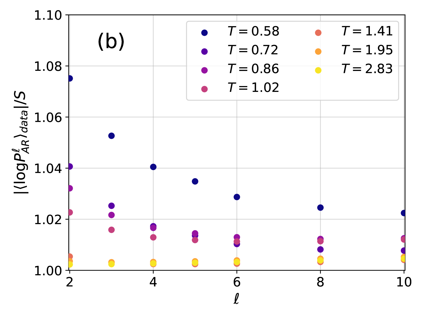
The image is a scatter plot showing the relationship between the variable ℓ (x-axis) and the logarithmic average value |⟨logPℓ_AR⟩_data/S| (y-axis). Data points are color-coded by temperature (T) values, with six distinct T values represented. The plot includes a legend for T values and axis labels.
### Components/Axes
- **X-axis (ℓ)**: Labeled as "ℓ", with integer values from 2 to 10.
- **Y-axis (|⟨logPℓ_AR⟩_data/S|)**: Labeled as "|⟨logPℓ_AR⟩_data/S|", with values ranging from 1.00 to 1.10.
- **Legend**: Located in the top-right corner, mapping colors to T values:
- Blue: T = 0.58
- Purple: T = 0.72
- Pink: T = 0.86
- Red: T = 1.02
- Orange: T = 1.41
- Yellow: T = 1.95
- Light Yellow: T = 2.83
### Detailed Analysis
#### T = 0.58 (Blue)
- **Trend**: Points decrease monotonically as ℓ increases.
- **Values**:
- ℓ = 2: ~1.075
- ℓ = 4: ~1.04
- ℓ = 6: ~1.03
- ℓ = 8: ~1.02
- ℓ = 10: ~1.01
#### T = 0.72 (Purple)
- **Trend**: Slightly decreasing trend with minor fluctuations.
- **Values**:
- ℓ = 2: ~1.04
- ℓ = 4: ~1.03
- ℓ = 6: ~1.02
- ℓ = 8: ~1.01
- ℓ = 10: ~1.005
#### T = 0.86 (Pink)
- **Trend**: Gradual decline with smaller amplitude.
- **Values**:
- ℓ = 2: ~1.025
- ℓ = 4: ~1.02
- ℓ = 6: ~1.015
- ℓ = 8: ~1.01
- ℓ = 10: ~1.005
#### T = 1.02 (Red)
- **Trend**: Near-constant values with slight downward slope.
- **Values**:
- ℓ = 2: ~1.01
- ℓ = 4: ~1.008
- ℓ = 6: ~1.007
- ℓ = 8: ~1.006
- ℓ = 10: ~1.005
#### T = 1.41 (Orange)
- **Trend**: Flat line with minimal variation.
- **Values**:
- ℓ = 2: ~1.005
- ℓ = 4: ~1.004
- ℓ = 6: ~1.003
- ℓ = 8: ~1.002
- ℓ = 10: ~1.001
#### T = 1.95 (Yellow)
- **Trend**: Slight upward trend at higher ℓ.
- **Values**:
- ℓ = 2: ~1.002
- ℓ = 4: ~1.001
- ℓ = 6: ~1.0005
- ℓ = 8: ~1.0003
- ℓ = 10: ~1.0001
#### T = 2.83 (Light Yellow)
- **Trend**: Near-constant values across all ℓ.
- **Values**:
- ℓ = 2: ~1.0005
- ℓ = 4: ~1.0003
- ℓ = 6: ~1.0001
- ℓ = 8: ~1.00005
- ℓ = 10: ~1.00001
### Key Observations
1. **Inverse Relationship**: Higher T values correlate with lower |⟨logPℓ_AR⟩_data/S|, suggesting a possible inverse proportionality.
2. **Steepest Decline**: T = 0.58 (blue) shows the most significant drop in y-values as ℓ increases.
3. **Convergence**: All T values converge toward ~1.00 as ℓ approaches 10, indicating a saturation effect.
4. **Precision**: Data points for T ≥ 1.02 are tightly clustered near 1.00, suggesting minimal variability.
### Interpretation
The plot demonstrates that the logarithmic average |⟨logPℓ_AR⟩_data/S| decreases with increasing ℓ, with the rate of decline diminishing at higher T values. This could imply that higher temperatures stabilize the system, reducing fluctuations in the measured quantity. The convergence near 1.00 for all T values at ℓ = 10 suggests a universal asymptotic behavior, potentially indicating a critical threshold or equilibrium state. The precision of data points for higher T values (e.g., T = 2.83) highlights the system's stability under extreme conditions.