\n
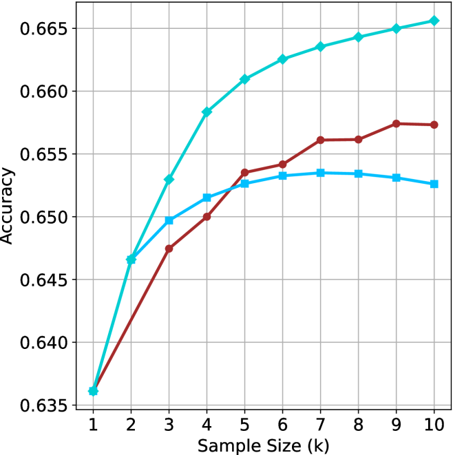
## Line Chart: Accuracy vs. Sample Size
### Overview
This image presents a line chart illustrating the relationship between sample size (in thousands) and accuracy. Two distinct data series are plotted, showing how accuracy changes as the sample size increases. The chart uses a grid background for easier readability.
### Components/Axes
* **X-axis:** Labeled "Sample Size (k)", ranging from 1 to 10 (in increments of 1).
* **Y-axis:** Labeled "Accuracy", ranging from 0.635 to 0.665 (in increments of 0.005).
* **Data Series 1:** Represented by a teal/cyan line.
* **Data Series 2:** Represented by a maroon/dark red line.
* **Grid:** A light gray grid is present to aid in reading values.
### Detailed Analysis
**Data Series 1 (Teal/Cyan Line):**
The teal line shows an initially steep upward trend, then plateaus.
* At Sample Size = 1k, Accuracy ≈ 0.637.
* At Sample Size = 2k, Accuracy ≈ 0.642.
* At Sample Size = 3k, Accuracy ≈ 0.648.
* At Sample Size = 4k, Accuracy ≈ 0.656.
* At Sample Size = 5k, Accuracy ≈ 0.659.
* At Sample Size = 6k, Accuracy ≈ 0.661.
* At Sample Size = 7k, Accuracy ≈ 0.662.
* At Sample Size = 8k, Accuracy ≈ 0.663.
* At Sample Size = 9k, Accuracy ≈ 0.663.
* At Sample Size = 10k, Accuracy ≈ 0.664.
**Data Series 2 (Maroon/Dark Red Line):**
The maroon line shows an initial upward trend, reaches a peak, and then declines slightly.
* At Sample Size = 1k, Accuracy ≈ 0.637.
* At Sample Size = 2k, Accuracy ≈ 0.644.
* At Sample Size = 3k, Accuracy ≈ 0.648.
* At Sample Size = 4k, Accuracy ≈ 0.651.
* At Sample Size = 5k, Accuracy ≈ 0.653.
* At Sample Size = 6k, Accuracy ≈ 0.654.
* At Sample Size = 7k, Accuracy ≈ 0.654.
* At Sample Size = 8k, Accuracy ≈ 0.656.
* At Sample Size = 9k, Accuracy ≈ 0.657.
* At Sample Size = 10k, Accuracy ≈ 0.656.
### Key Observations
* Both data series start at the same accuracy level (approximately 0.637) at a sample size of 1k.
* The teal line consistently demonstrates higher accuracy than the maroon line after a sample size of 4k.
* The maroon line exhibits a peak in accuracy around a sample size of 8k-9k before slightly decreasing.
* The teal line shows diminishing returns in accuracy gains as the sample size increases beyond 5k.
### Interpretation
The chart suggests that increasing the sample size generally improves accuracy, but there are diminishing returns. The teal line likely represents a model or method that benefits more significantly from larger sample sizes, achieving a higher plateau in accuracy. The maroon line indicates a method that reaches an optimal sample size (around 8k-9k) beyond which further increases in sample size do not lead to substantial improvements, and may even slightly decrease accuracy. This could be due to overfitting or the inherent limitations of the method represented by the maroon line. The initial convergence of the two lines suggests that both methods perform similarly with small sample sizes, but their behaviors diverge as more data becomes available. The difference in the final accuracy levels indicates that the teal method is more robust and scalable with larger datasets.