\n
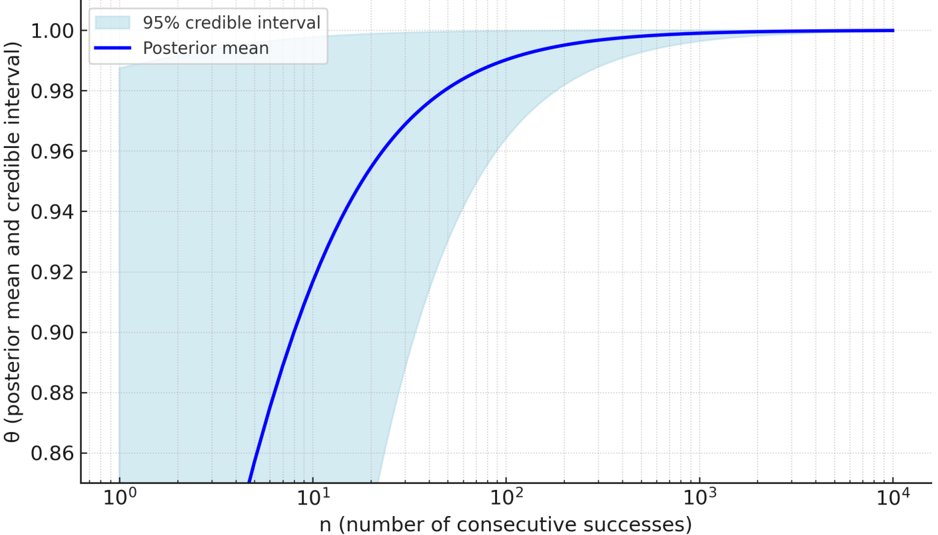
## Line Chart: Posterior Mean and Credible Interval
### Overview
The image presents a line chart illustrating the relationship between the number of consecutive successes (n) and the posterior mean and 95% credible interval of a parameter θ (theta). The x-axis represents 'n' on a logarithmic scale, while the y-axis represents θ (posterior mean and credible interval). The chart shows how the estimate of θ improves with increasing consecutive successes.
### Components/Axes
* **X-axis Label:** "n (number of consecutive successes)" - Logarithmic scale from 10⁰ to 10⁴.
* **Y-axis Label:** "θ (posterior mean and credible interval)" - Scale from 0.86 to 1.00.
* **Legend:** Located in the top-left corner.
* "95% credible interval" - Represented by a light blue shaded area.
* "Posterior mean" - Represented by a dark blue solid line.
* **Gridlines:** Present throughout the chart for easier readability.
### Detailed Analysis
The chart displays two primary elements: the posterior mean (a dark blue line) and the 95% credible interval (a light blue shaded region).
* **Posterior Mean (Dark Blue Line):**
* The line starts at approximately 0.87 when n = 10⁰ (n=1).
* It rapidly increases between n = 10⁰ and n = 10¹, reaching approximately 0.95 when n = 10.
* The rate of increase slows down between n = 10¹ and n = 10², leveling off around 0.98 when n = 100.
* The line continues to increase, but at a diminishing rate, approaching 0.995 when n = 1000 and reaching approximately 0.998 when n = 10⁴ (n=10000).
* **95% Credible Interval (Light Blue Shaded Area):**
* The interval is wide at low values of n, starting at approximately 0.86 at n = 10⁰.
* The lower bound of the interval decreases rapidly as n increases, converging towards a value around 0.97 when n = 100.
* The upper bound of the interval also increases with n, but at a slower rate, approaching 1.00 as n increases.
* The interval narrows significantly as n increases, indicating increased certainty in the estimate of θ.
### Key Observations
* The posterior mean converges towards 1.0 as the number of consecutive successes increases.
* The credible interval becomes much narrower with increasing n, demonstrating that the estimate of θ becomes more precise with more evidence.
* The initial increase in the posterior mean is very steep, indicating a rapid learning phase.
* The credible interval is asymmetric, particularly at lower values of n, with a wider lower tail.
### Interpretation
This chart likely represents a Bayesian analysis of a parameter θ, possibly related to the probability of success in a series of trials. The 'n' represents the number of consecutive successes observed. The posterior mean represents the best estimate of θ given the observed data, while the 95% credible interval provides a range of values within which θ is likely to lie with 95% probability.
The chart demonstrates that as the number of consecutive successes increases, our confidence in the estimate of θ also increases. The convergence of the posterior mean towards 1.0 suggests that the probability of success is high, and the narrowing of the credible interval confirms this. The initial steep increase indicates that even a small number of consecutive successes can significantly improve our estimate of θ. This type of analysis is common in fields like quality control, reliability engineering, and machine learning, where it is important to estimate the probability of success based on observed data. The logarithmic scale on the x-axis is used to better visualize the changes in the posterior mean and credible interval over a wide range of n values.