## Scatter Plot: A-mem vs. Base Distribution
### Overview
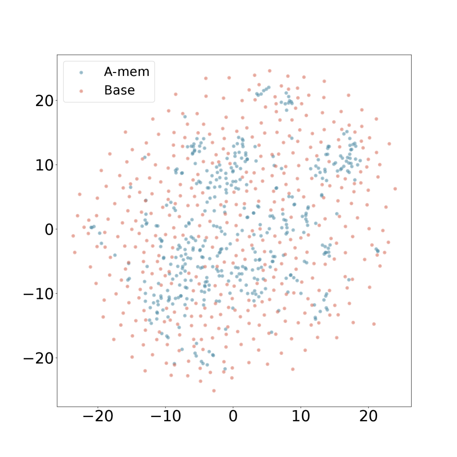
The image is a 2D scatter plot comparing the distribution of two datasets labeled "A-mem" and "Base". The plot visualizes the spatial spread and clustering of data points across a shared coordinate system.
### Components/Axes
* **Chart Type:** Scatter Plot
* **X-Axis:** Linear scale ranging from approximately -25 to +25. Major tick marks are labeled at -20, -10, 0, 10, and 20. No axis title is present.
* **Y-Axis:** Linear scale ranging from approximately -25 to +25. Major tick marks are labeled at -20, -10, 0, 10, and 20. No axis title is present.
* **Legend:** Located in the top-left corner of the plot area. It contains two entries:
* A blue dot labeled "A-mem".
* A pink/salmon dot labeled "Base".
* **Data Points:** The plot contains hundreds of individual points, each representing a single data observation from one of the two series.
### Detailed Analysis
**Data Series: A-mem (Blue Points)**
* **Visual Trend:** The blue points form a relatively dense, centrally concentrated cluster. The distribution appears roughly elliptical or cloud-like, centered near the origin (0,0).
* **Spatial Distribution:** The highest density of blue points is found within the region defined by x ≈ -10 to +10 and y ≈ -10 to +10. The cluster extends outward but becomes sparser. The points are not uniformly distributed; there are visible sub-clusters and voids within the main cloud.
* **Range:** The points span nearly the entire visible axis range, from approximately x = -22 to x = +22 and y = -22 to y = +24.
**Data Series: Base (Pink/Salmon Points)**
* **Visual Trend:** The pink points are much more widely and evenly dispersed across the entire plot area compared to the blue points. They do not form a single tight cluster.
* **Spatial Distribution:** The pink points appear to fill the background space more uniformly. They are present in all quadrants and at the peripheries where blue points are sparse or absent. Their distribution suggests a higher variance or a more random spread.
* **Range:** The points span the full visible axis range, from approximately x = -24 to x = +24 and y = -24 to y = +24.
**Cross-Reference & Spatial Grounding:**
* The legend in the top-left correctly maps the blue color to "A-mem" and the pink color to "Base".
* The central, dense cluster is composed exclusively of blue ("A-mem") points.
* The widely scattered points forming the background and outer edges are predominantly pink ("Base") points, though some blue points are also present at the fringes.
### Key Observations
1. **Distinct Distributions:** The two datasets exhibit fundamentally different spatial distributions. "A-mem" is clustered and centralized, while "Base" is dispersed and widespread.
2. **Central Overlap:** There is significant overlap in the central region (roughly within ±10 on both axes), where both blue and pink points are intermingled, though blue points dominate the very center.
3. **Peripheral Dominance:** The outer regions of the plot (beyond ±15 on either axis) are almost exclusively populated by pink ("Base") points.
4. **Density Gradient:** The "A-mem" series shows a clear density gradient, peaking at the center and fading outward. The "Base" series shows a much flatter density profile.
### Interpretation
This scatter plot likely visualizes the output of a dimensionality reduction technique (like t-SNE or PCA) applied to two different models or data representations ("A-mem" and "Base"). The key insight is the difference in their latent space organization.
* **What the data suggests:** The "A-mem" representation has learned a more structured and compact encoding, where similar items are mapped close together in the center of the space. This is often desirable for tasks requiring generalization or clustering. The "Base" representation appears more entangled or less structured, with data points scattered more randomly. This could indicate a less specialized or less trained model.
* **Relationship between elements:** The plot directly compares the geometric properties of the two representations. The central clustering of "A-mem" versus the dispersion of "Base" is the primary relationship being demonstrated.
* **Notable anomalies/trends:** The most significant trend is the stark contrast in distribution shape and density. There are no obvious outlier points that belong to one series but are located deep within the typical region of the other; the separation is more about overall distribution than individual point misplacement. The visualization strongly implies that the "A-mem" method produces a more organized internal representation of the data compared to the "Base" method.