\n
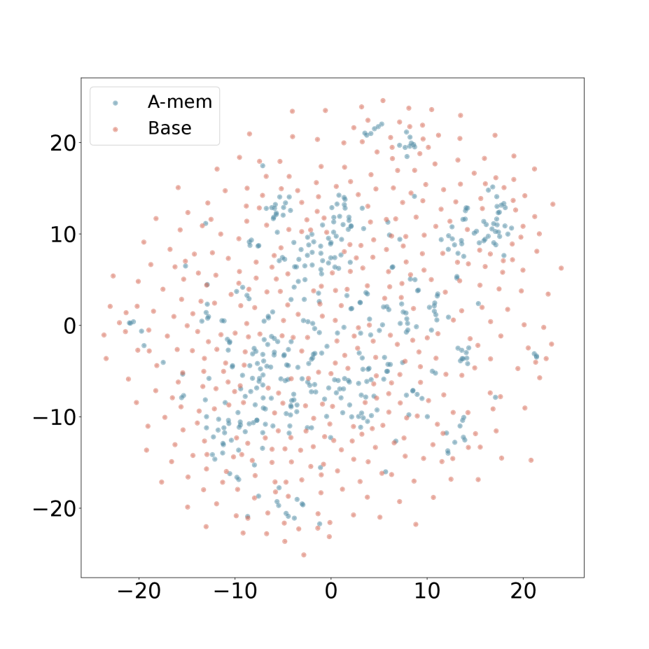
## Scatter Plot: A-mem vs. Base
### Overview
The image presents a scatter plot comparing two datasets, labeled "A-mem" and "Base". The plot displays the distribution of data points across a two-dimensional space, with both the x and y axes ranging from approximately -20 to 20. The data appears to be randomly distributed, with some clustering observed.
### Components/Axes
* **X-axis:** Ranges from approximately -20 to 20, unlabeled.
* **Y-axis:** Ranges from approximately -20 to 20, unlabeled.
* **Legend:** Located in the top-left corner.
* "A-mem" - Represented by blue dots.
* "Base" - Represented by orange/red dots.
### Detailed Analysis
The plot contains a large number of data points for both "A-mem" and "Base". Due to the density of points, precise numerical values cannot be extracted without further data. However, we can describe the distribution and trends.
**A-mem (Blue Dots):**
The blue data points are somewhat concentrated in the upper-middle region of the plot (x values between approximately -10 and 15, y values between approximately 0 and 20). There is a slight tendency for the points to be more dispersed at lower y-values. The points are distributed across the entire x-axis range.
**Base (Orange/Red Dots):**
The orange/red data points are more evenly distributed across the entire plot area. There is a slight concentration of points in the lower-left quadrant (x values between approximately -20 and 0, y values between approximately -20 and 0). The points are distributed across the entire y-axis range.
There is significant overlap between the two datasets, making it difficult to visually distinguish clear separation.
### Key Observations
* Both datasets appear to have a roughly normal distribution along both axes, though this is difficult to confirm precisely due to the scatter plot format.
* The "A-mem" dataset seems to have a slightly higher average y-value than the "Base" dataset.
* There are no obvious outliers in either dataset.
* The datasets are not clearly separated, suggesting a high degree of correlation or overlap.
### Interpretation
The scatter plot suggests a comparison between two conditions or groups, "A-mem" and "Base". The lack of clear separation between the datasets indicates that the two conditions do not produce drastically different distributions of values. The slight upward shift in the "A-mem" data along the y-axis could indicate a tendency for higher values in this condition, but further statistical analysis would be needed to confirm this.
The unlabeled axes suggest that the plot represents abstract measurements or features, rather than concrete physical quantities. Without knowing what the axes represent, it is difficult to draw definitive conclusions about the meaning of the data. The plot could be visualizing the relationship between two variables within a larger dataset, or it could be a representation of the distribution of scores or measurements for two different groups.
The random distribution of points suggests that there is no strong linear relationship between the two variables being plotted. However, there may be other, more complex relationships that are not apparent from the scatter plot alone.