## Line Chart: HMC Step vs. Value for Different 'd' Values
### Overview
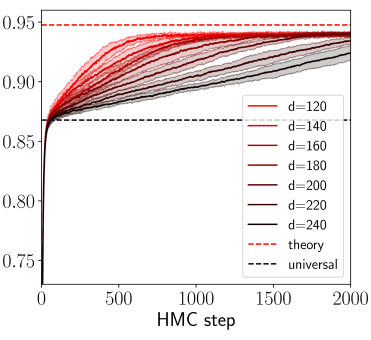
The image is a line chart showing the relationship between the HMC (Hamiltonian Monte Carlo) step and a value (presumably a metric of performance or convergence) for different values of 'd'. The chart includes a legend indicating the 'd' values, ranging from 120 to 240, as well as theoretical and universal baselines. The lines generally increase with the HMC step, eventually plateauing.
### Components/Axes
* **X-axis:** "HMC step", ranging from 0 to 2000.
* **Y-axis:** Value, ranging from 0.75 to 0.95.
* **Legend:** Located on the right side of the chart.
* `d=120` (Red)
* `d=140` (Dark Red)
* `d=160` (Dark Red)
* `d=180` (Dark Red)
* `d=200` (Dark Brown)
* `d=220` (Dark Gray)
* `d=240` (Black)
* `theory` (Dashed Red Line)
* `universal` (Dashed Black Line)
### Detailed Analysis
* **d=120 (Red):** Starts at approximately 0.73 and increases rapidly, reaching approximately 0.94 around HMC step 500, then plateaus.
* **d=140 (Dark Red):** Starts at approximately 0.73 and increases rapidly, reaching approximately 0.94 around HMC step 500, then plateaus.
* **d=160 (Dark Red):** Starts at approximately 0.73 and increases rapidly, reaching approximately 0.93 around HMC step 500, then plateaus.
* **d=180 (Dark Red):** Starts at approximately 0.73 and increases rapidly, reaching approximately 0.93 around HMC step 500, then plateaus.
* **d=200 (Dark Brown):** Starts at approximately 0.73 and increases rapidly, reaching approximately 0.92 around HMC step 500, then plateaus.
* **d=220 (Dark Gray):** Starts at approximately 0.73 and increases rapidly, reaching approximately 0.91 around HMC step 500, then plateaus.
* **d=240 (Black):** Starts at approximately 0.73 and increases rapidly, reaching approximately 0.90 around HMC step 500, then plateaus.
* **theory (Dashed Red Line):** Horizontal line at approximately 0.95.
* **universal (Dashed Black Line):** Horizontal line at approximately 0.87.
### Key Observations
* All 'd' values start at approximately the same point (0.73) and increase rapidly initially.
* The lines for lower 'd' values (120-180) plateau at higher values than the lines for higher 'd' values (200-240).
* The "theory" line represents an upper bound, while the "universal" line represents a lower bound.
* The shaded regions around each line likely represent the standard deviation or confidence interval.
### Interpretation
The chart demonstrates the convergence behavior of an HMC algorithm for different values of 'd'. The 'd' parameter seems to influence the final plateau value, with lower 'd' values achieving higher values. The "theory" and "universal" lines provide theoretical upper and lower bounds for the algorithm's performance. The convergence rate is similar for all 'd' values, as indicated by the initial rapid increase in the value. The shaded regions indicate the variability in the results. The data suggests that the choice of 'd' can impact the performance of the HMC algorithm, and there may be an optimal range for 'd' that balances convergence speed and final value.