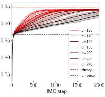
## Line Chart: Performance of Models with Varying Dimensions (d) Across HMC Steps
### Overview
The chart illustrates the convergence behavior of multiple models with different dimensionalities (d) as they perform Hamiltonian Monte Carlo (HMC) steps. The y-axis represents a metric (likely probability or performance score) that approaches 1 as HMC steps increase. The chart includes reference lines for "theory" (red dashed) and "universal" (black dashed) benchmarks.
### Components/Axes
- **X-axis**: "HMC step" (0 to 2000), representing the number of Hamiltonian Monte Carlo steps.
- **Y-axis**: A normalized metric (0.75 to 0.95), likely a probability or performance score.
- **Legend**:
- Solid lines represent models with dimensions (d) = 120, 140, 160, 180, 200, 220, 240.
- Red dashed line: "theory" (benchmark at ~0.95).
- Black dashed line: "universal" (benchmark at ~0.85).
### Detailed Analysis
- **Data Series**:
- **d=120 (red)**: Starts at ~0.75, rises sharply to ~0.85 by ~500 steps, then plateaus near 0.85.
- **d=140 (orange)**: Similar to d=120 but slightly higher, reaching ~0.88 by ~1000 steps.
- **d=160 (dark red)**: Reaches ~0.90 by ~1000 steps, plateauing near 0.90.
- **d=180 (brown)**: Approaches ~0.92 by ~1500 steps.
- **d=200 (dark brown)**: Reaches ~0.93 by ~1500 steps.
- **d=220 (black)**: Approaches ~0.94 by ~1500 steps.
- **d=240 (dark gray)**: Closest to the "theory" line, reaching ~0.945 by ~2000 steps.
- **Reference Lines**:
- **Theory (red dashed)**: Horizontal line at ~0.95, representing the theoretical maximum.
- **Universal (black dashed)**: Horizontal line at ~0.85, possibly a baseline or alternative benchmark.
### Key Observations
1. **Convergence Trends**: All models show rapid initial improvement, with performance plateauing as HMC steps increase. Higher-dimensional models (larger d) achieve higher plateaus closer to the "theory" line.
2. **Dimensionality Impact**: Larger d values (e.g., 240) outperform smaller d values (e.g., 120) by ~0.1 in the final plateau.
3. **Benchmark Alignment**: The "theory" line is the highest, suggesting it represents an idealized or optimal performance. The "universal" line is lower, possibly indicating a conservative or alternative theoretical limit.
### Interpretation
The chart demonstrates that increasing the dimensionality (d) of the model improves its convergence toward the theoretical maximum ("theory" line). This suggests that higher-dimensional models may better capture complex patterns in the data, aligning with expectations in Bayesian inference where higher dimensions can reduce bias. The "universal" line may represent a lower bound or a different theoretical framework, highlighting the trade-off between model complexity and practical performance. The data implies that optimizing d is critical for balancing computational efficiency and accuracy in HMC-based methods.