\n
## Heatmap: Color-Coded Matrix
### Overview
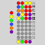
The image presents a heatmap-style matrix of colored circles arranged in a rectangular grid. The matrix appears to represent a relationship between two categorical variables, with color indicating the intensity or value of the relationship. There are no explicit axis labels or numerical scales. A legend is provided at the bottom of the image, indicating the color-to-category mapping.
### Components/Axes
The image consists of:
* **Matrix:** A grid of circles, arranged in approximately 6 rows and 10 columns.
* **Legend:** Located at the bottom of the image, consisting of five colored circles (yellow, green, red, and purple) with corresponding labels.
* **Background:** A uniform gray background.
The matrix does not have explicit axis labels. The rows and columns likely represent categories, but their names are not provided.
### Detailed Analysis or Content Details
The legend maps colors to categories as follows:
* Yellow
* Green
* Red
* Purple
* Gray
The matrix itself contains the following color distribution (approximated based on visual inspection):
* **Row 1:** Red, Yellow, Red, Blue, Orange, Red, Red, Yellow, Yellow, Gray
* **Row 2:** Yellow, Blue, Yellow, Green, Red, Purple, Gray, Gray, Gray, Gray
* **Row 3:** Green, Green, Blue, Yellow, Green, Red, Gray, Gray, Gray, Gray
* **Row 4:** Blue, Orange, Blue, Blue, Orange, Gray, Gray, Gray, Gray, Gray
* **Row 5:** Orange, Yellow, Orange, Gray, Gray, Gray, Gray, Gray, Gray, Gray
* **Row 6:** Purple, Green, Purple, Gray, Gray, Gray, Gray, Gray, Gray, Gray
The rightmost column is entirely gray. The bottom row consists of the legend colors: Yellow, Green, Red, Purple.
### Key Observations
* The matrix is not fully populated, with a significant portion of the cells filled with gray.
* The distribution of colors is uneven, with red and yellow appearing more frequently in the first two rows.
* The last column is entirely gray, suggesting a lack of association or a neutral value for that category.
* The bottom row is the legend, and it is positioned horizontally.
### Interpretation
The image likely represents a contingency table or a correlation matrix, where the color of each cell indicates the strength or presence of a relationship between two categorical variables. The gray color likely represents a missing value, a zero value, or a lack of association.
Without knowing the labels for the rows and columns, it is difficult to draw specific conclusions. However, the pattern suggests that certain combinations of categories are more common or have a stronger relationship than others. For example, the frequent appearance of red and yellow in the first two rows suggests a potential association between those categories and the categories represented by the first two columns.
The heatmap could be used to visualize data from a survey, experiment, or observational study. The colors could represent the frequency of responses, the strength of a correlation, or the probability of an event occurring. The image is a visual representation of data, but lacks the context needed for a full understanding.