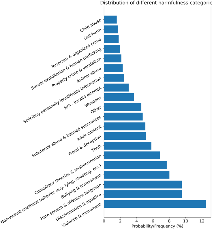
## Horizontal Bar Chart: Distribution of Harmfulness Categories
### Overview
The image is a horizontal bar chart titled "Distribution of different harmfulness categories." It displays the relative frequency or probability (in percentage) of various categories of harmful content or behavior. The categories are listed on the vertical (Y) axis, and their corresponding values are measured on the horizontal (X) axis. The bars are all a uniform blue color, and the chart is sorted in ascending order of frequency from top to bottom.
### Components/Axes
* **Chart Title:** "Distribution of different harmfulness categories" (located at the top center).
* **Y-Axis (Vertical):** Lists 20 distinct harmfulness categories. The labels are rotated approximately 45 degrees for readability. From top to bottom, they are:
1. Child abuse
2. Self-harm
3. Terrorism & organized crime
4. Sexual exploitation & human trafficking
5. Property crime & vandalism
6. Animal abuse
7. Soliciting personally identifiable information
8. N/A - Invalid attempt
9. Weapons
10. Other
11. Substance abuse & banned substances
12. Adult content
13. Fraud & deception
14. Theft
15. Conspiracy theories & misinformation
16. Non-violent unethical behavior (e.g. lying, cheating, etc.)
17. Bullying & harassment
18. Hate speech & offensive language
19. Discrimination & injustice
20. Violence & incitement
* **X-Axis (Horizontal):** Labeled "Probability/Frequency (%)". The axis has major tick marks at intervals of 2, labeled 0, 2, 4, 6, 8, 10, 12.
* **Data Series:** A single series represented by horizontal blue bars. Each bar's length corresponds to the percentage value for its category.
### Detailed Analysis
The chart presents a ranked distribution. The visual trend is clear: bar length increases consistently from the top category to the bottom category. Below are the approximate values for each category, estimated from the bar lengths relative to the X-axis scale. Uncertainty is noted where the bar end falls between tick marks.
1. **Child abuse:** ~1.5% (Bar ends between 0 and 2, closer to 2)
2. **Self-harm:** ~1.8% (Slightly longer than "Child abuse")
3. **Terrorism & organized crime:** ~2.0% (Bar ends at or very near the 2% mark)
4. **Sexual exploitation & human trafficking:** ~2.2%
5. **Property crime & vandalism:** ~2.5%
6. **Animal abuse:** ~2.8%
7. **Soliciting personally identifiable information:** ~3.2%
8. **N/A - Invalid attempt:** ~3.8%
9. **Weapons:** ~4.5%
10. **Other:** ~4.8%
11. **Substance abuse & banned substances:** ~5.0% (Bar ends at or very near the 5% mark, halfway between 4 and 6)
12. **Adult content:** ~5.2%
13. **Fraud & deception:** ~5.8%
14. **Theft:** ~6.8%
15. **Conspiracy theories & misinformation:** ~7.5%
16. **Non-violent unethical behavior (e.g. lying, cheating, etc.):** ~8.0% (Bar ends at or very near the 8% mark)
17. **Bullying & harassment:** ~9.5%
18. **Hate speech & offensive language:** ~9.5% (Appears very similar in length to "Bullying & harassment")
19. **Discrimination & injustice:** ~10.0% (Bar ends at or very near the 10% mark)
20. **Violence & incitement:** ~12.5% (The longest bar, extending past the 12% mark)
### Key Observations
* **Clear Hierarchy:** There is a pronounced hierarchy of frequency. "Violence & incitement" is the most frequently observed category by a significant margin, being the only one exceeding 12%.
* **Top Tier:** The top four most frequent categories are "Violence & incitement," "Discrimination & injustice," "Hate speech & offensive language," and "Bullying & harassment," all at or above ~9.5%.
* **Lower Frequency Cluster:** The top seven categories on the list (from "Child abuse" to "Soliciting personally identifiable information") all have frequencies below 4%, forming a cluster of relatively lower-occurrence harms in this dataset.
* **Mid-Range Categories:** A substantial group of categories falls in the 4% to 8% range, including "Weapons," "Substance abuse," "Adult content," "Fraud," "Theft," and "Conspiracy theories."
* **Ordering:** The chart is meticulously ordered from least to most frequent, making the comparative analysis straightforward.
### Interpretation
This chart provides a quantitative snapshot of the prevalence of different types of harmful content or behaviors within a specific, though unstated, context (e.g., a platform's moderation queue, a dataset of flagged content, or a survey).
* **What the Data Suggests:** The data indicates that in the analyzed context, harms related to **interpersonal conflict, social dynamics, and incitement** (violence, discrimination, hate speech, bullying) are reported or detected far more frequently than harms related to **specific illegal activities or severe individual pathology** (child abuse, terrorism, self-harm). This could reflect the relative volume of such content online, the effectiveness of detection systems for different harm types, or reporting biases.
* **Relationship Between Elements:** The direct correlation between category label and bar length creates an immediate visual ranking. The uniform color of the bars focuses attention solely on the magnitude of the values, not on differentiating subgroups of harm.
* **Notable Anomalies/Patterns:** The near-identical values for "Bullying & harassment" and "Hate speech & offensive language" (~9.5%) suggest these categories may be closely related or frequently co-occur. The category "N/A - Invalid attempt" (~3.8%) is interesting, as it likely represents false positives or non-actionable reports, indicating a baseline noise level in the detection or reporting system. The significant jump in frequency from "Conspiracy theories" (~7.5%) to "Non-violent unethical behavior" (~8.0%) and then to "Bullying & harassment" (~9.5%) marks a clear threshold into the most common harm types.
**Language Note:** All text in the image is in English.