## Scatter Plot & Line Chart: Early Stopping Step and Loss Curves
### Overview
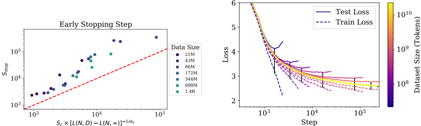
The image contains two distinct but related plots presented side-by-side. The left plot is a scatter plot analyzing the relationship between a computed metric and the early stopping step (`S_stop`) for various model/data sizes. The right plot shows training and test loss curves over training steps for models trained on datasets of different sizes, with loss values color-coded by dataset size.
### Components/Axes
**Left Plot: "Early Stopping Step"**
* **Title:** "Early Stopping Step" (centered at the top).
* **Y-axis:** Label is `S_stop`. Scale is logarithmic, with major ticks at `10^3`, `10^4`, and `10^5`.
* **X-axis:** Label is a complex formula: `S_c × [L(N,D) - L(N,∞)]^{-1/α_s}`. Scale is logarithmic, with major ticks at `10^3`, `10^4`, and `10^5`.
* **Legend:** Located on the right side of the plot. Title is "Data Size". It lists 7 categories with corresponding colored circles:
* 21M (dark purple)
* 43M (dark blue-purple)
* 86M (blue)
* 172M (teal)
* 345M (green-teal)
* 688M (green)
* 1.4B (light green)
* **Reference Line:** A red dashed line runs diagonally from the bottom-left to the top-right, appearing to represent a `y = x` relationship.
**Right Plot: Loss Curves**
* **Y-axis:** Label is "Loss". Linear scale from 2 to 6.
* **X-axis:** Label is "Step". Logarithmic scale, with major ticks at `10^3`, `10^4`, and `10^5`.
* **Legend:** Located in the top-right corner. It defines two line styles:
* Solid line: "Test Loss"
* Dashed line: "Train Loss"
* **Color Bar:** Located on the far right. Label is "Dataset Size (Tokens)". It is a vertical gradient bar mapping color to a logarithmic scale of dataset size, ranging from approximately `10^8` (dark purple) to `10^10` (bright yellow). Major ticks are at `10^8`, `10^9`, and `10^10`.
### Detailed Analysis
**Left Plot Analysis (Early Stopping Step):**
* **Trend:** The data points show a strong positive correlation. As the value on the x-axis (`S_c × [L(N,D) - L(N,∞)]^{-1/α_s}`) increases, the early stopping step `S_stop` also increases. The relationship appears roughly linear on this log-log plot.
* **Data Series & Values (Approximate):**
* The smallest dataset (21M, dark purple) has points clustered at the lower-left, with x-values ~`2×10^3` to `5×10^3` and y-values (`S_stop`) ~`2×10^3` to `5×10^3`.
* The largest dataset (1.4B, light green) has points at the upper-right, with x-values ~`2×10^4` to `8×10^4` and y-values (`S_stop`) ~`5×10^4` to `2×10^5`.
* Intermediate data sizes (e.g., 172M, teal) fall between these extremes.
* **Relationship to Reference Line:** Most data points lie slightly above the red dashed `y=x` line, indicating that the actual `S_stop` is generally greater than the value predicted by the x-axis metric alone.
**Right Plot Analysis (Loss Curves):**
* **General Trend:** All loss curves (both train and test) decrease as the number of training steps increases, showing typical learning behavior. The rate of decrease slows over time (logarithmic decay).
* **Dataset Size Effect (Color Gradient):**
* **Larger Datasets (Yellow/Green, ~10^9 - 10^10 tokens):** These curves (e.g., the topmost yellow solid line) start at a higher loss (~6) and descend more gradually. They achieve a lower final loss (around 2.5-2.8 for test loss at 10^5 steps) compared to smaller datasets.
* **Smaller Datasets (Purple/Blue, ~10^8 tokens):** These curves (e.g., the bottom-most dark purple dashed line) start at a lower initial loss (~4) but plateau earlier and at a higher final loss value (around 3.0-3.5 for test loss).
* **Train vs. Test Loss:**
* For every dataset size (color), the dashed "Train Loss" line is consistently below the solid "Test Loss" line of the same color, indicating the presence of generalization gap/overfitting.
* The gap between train and test loss appears more pronounced for the smaller datasets (darker colors).
* **Spatial Grounding & Key Points (Approximate):**
* At Step = `10^3`: Loss values range from ~4.0 (small dataset, purple) to ~6.0 (large dataset, yellow).
* At Step = `10^5`: Test loss values converge to a narrower range, approximately between 2.6 (large dataset) and 3.2 (small dataset).
* The curves for the largest datasets (yellow) are the flattest at the end, suggesting they may not have fully converged even at 100,000 steps.
### Key Observations
1. **Strong Scaling Law:** The left plot demonstrates a clear, predictable scaling relationship between the computed metric and the optimal early stopping point across three orders of magnitude in data size.
2. **Data Efficiency:** Larger datasets require more training steps to reach their optimal point (higher `S_stop`) but ultimately achieve lower loss values.
3. **Generalization Gap:** A consistent gap between training and test loss exists across all dataset sizes, but it is visually larger for smaller datasets, suggesting they are more prone to overfitting.
4. **Convergence Behavior:** Models trained on larger datasets show slower initial loss reduction but continue to improve for more steps, while smaller datasets hit a performance plateau sooner.
### Interpretation
These plots together illustrate fundamental principles of scaling in machine learning model training.
The **left plot** suggests the existence of a predictable law governing training dynamics. The x-axis metric, which likely combines model capacity (`S_c`), the gap between finite-data and infinite-data loss (`L(N,D) - L(N,∞)`), and a scaling exponent (`α_s`), successfully predicts when training should be stopped (`S_stop`) to avoid overfitting. The fact that points lie above the `y=x` line implies the theoretical metric provides a lower-bound estimate, and the actual optimal stopping point is slightly later.
The **right plot** provides the empirical loss curves that underpin the analysis on the left. It shows the trade-off between dataset size and model performance:
* **Small Data:** Models learn quickly but are limited by the data's information content, leading to higher final loss and a larger generalization gap.
* **Large Data:** Models learn more slowly (require more steps) because they are fitting a more complex, richer data distribution, but they achieve superior final performance and a relatively smaller generalization gap.
The connection between the plots is that the early stopping step (`S_stop`) analyzed on the left is the point on the right-hand curves where the test loss (solid line) is minimized before it would start to increase due to overfitting. The analysis provides a method to predict this critical point without having to run full training to completion for every new dataset size, which is crucial for efficient large-scale model training. The clear trends indicate these scaling relationships are robust across the evaluated range of data sizes (from 21 million to 1.4 billion data points/tokens).