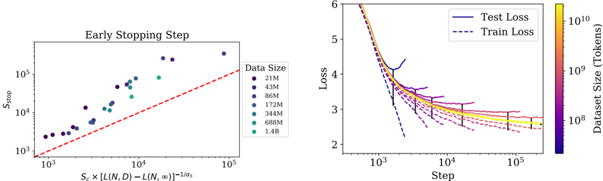
## Chart: Early Stopping Step and Loss vs. Step
### Overview
The image presents two charts. The left chart shows the relationship between the early stopping step and a function of the loss difference, colored by dataset size. The right chart shows the loss (both test and train) as a function of the step, with dataset size indicated by color.
### Components/Axes
**Left Chart:**
* **Title:** Early Stopping Step
* **Y-axis:** S<sub>stop</sub> (logarithmic scale from 10<sup>3</sup> to 10<sup>5</sup>)
* **X-axis:** S<sub>c</sub> x [L(N, D) - L(N, ∞)]<sup>-1/α<sub>s</sub></sup> (logarithmic scale from 10<sup>3</sup> to 10<sup>5</sup>)
* **Data Series:** Scatter plot with points colored according to dataset size.
* **Legend (top-right):**
* 21M (dark purple)
* 43M (purple)
* 86M (light purple)
* 172M (blue)
* 344M (light blue)
* 688M (green)
* 1.4B (light green)
* A red dashed line is present, running diagonally.
**Right Chart:**
* **Y-axis:** Loss (linear scale from 2 to 6)
* **X-axis:** Step (logarithmic scale from 10<sup>3</sup> to 10<sup>5</sup>)
* **Data Series:**
* Test Loss (solid lines, color-coded by dataset size)
* Train Loss (dashed lines, color-coded by dataset size)
* **Legend (top-right):**
* Test Loss (solid dark blue line)
* Train Loss (dashed dark blue line)
* **Colorbar (right):** Dataset Size (Tokens), ranging from 10<sup>8</sup> to 10<sup>10</sup>, with colors transitioning from dark purple to yellow.
### Detailed Analysis
**Left Chart:**
* The data points generally trend upwards, indicating a positive correlation between the early stopping step and the function on the x-axis.
* The red dashed line appears to represent a reference line, possibly indicating a theoretical or expected relationship.
* The color gradient suggests that larger datasets (green/yellow) tend to have higher early stopping steps compared to smaller datasets (purple/blue).
**Right Chart:**
* Both Test Loss and Train Loss decrease as the Step increases, indicating learning.
* The loss curves flatten out as the Step increases, suggesting convergence.
* The color gradient shows that larger datasets (yellow) generally have lower final losses compared to smaller datasets (purple).
* The Test Loss and Train Loss curves for each dataset size tend to converge as the Step increases.
* Error bars are present on the Test Loss lines, indicating the variability in the loss.
**Specific Data Points (Right Chart - Approximate):**
* **21M (dark purple):**
* Test Loss: Starts around 4.5, decreases to approximately 2.7 at step 10<sup>5</sup>.
* Train Loss: Starts around 4.0, decreases to approximately 2.4 at step 10<sup>5</sup>.
* **1.4B (light green):**
* Test Loss: Starts around 5.8, decreases to approximately 2.9 at step 10<sup>5</sup>.
* Train Loss: Starts around 5.5, decreases to approximately 2.6 at step 10<sup>5</sup>.
### Key Observations
* Larger datasets generally lead to lower final losses and higher early stopping steps.
* The loss curves exhibit a typical learning curve pattern, with a rapid initial decrease followed by a slower convergence.
* The early stopping step appears to be correlated with a function of the loss difference, suggesting a potential strategy for optimizing training.
### Interpretation
The charts illustrate the impact of dataset size on the training process and early stopping criteria. The data suggests that larger datasets not only lead to better performance (lower loss) but also influence the optimal point to stop training. The relationship between the early stopping step and the loss difference function could be used to develop more efficient training strategies. The convergence of Test and Train Loss suggests that the model is generalizing well, and the error bars on the Test Loss provide an indication of the model's robustness.