\n
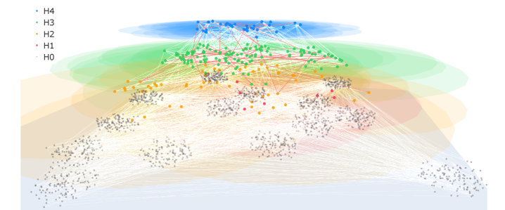
## Diagram: Network Visualization - Hierarchical Structure
### Overview
The image depicts a network visualization representing a hierarchical structure. The diagram consists of numerous nodes connected by lines, arranged in a layered fashion suggesting different levels of a hierarchy. The nodes are color-coded based on their hierarchical level (H0-H4), with connections indicating relationships between nodes at different levels. The density of nodes decreases as you move down the hierarchy.
### Components/Axes
The diagram does not have explicit axes in the traditional sense. However, the vertical arrangement represents hierarchical levels. The legend, located in the top-left corner, defines the color coding:
* H4 (Blue)
* H3 (Green)
* H2 (Yellow)
* H1 (Red)
* H0 (Orange)
The diagram is composed of nodes (dots) and edges (lines connecting the nodes). The nodes are distributed across the image, with a concentration at the top and a gradual dispersion towards the bottom. The lines connecting the nodes are thin and numerous, creating a complex network appearance.
### Detailed Analysis
The diagram can be conceptually divided into five horizontal layers corresponding to the hierarchical levels H0 through H4.
* **H4 (Blue):** Approximately 20-30 nodes are clustered at the very top of the diagram. These nodes are densely interconnected with lines primarily extending downwards to nodes in H3.
* **H3 (Green):** A layer below H4, containing roughly 50-60 nodes. These nodes are connected to both H4 (above) and H2 (below). The connections to H4 are more numerous than those to H2.
* **H2 (Yellow):** This layer has approximately 60-80 nodes. Connections extend from H3 (above) and to H1 (below).
* **H1 (Red):** Contains approximately 80-100 nodes. Connections extend from H2 (above) and to H0 (below).
* **H0 (Orange):** The bottom layer, with the highest number of nodes – approximately 150-200. These nodes are primarily connected to H1 (above) and have very few connections amongst themselves.
The lines connecting the nodes are not uniform in density. The connections are most dense between H4 and H3, and gradually decrease in density as you move down the hierarchy. The bottom layer (H0) has the sparsest connections.
There are a few isolated nodes in each layer that do not appear to be fully connected to the main network.
### Key Observations
* The network exhibits a clear hierarchical structure, with a decreasing number of nodes at each lower level.
* The connections are directional, flowing primarily from higher levels to lower levels.
* The density of connections decreases as you move down the hierarchy, suggesting a funneling effect.
* The bottom layer (H0) is the most populated but least connected.
* The top layer (H4) is the least populated but most densely connected.
### Interpretation
This diagram likely represents a system with a hierarchical organization, such as a decision-making process, a command structure, or a data flow diagram. The different levels (H0-H4) could represent different stages in a process, different levels of authority, or different categories of data.
The funneling effect suggests that information or control flows from the top levels to the bottom levels, with a convergence of inputs at the lower levels. The sparse connections within the bottom layer (H0) might indicate that the nodes at this level operate relatively independently or represent terminal points in the process.
The isolated nodes could represent outliers or nodes that are not fully integrated into the network.
The diagram provides a visual representation of the relationships between different entities within the system, highlighting the hierarchical structure and the flow of information or control. It could be used to analyze the network's efficiency, identify bottlenecks, or understand the impact of changes at different levels.