## Histogram: CLUTRR Cost Histogram
### Overview
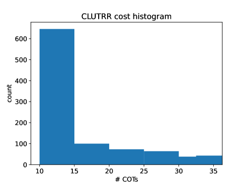
The image is a histogram titled "CLUTRR cost histogram". The histogram displays the distribution of "# COTs" (number of commercial off-the-shelf components) on the x-axis versus "count" on the y-axis. The histogram bars are blue.
### Components/Axes
* **Title:** CLUTRR cost histogram
* **X-axis:** # COTs (number of commercial off-the-shelf components). The x-axis ranges from approximately 10 to 35, with tick marks at 10, 15, 20, 25, 30, and 35.
* **Y-axis:** count. The y-axis ranges from 0 to 600, with tick marks at 0, 100, 200, 300, 400, 500, and 600.
### Detailed Analysis
The histogram shows the frequency distribution of # COTs.
* **Bar 1:** The first bar spans from approximately 10 to 15 on the x-axis and has a height of approximately 640 on the y-axis.
* **Bar 2:** The second bar spans from approximately 15 to 20 on the x-axis and has a height of approximately 100 on the y-axis.
* **Bar 3:** The third bar spans from approximately 20 to 25 on the x-axis and has a height of approximately 70 on the y-axis.
* **Bar 4:** The fourth bar spans from approximately 25 to 30 on the x-axis and has a height of approximately 65 on the y-axis.
* **Bar 5:** The fifth bar spans from approximately 30 to 35 on the x-axis and has a height of approximately 40 on the y-axis.
### Key Observations
The histogram is heavily skewed to the left, indicating that most data points have a low # COTs value (between 10 and 15). The frequency decreases as the # COTs value increases.
### Interpretation
The histogram suggests that the CLUTRR system or process being analyzed tends to have a low cost, as indicated by the high frequency of low # COTs values. The decreasing frequency with increasing # COTs suggests that higher costs are less common. The data implies that the system is optimized or designed to minimize the number of commercial off-the-shelf components used, leading to a cost-effective solution.