## CLUTRR Cost Histogram
### Overview
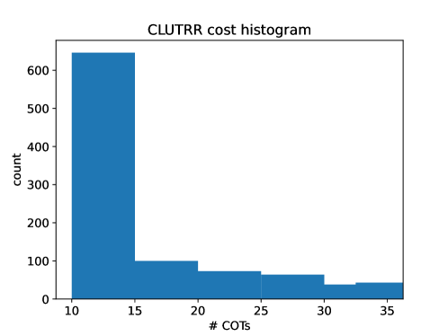
The image displays a histogram titled "CLUTRR cost histogram." The histogram is used to visualize the distribution of costs associated with CLUTRR, which is likely a software or service. The x-axis represents the number of Cost of Technical Services (COTS), while the y-axis represents the count of occurrences.
### Components/Axes
- **Title**: CLUTRR cost histogram
- **X-axis**: # COTS (Number of COTS)
- **Y-axis**: count
- **Legend**: Not visible in the image
### Detailed Analysis or Content Details
The histogram shows a clear distribution of costs. The majority of the data points are concentrated in the lower range of COTS, with a significant peak around 10 COTS. The count of occurrences is highest around 600, indicating that the majority of the costs are associated with 10 COTS. The count gradually decreases as the number of COTS increases, with the lowest count being around 35 COTS.
### Key Observations
- The majority of the costs are associated with 10 COTS.
- The distribution is skewed towards lower values of COTS.
- There is a significant peak around 600 occurrences.
### Interpretation
The histogram suggests that the majority of the costs associated with CLUTRR are relatively low, with the majority of the costs being associated with 10 COTS. This indicates that the majority of the costs are concentrated in the lower range of COTS. The significant peak around 600 occurrences suggests that there are a few instances where the costs are significantly higher than the average. This could indicate that there are a few instances where the costs are associated with a higher number of COTS. Overall, the histogram provides a clear visual representation of the distribution of costs associated with CLUTRR.