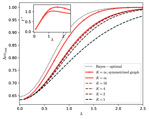
## Chart: Test Accuracy vs. Lambda
### Overview
The image presents a line chart illustrating the relationship between test accuracy (Acc<sub>test</sub>) and a parameter lambda (λ) for different values of K. An inset chart shows a separate relationship between a value 'x*' and lambda. The chart compares the performance of different models or configurations, likely in a machine learning context.
### Components/Axes
* **X-axis:** Lambda (λ), ranging from approximately 0.0 to 2.5.
* **Y-axis:** Test Accuracy (Acc<sub>test</sub>), ranging from approximately 0.65 to 1.00.
* **Legend:** Located in the top-right corner, identifies the different lines:
* Bayes – optimal (dotted black line)
* K = ∞, symmetrized graph (solid red line)
* K = ∞ (solid red line)
* K = 16 (dashed red line)
* K = 4 (dashed brown line)
* K = 2 (dashed gray line)
* K = 1 (dashed black line)
* **Inset Chart:** Located in the top-left corner, shows a plot of 'x*' versus lambda (λ), ranging from approximately 0.0 to 2.0 for lambda and 0.0 to 1.0 for x*.
### Detailed Analysis
The main chart displays several curves representing different values of K.
* **Bayes – optimal (dotted black line):** This line starts at approximately 0.66 at λ = 0.0, increases rapidly, and reaches approximately 0.98 at λ = 1.0, then plateaus.
* **K = ∞, symmetrized graph (solid red line):** This line starts at approximately 0.66 at λ = 0.0, increases more slowly than the Bayes line, reaches approximately 0.99 at λ = 1.5, and plateaus.
* **K = ∞ (solid red line):** This line is nearly identical to the "K = ∞, symmetrized graph" line, starting at approximately 0.66 at λ = 0.0, increasing slowly, and reaching approximately 0.99 at λ = 1.5, then plateaus.
* **K = 16 (dashed red line):** This line starts at approximately 0.66 at λ = 0.0, increases at a moderate rate, reaches approximately 0.95 at λ = 1.5, and plateaus.
* **K = 4 (dashed brown line):** This line starts at approximately 0.66 at λ = 0.0, increases at a slower rate than K=16, reaches approximately 0.85 at λ = 1.5, and plateaus.
* **K = 2 (dashed gray line):** This line starts at approximately 0.66 at λ = 0.0, increases slowly, reaches approximately 0.75 at λ = 1.5, and plateaus.
* **K = 1 (dashed black line):** This line starts at approximately 0.66 at λ = 0.0, increases slowly, reaches approximately 0.70 at λ = 1.5, and plateaus.
The inset chart shows a single curve.
* **Inset Chart:** The curve starts at approximately 0.4 at λ = 0.0, increases to a peak of approximately 1.0 at λ = 1.0, and then decreases to approximately 0.7 at λ = 2.0.
### Key Observations
* The Bayes – optimal line consistently outperforms all other configurations across the range of λ.
* As K increases, the test accuracy generally increases, with K = ∞ providing the best performance among the K-based models.
* The inset chart shows a non-monotonic relationship between 'x*' and λ, peaking at λ = 1.0.
* All lines start at the same accuracy level (approximately 0.66) when λ = 0.0.
### Interpretation
The chart demonstrates the impact of the parameter K on the test accuracy of a model as a function of lambda. The "Bayes – optimal" line represents a theoretical upper bound on performance. The results suggest that increasing K generally improves performance, approaching the optimal Bayes solution as K approaches infinity. The inset chart likely represents a related parameter or metric that influences the overall model behavior, exhibiting a peak performance at a specific value of lambda. The fact that all lines start at the same accuracy suggests that the initial performance is independent of K, but the subsequent improvement is heavily influenced by it. The plateauing of the lines at higher lambda values indicates that the model reaches a saturation point where further increases in lambda do not lead to significant improvements in accuracy. This could be due to overfitting or other limitations of the model.