## 2D Contour Plot with Marginal Distributions: General Text vs. Medical Text
### Overview
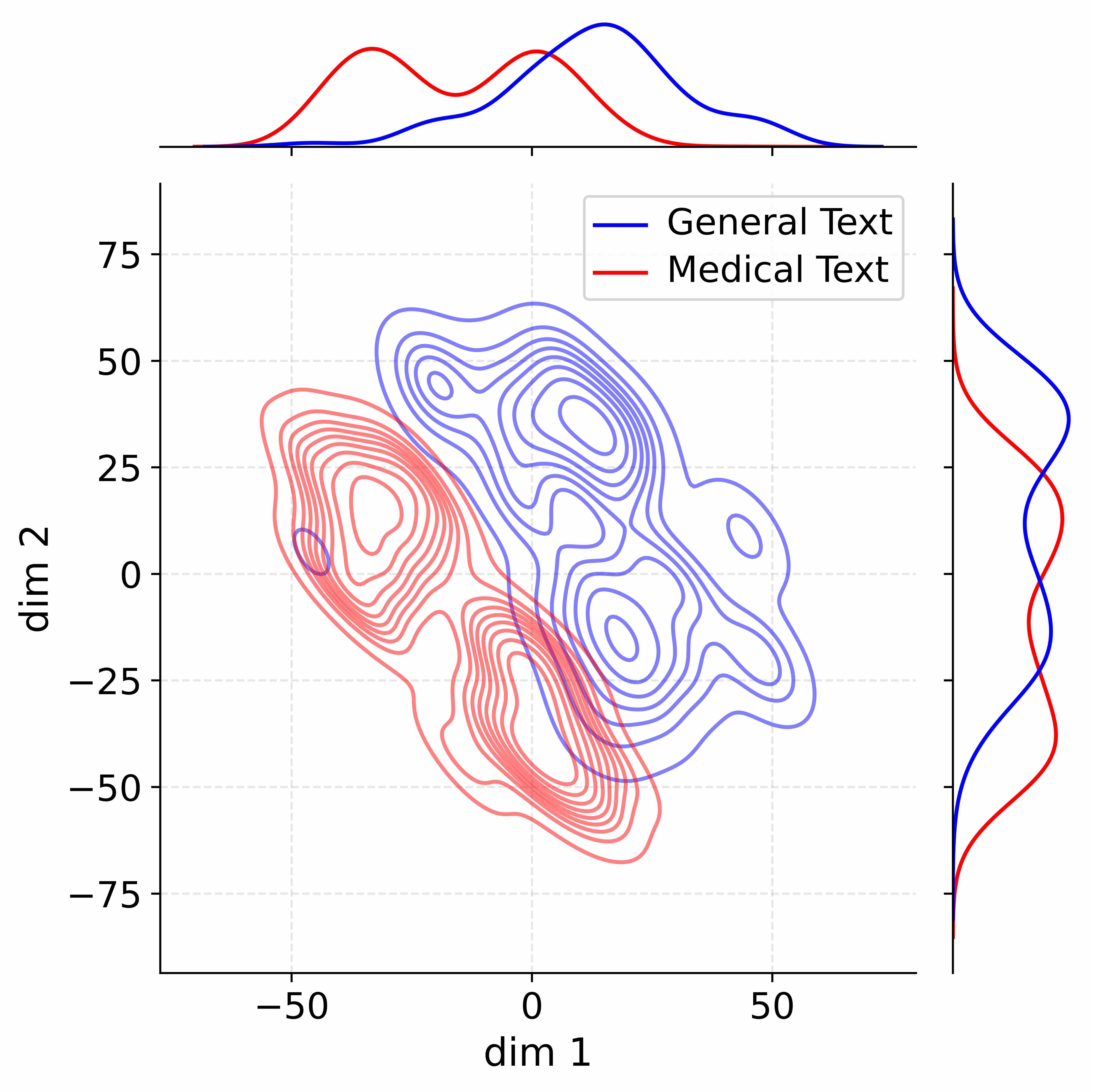
This image is a 2D contour plot comparing the distribution of two datasets, labeled "General Text" and "Medical Text," across two dimensions (`dim 1` and `dim 2`). The plot includes marginal density plots (univariate distributions) along the top (for `dim 1`) and right side (for `dim 2`). The visualization aims to show how the two text types cluster differently in this two-dimensional feature space.
### Components/Axes
* **Main Plot (Center):**
* **X-axis:** Labeled `dim 1`. Major tick marks are at -50, 0, and 50. The axis spans approximately from -75 to +75.
* **Y-axis:** Labeled `dim 2`. Major tick marks are at -75, -50, -25, 0, 25, 50, and 75. The axis spans approximately from -80 to +80.
* **Data Series (Contour Lines):**
* **Blue Contours:** Represent the density of "General Text" data points.
* **Red Contours:** Represent the density of "Medical Text" data points.
* **Legend:** Located in the top-right quadrant of the main plot area. It contains:
* A blue line segment followed by the text "General Text".
* A red line segment followed by the text "Medical Text".
* **Top Marginal Plot:**
* Shows the 1D density distribution along the `dim 1` axis.
* Contains a blue curve (General Text) and a red curve (Medical Text).
* The x-axis aligns with the main plot's `dim 1` axis.
* **Right Marginal Plot:**
* Shows the 1D density distribution along the `dim 2` axis.
* Contains a blue curve (General Text) and a red curve (Medical Text).
* The y-axis aligns with the main plot's `dim 2` axis.
### Detailed Analysis
**1. Main Contour Plot:**
* **General Text (Blue):** The contours form a large, complex cluster primarily located in the quadrant where `dim 1` is positive and `dim 2` is positive. The highest density peaks (innermost contours) are centered approximately at (`dim 1` ≈ 10 to 30, `dim 2` ≈ 20 to 40). The distribution is broad, extending from `dim 1` ≈ -20 to +60 and `dim 2` ≈ -40 to +60. There is a secondary, smaller density peak near (`dim 1` ≈ 40, `dim 2` ≈ 10).
* **Medical Text (Red):** The contours form a distinct cluster primarily located where `dim 1` is negative and `dim 2` is negative. The highest density peak is centered approximately at (`dim 1` ≈ -30, `dim 2` ≈ -10). The distribution is more compact than the General Text cluster, extending roughly from `dim 1` ≈ -50 to +10 and `dim 2` ≈ -60 to +30. There is a noticeable secondary lobe extending towards (`dim 1` ≈ -10, `dim 2` ≈ -40).
* **Overlap:** There is a region of overlap between the two distributions, primarily in the area around (`dim 1` ≈ -10 to 0, `dim 2` ≈ -20 to 0).
**2. Top Marginal Plot (dim 1 Distribution):**
* **General Text (Blue):** The distribution is broad and appears bimodal. The primary, higher peak is centered at approximately `dim 1` = +20. A secondary, lower peak or shoulder is visible around `dim 1` = -10.
* **Medical Text (Red):** The distribution is also broad and appears bimodal. The primary peak is centered at approximately `dim 1` = -30. A secondary peak is centered near `dim 1` = 0.
* **Comparison:** The Medical Text distribution is shifted significantly to the left (more negative values) compared to the General Text distribution on the `dim 1` axis.
**3. Right Marginal Plot (dim 2 Distribution):**
* **General Text (Blue):** The distribution is broad with a primary peak at approximately `dim 2` = +30 and a secondary peak or shoulder near `dim 2` = -10.
* **Medical Text (Red):** The distribution is also broad with a primary peak at approximately `dim 2` = -10 and a secondary peak near `dim 2` = +20.
* **Comparison:** The Medical Text distribution is shifted downward (more negative values) compared to the General Text distribution on the `dim 2` axis, though the overlap is greater here than on `dim 1`.
### Key Observations
1. **Clear Separation:** The two text types form distinct clusters in the 2D space, with General Text favoring positive values on both dimensions and Medical Text favoring negative values.
2. **Multimodality:** Both marginal distributions for each text type appear to have more than one peak, suggesting potential sub-categories or modes within each text domain.
3. **Different Spread:** The General Text cluster (blue) appears more diffuse and covers a larger area of the plot than the more concentrated Medical Text cluster (red).
4. **Axis-Specific Shifts:** The separation between the groups is more pronounced along the `dim 1` axis than the `dim 2` axis.
### Interpretation
This plot likely visualizes the output of a dimensionality reduction technique (like PCA, t-SNE, or UMAP) applied to textual data. The two dimensions (`dim 1`, `dim 2`) represent abstract features derived from the text.
The data suggests that **"Medical Text" and "General Text" have fundamentally different statistical profiles** in this feature space. Medical text is characterized by more negative values on both derived dimensions, forming a tighter, more specific cluster. This could reflect the use of specialized, consistent vocabulary and structure in medical documents. In contrast, General Text is more varied (broader spread) and occupies a different region of the feature space, likely reflecting a wider range of topics, styles, and vocabularies.
The multimodal nature of the distributions hints at **internal structure within each category**. For example, the two peaks in the Medical Text `dim 1` distribution could correspond to different sub-fields (e.g., clinical notes vs. research papers) or document types. The overlap region indicates that some medical texts may share characteristics with general texts, and vice-versa, but the core distributions are distinct. This visualization provides strong evidence that a model or analysis can successfully differentiate between these two text domains based on their underlying features.