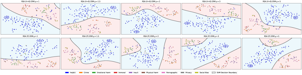
## Scatter Plot Grid: Fairness Metrics vs. Harmful/Helpful Outcomes
### Overview
The image displays a 2x5 grid of scatter plots, each representing different configurations of fairness metrics (ERM, RSA) and parameter values (μ). Each plot visualizes the distribution of data points categorized by harm types (e.g., "Helpful," "Crime," "Emotional Harm") across two axes: "Helpful" (x-axis) and "Harmful" (y-axis). The plots are labeled with parameters like "ERM μ=1," "RSA (H+S) ERM μ=1.5," etc., and include a legend mapping colors to harm categories.
### Components/Axes
- **Axes**:
- X-axis: "Helpful" (scale 0–1)
- Y-axis: "Harmful" (scale 0–1)
- **Legend**:
- Colors correspond to harm categories:
- Blue: Helpful
- Orange: Crime
- Green: Emotional Harm
- Red: Immoral
- Purple: Insult
- Brown: Physical Harm
- Pink: Demographic
- Gray: Privacy
- Yellow: Social Bias
- Dashed line: SVM Decision Boundary
- **Plot Titles**:
- Top row: "RSA (H+S) ERM μ=1," "RSA (H+S) ERM μ=1.5," "RSA (H+S) ERM μ=2," "RSA (H+S) ERM μ=3," "RSA (H+S) ERM μ=5"
- Bottom row: "RSA (P) ERM μ=1," "RSA (P) ERM μ=1.5," "RSA (P) ERM μ=2," "RSA (P) ERM μ=3," "RSA (P) ERM μ=5"
### Detailed Analysis
- **Data Points**:
- Each plot contains scattered points in varying densities. For example:
- In "RSA (H+S) ERM μ=1," blue ("Helpful") points dominate the lower-left quadrant, while orange ("Crime") and green ("Emotional Harm") points cluster in the upper-right.
- As μ increases (e.g., μ=5), the separation between "Helpful" and "Harmful" categories becomes more pronounced, with fewer overlapping points.
- The dashed "SVM Decision Boundary" appears in all plots, indicating a linear separator between categories.
- **Color Consistency**:
- Legend colors match point colors across all plots (e.g., blue always represents "Helpful").
- **Parameter Effects**:
- Higher μ values (e.g., μ=5) correlate with tighter clustering of "Helpful" points and sparser "Harmful" points, suggesting improved fairness in distinguishing categories.
- "RSA (H+S)" and "RSA (P)" configurations show distinct distributions, implying differences in how harm types are prioritized.
### Key Observations
1. **μ Dependency**:
- Larger μ values (e.g., μ=5) reduce overlap between "Helpful" and "Harmful" categories, indicating stronger fairness constraints.
2. **Harm Type Distribution**:
- "Crime" (orange) and "Emotional Harm" (green) consistently appear in the upper-right quadrant, suggesting higher harm scores.
- "Helpful" (blue) points are concentrated in the lower-left, with minimal overlap in higher μ plots.
3. **SVM Boundary**:
- The dashed line shifts slightly across plots, reflecting changes in model decision boundaries as parameters vary.
### Interpretation
The plots demonstrate how fairness metrics (ERM, RSA) and parameter tuning (μ) influence the trade-off between helpful and harmful outcomes. Higher μ values likely enforce stricter fairness constraints, reducing harmful outputs at the cost of potentially limiting helpful ones. The distinction between "RSA (H+S)" and "RSA (P)" suggests that the choice of fairness framework (e.g., handling harmful vs. protected attributes) significantly impacts the model's behavior. The SVM boundary’s variability highlights the dynamic nature of classification under different fairness settings.
*Note: Exact numerical values for data points are not provided in the image; trends are inferred from visual clustering and axis scales.*