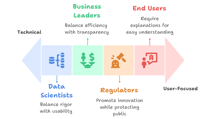
## Diagram: Stakeholder Priorities Spectrum
### Overview
The image is a conceptual diagram illustrating four key stakeholder groups in a technical or business context, positioned along a spectrum from "Technical" to "User-Focused." Each group is represented by a colored block containing an icon, a label, and a core priority statement. The diagram visually maps how different roles balance competing objectives within a system or project.
### Components/Axes
* **Horizontal Spectrum Axis:**
* **Left Anchor:** Labeled "Technical" in black text.
* **Right Anchor:** Labeled "User-Focused" in black text.
* A large, faint arrow in the background points from left to right, reinforcing the directional spectrum.
* **Stakeholder Blocks (arranged left to right along the spectrum):**
1. **Data Scientists (Blue Block):**
* **Icon:** A blue database/server icon.
* **Label:** "Data Scientists" in blue text below the block.
* **Priority Statement:** "Balance rigor with usability" in black text below the label.
* **Position:** Closest to the "Technical" end.
2. **Business Leaders (Green Block):**
* **Icon:** A green icon of hands holding a dollar sign.
* **Label:** "Business Leaders" in green text above the block.
* **Priority Statement:** "Balance efficiency with transparency" in black text below the label.
3. **Regulators (Orange Block):**
* **Icon:** An orange gavel icon.
* **Label:** "Regulators" in orange text below the block.
* **Priority Statement:** "Promote innovation while protecting public" in black text below the label.
4. **End Users (Red Block):**
* **Icon:** A red icon of a person with a speech bubble containing a document.
* **Label:** "End Users" in red text above the block.
* **Priority Statement:** "Require explanations for easy understanding" in black text below the label.
* **Position:** Closest to the "User-Focused" end.
* **Connectors:** Thin, colored arrows point from each stakeholder block to its corresponding priority statement.
### Detailed Analysis
The diagram is structured to show a progression of priorities:
* **Technical End (Left):** The **Data Scientists** are positioned here. Their core tension is between methodological "rigor" and practical "usability," reflecting a need to make complex models both valid and functional.
* **Center-Left:** **Business Leaders** occupy this space. Their focus is on operational "efficiency" balanced with "transparency," indicating a need for systems that are both cost-effective and explainable to stakeholders.
* **Center-Right:** **Regulators** are placed here. Their mandate is dual: fostering "innovation" while "protecting the public," highlighting a governance role that must manage risk and progress.
* **User-Focused End (Right):** **End Users** are at this extreme. Their primary need is for "explanations for easy understanding," emphasizing clarity, accessibility, and usability over technical complexity.
### Key Observations
1. **Spectrum Logic:** The left-to-right arrangement creates a logical flow from creation and analysis (Data Scientists) through management and governance (Business Leaders, Regulators) to consumption and application (End Users).
2. **Color Coding:** Each stakeholder group is consistently associated with a unique color (blue, green, orange, red) for its icon, label, and connecting arrow, enhancing visual differentiation.
3. **Iconography:** The icons are simple, symbolic representations of each group's primary function or concern (data, money, law, communication).
4. **Balancing Acts:** Three of the four priority statements explicitly mention balancing two concepts (rigor/usability, efficiency/transparency, innovation/protection), underscoring the inherent trade-offs in complex systems.
### Interpretation
This diagram serves as a stakeholder alignment model, likely for projects involving data, AI, or complex systems. It argues that successful implementation requires navigating the distinct and sometimes conflicting priorities of these four groups.
* **Underlying Narrative:** The spectrum suggests that as a project or product moves from development (technical) toward deployment (user-focused), the primary concerns shift from internal validity and efficiency to external clarity, safety, and accessibility.
* **Peircean Investigation:** The diagram is a **symbolic** representation (using icons and colors) that makes an **indexical** claim about the relationship between roles and priorities (e.g., Data Scientists are *indexed* to the technical end). Its intended **interpretant** is for a viewer to understand that technical projects must consciously address this full spectrum of needs to be viable and ethical.
* **Notable Implication:** The placement of "Regulators" between "Business Leaders" and "End Users" is significant. It positions regulatory oversight as a bridge between commercial interests and public/user welfare, suggesting its role is to mediate and ensure that business efficiency does not compromise public good or user understanding.
* **Anomaly/Gap:** The diagram does not show conflict or overlap between the groups, presenting their priorities as a clean, linear progression. In reality, these priorities often conflict directly (e.g., Data Scientists' rigor vs. End Users' need for simplicity), and the diagram simplifies these complex negotiations into a spatial model.