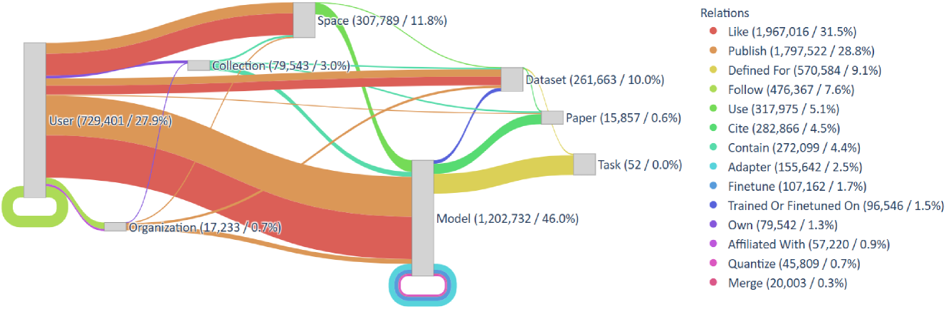
## Network Diagram: Relationship Visualization
### Overview
The image presents a network diagram visualizing relationships between various entities: User, Organization, Collection, Space, Dataset, Paper, Task, and Model. The connections between these entities are represented by colored lines, with the thickness of the lines indicating the strength or frequency of the relationship. A legend on the right side details the types of relationships and their corresponding counts and percentages.
### Components/Axes
The diagram consists of eight main nodes representing the entities. These nodes are positioned around the center of the image. Connecting these nodes are curved lines of varying colors, each representing a specific type of relationship. A legend is located in the top-right corner, listing the relationship types and their associated colors. The nodes display both a count and a percentage, presumably representing the number of times that relationship appears and its proportion of the total relationships.
### Detailed Analysis or Content Details
Let's analyze each entity and its connections, referencing the legend for color accuracy:
* **User (729,401 / 27.9%):** Located on the left side of the image. Multiple lines connect it to other nodes, including Model (red), Organization (red), Collection (blue), Space (green), and Dataset (green).
* **Organization (17,233 / 0.7%):** Positioned below User. Connected primarily to User (red).
* **Collection (79,543 / 3.0%):** Located above User. Connected to User (blue) and Space (green).
* **Space (307,789 / 11.8%):** Positioned above Collection. Connected to User (green), Collection (green), and Dataset (green).
* **Dataset (261,663 / 10.0%):** Located to the right of Space. Connected to Space (green), Paper (green), and Model (red).
* **Paper (15,857 / 0.6%):** Positioned below Dataset. Connected to Dataset (green).
* **Task (52 / 0.0%):** Located below Paper. Connected to Model (red).
* **Model (1,202,732 / 46.0%):** Positioned on the right side of the image. Connected to User (red), Dataset (red), and Task (red).
**Legend (Top-Right):**
* **Like (1,967,016 / 31.5%):** Red
* **Publish (1,797,522 / 28.8%):** Red
* **Defined For (570,584 / 9.1%):** Red
* **Follow (476,367 / 7.6%):** Red
* **Use (317,975 / 5.1%):** Red
* **Cite (282,866 / 4.5%):** Red
* **Contain (272,099 / 4.4%):** Red
* **Adapter (155,642 / 2.5%):** Red
* **Finetune (107,162 / 1.7%):** Red
* **Trained Or Finetuned On (96,546 / 1.5%):** Red
* **Own (79,542 / 1.3%):** Red
* **Affiliated With (57,220 / 0.9%):** Red
* **Quantize (45,809 / 0.7%):** Red
* **Merge (20,003 / 0.3%):** Red
All relationships are represented by red lines.
### Key Observations
* The "Model" entity has the highest count (1,202,732) and percentage (46.0%), indicating it is the most frequently related entity.
* The "User" entity also has a high count (729,401) and percentage (27.9%).
* The "Organization" entity has the lowest count (17,233) and percentage (0.7%).
* All relationships are represented by red lines, suggesting a single type of relationship is being visualized, or that the color differentiation is not being used in this diagram.
* The lines connecting the nodes vary in thickness, likely representing the strength or frequency of the relationship.
### Interpretation
This diagram illustrates the relationships between different entities within a knowledge graph or network. The prominence of "Model" and "User" suggests that these entities are central to the network. The low count for "Organization" indicates a weaker connection or fewer relationships involving organizations. The fact that all relationships are represented by the same color (red) suggests that the diagram focuses on the overall connectivity rather than differentiating between relationship types. The diagram could be used to understand the structure of a research network, a collaboration network, or a knowledge base. The percentages provide a quantitative measure of the importance of each entity and relationship within the network. The diagram suggests a strong connection between users and models, and a less strong connection between organizations and other entities. The diagram is limited by the lack of differentiation in relationship types, as all connections are represented by the same color.