\n
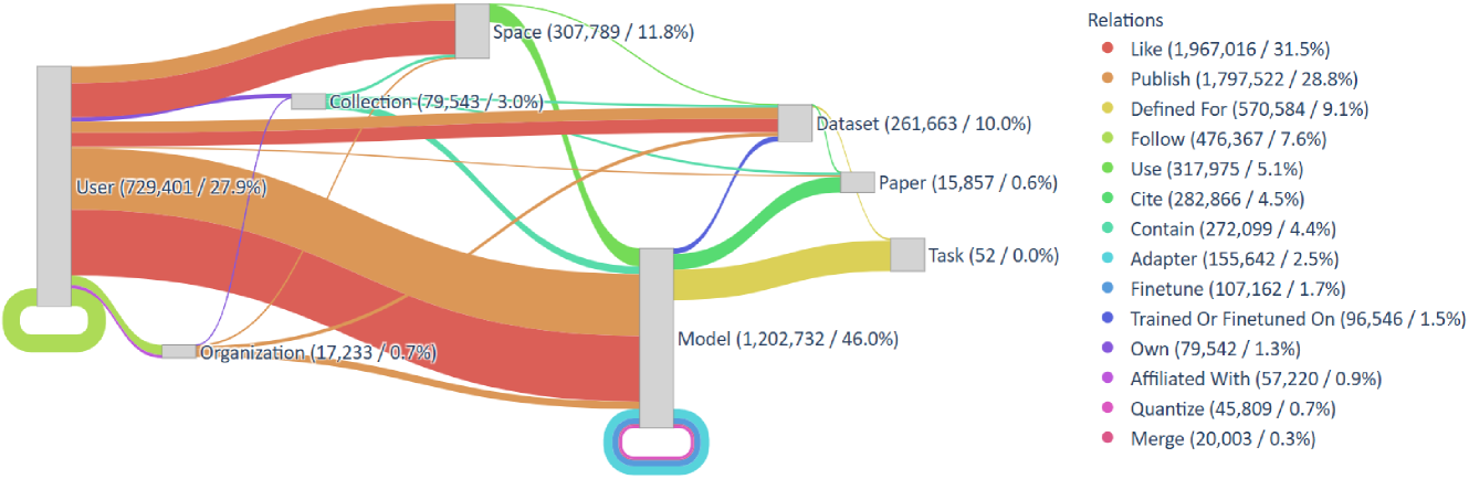
## Sankey Diagram: Entity Relationships in a Knowledge Graph
### Overview
This image is a Sankey diagram visualizing the flow and relationships between various entities within a data ecosystem, likely representing a platform for machine learning models, datasets, and research. The diagram shows connections from source entities (left) to target entities (right), with the width of the flows representing the volume of relationships. A legend on the right defines the relationship types by color.
### Components/Axes
**Nodes (Entities):**
The diagram features eight primary nodes, each labeled with a name, an absolute count, and a percentage (likely of total relationships or entities).
* **User** (729,401 / 27.9%) - Positioned on the far left.
* **Organization** (17,233 / 0.7%) - Positioned below User on the left.
* **Space** (307,789 / 11.8%) - Positioned in the upper middle.
* **Collection** (79,543 / 3.0%) - Positioned below Space.
* **Dataset** (261,663 / 10.0%) - Positioned in the upper right.
* **Paper** (15,857 / 0.6%) - Positioned below Dataset.
* **Task** (52 / 0.0%) - Positioned below Paper.
* **Model** (1,202,732 / 46.0%) - Positioned in the lower right, the largest node.
**Legend (Relations):**
A legend titled "Relations" is positioned on the right side of the image. It lists 15 relationship types, each with a distinct color, an absolute count, and a percentage.
1. **Like** (Red): 1,967,016 / 31.5%
2. **Publish** (Orange): 1,797,522 / 28.8%
3. **Defined For** (Yellow): 570,584 / 9.1%
4. **Follow** (Light Green): 476,367 / 7.6%
5. **Use** (Green): 317,975 / 5.1%
6. **Cite** (Dark Green): 282,866 / 4.5%
7. **Contain** (Teal): 272,099 / 4.4%
8. **Adapter** (Light Blue): 155,642 / 2.5%
9. **Finetune** (Blue): 107,162 / 1.7%
10. **Trained Or Finetuned On** (Dark Blue): 96,546 / 1.5%
11. **Own** (Purple): 79,542 / 1.3%
12. **Affiliated With** (Light Purple): 57,220 / 0.9%
13. **Quantize** (Pink): 45,809 / 0.7%
14. **Merge** (Dark Pink): 20,003 / 0.3%
### Detailed Analysis
**Flow Analysis (Source to Target):**
The flows are color-coded according to the "Relations" legend. The thickness of each band is proportional to the count of that specific relationship.
* **From User (Left):**
* A very thick **orange (Publish)** flow goes to **Model**. This is the single largest flow in the diagram.
* A thick **red (Like)** flow goes to **Space**.
* A medium **red (Like)** flow goes to **Model**.
* A medium **orange (Publish)** flow goes to **Dataset**.
* A thinner **yellow (Defined For)** flow goes to **Task**.
* A thin **light green (Follow)** flow goes to **User** (a self-loop).
* A thin **purple (Own)** flow goes to **Organization**.
* A thin **light purple (Affiliated With)** flow goes to **Organization**.
* **From Organization (Left):**
* A medium **orange (Publish)** flow goes to **Model**.
* A thin **purple (Own)** flow goes to **User**.
* A thin **light purple (Affiliated With)** flow goes to **User**.
* **From Space (Middle):**
* A thick **teal (Contain)** flow goes to **Dataset**.
* A medium **green (Use)** flow goes to **Model**.
* A thin **dark green (Cite)** flow goes to **Paper**.
* **From Collection (Middle):**
* A medium **teal (Contain)** flow goes to **Dataset**.
* A thin **green (Use)** flow goes to **Model**.
* **From Dataset (Right):**
* A medium **dark blue (Trained Or Finetuned On)** flow goes to **Model**.
* A thin **blue (Finetune)** flow goes to **Model**.
* A thin **light blue (Adapter)** flow goes to **Model**.
* **From Paper (Right):**
* A thin **dark green (Cite)** flow goes to **Model**.
* **From Model (Right):**
* A thin **pink (Quantize)** flow loops back to itself.
* A thin **dark pink (Merge)** flow loops back to itself.
### Key Observations
1. **Dominant Entities:** The **Model** node is the largest (46.0%), indicating it is the central entity in this ecosystem. **User** (27.9%) is the second largest source entity.
2. **Dominant Relationships:** The **"Like"** (31.5%) and **"Publish"** (28.8%) relationships account for over 60% of all connections, suggesting the platform's primary functions are social engagement and content publication.
3. **Major Flows:** The most significant flow is users publishing models (User -> Model, orange). The second most significant is users liking spaces (User -> Space, red).
4. **Model Provenance:** Models are connected to their origins through "Trained Or Finetuned On," "Finetune," and "Adapter" relationships from Datasets, and "Cite" relationships from Papers.
5. **Self-Referential Loops:** Both "User" (Follow) and "Model" (Quantize, Merge) have self-referential loops, indicating actions taken on the same entity type.
### Interpretation
This Sankey diagram maps the relational structure of a collaborative platform for machine learning, resembling ecosystems like Hugging Face. The data suggests a vibrant community where **Users** and **Organizations** are the primary actors, heavily engaged in **Publishing** and **Liking** content.
The central role of **Models** (46% of entities) highlights that the platform is model-centric. The thick "Publish" flow from Users to Models indicates a high volume of model sharing. The "Like" flows show strong user engagement with both Models and Spaces (which likely host collections of models/datasets).
The diagram reveals the lifecycle and provenance of models: they are **Published** by users/orgs, **Contained** within Spaces/Collections, **Defined For** specific Tasks, and **Trained/Finetuned** on Datasets. The presence of "Cite" from Papers to Models suggests an academic or research-oriented layer where models are referenced in scholarly work.
The minimal percentage for "Task" (0.0%) and its very low count (52) is a notable outlier. This could mean tasks are a very granular or newly introduced category, or that the "Defined For" relationship is not the primary way models are categorized on this platform. The diagram effectively visualizes a knowledge graph where social interaction (Like, Follow) and content contribution (Publish, Contain) are the fundamental drivers connecting users to machine learning artifacts.