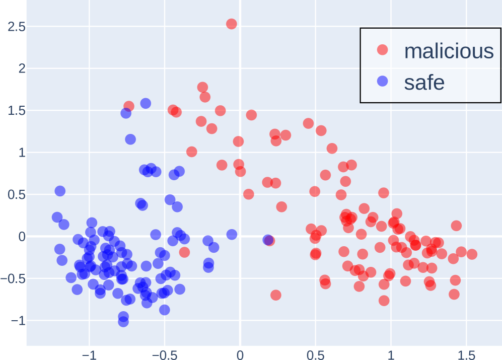
## Scatter Plot: Malicious vs. Safe Classification
### Overview
The image is a 2D scatter plot visualizing the distribution of data points classified into two categories: "malicious" and "safe." The plot demonstrates a clear, though not absolute, separation between the two classes, with "malicious" points generally occupying the upper and right portions of the chart, and "safe" points concentrated in the lower-left region.
### Components/Axes
* **Legend:** Located in the top-right corner. It contains two entries:
* A red circle labeled "malicious".
* A blue circle labeled "safe".
* **X-Axis:** A horizontal numerical axis. The visible major tick marks and labels are at -1, -0.5, 0, 0.5, 1, and 1.5. The axis extends slightly beyond these bounds.
* **Y-Axis:** A vertical numerical axis. The visible major tick marks and labels are at -1, -0.5, 0, 0.5, 1, 1.5, 2, and 2.5.
* **Grid:** A light gray grid is present, with lines corresponding to the major tick marks on both axes.
* **Data Points:** The plot consists of numerous semi-transparent circular markers. Their color corresponds to the legend: red for "malicious," blue for "safe."
### Detailed Analysis
* **Data Distribution & Ranges:**
* **"Safe" (Blue) Points:** Primarily clustered in a dense cloud in the lower-left quadrant. Their approximate ranges are:
* X-axis: -1.2 to 0.2
* Y-axis: -1.0 to 0.8
* The highest concentration is between X: -1.0 to -0.5 and Y: -0.8 to 0.0.
* **"Malicious" (Red) Points:** More widely dispersed across the plot. Their approximate ranges are:
* X-axis: -0.8 to 1.6
* Y-axis: -0.8 to 2.5
* They form a broad, less dense cluster extending from the center to the top and right edges.
* **Spatial Relationship & Separation:**
* There is a visible boundary zone running roughly diagonally from the top-left to the bottom-right.
* The majority of "safe" points lie below and to the left of this boundary.
* The majority of "malicious" points lie above and to the right of this boundary.
* **Overlap Zone:** There is a region of overlap, primarily between X: -0.5 to 0.5 and Y: -0.5 to 0.5, where both red and blue points are intermingled. This indicates a feature space where classification is ambiguous.
* **Notable Outliers:**
* A single "malicious" (red) point is a significant outlier, located at approximately (X: 0.0, Y: 2.5), far above the main cluster.
* A few "safe" (blue) points are located within the main "malicious" cluster, such as one near (X: 0.2, Y: 0.0).
### Key Observations
1. **Class Separability:** The two classes are largely separable in this 2D feature space, suggesting the underlying features used for plotting have discriminative power.
2. **Variance Difference:** The "malicious" class exhibits significantly higher variance, especially along the Y-axis, compared to the more tightly clustered "safe" class.
3. **Density Gradient:** The density of "safe" points decreases sharply moving rightward and upward from the (-1, -0.5) region. The density of "malicious" points is more uniform across its occupied space.
4. **Axis Titles Absent:** The plot lacks descriptive titles for the X and Y axes, which limits the interpretability of what the coordinates represent (e.g., feature1, feature2, principal components).
### Interpretation
This scatter plot likely represents the output of a dimensionality reduction technique (like PCA or t-SNE) or two selected features from a dataset used for security classification (e.g., malware detection, network intrusion analysis).
* **What the Data Suggests:** The clear separation implies that the model or features can effectively distinguish between most malicious and safe instances. The "malicious" class's wider spread could indicate it is more heterogeneous, encompassing a broader range of attack types or behaviors, while "safe" behavior is more consistent and predictable.
* **The Overlap Zone:** The intermingled points in the center are critical. They represent cases where the model's features are not sufficient for confident classification. These could be sophisticated attacks mimicking safe behavior ("false negatives") or benign activities that appear anomalous ("false positives"). Analyzing these specific points would be crucial for improving the classifier.
* **The Outlier:** The extreme "malicious" outlier at (0, 2.5) represents an instance with a very unusual profile compared to all others. This could be a novel attack type, a data error, or an edge case that a robust system must handle.
* **Missing Context:** Without axis labels, we cannot determine *what* properties make an instance appear malicious (e.g., high CPU usage, unusual packet size, specific API call sequences). The plot shows *that* separation exists in this abstract space, but not *why*. The next step would be to correlate these spatial positions with the original feature values to understand the driving factors behind the classification.