## Scatter Plot: Malicious vs. Safe Data Points
### Overview
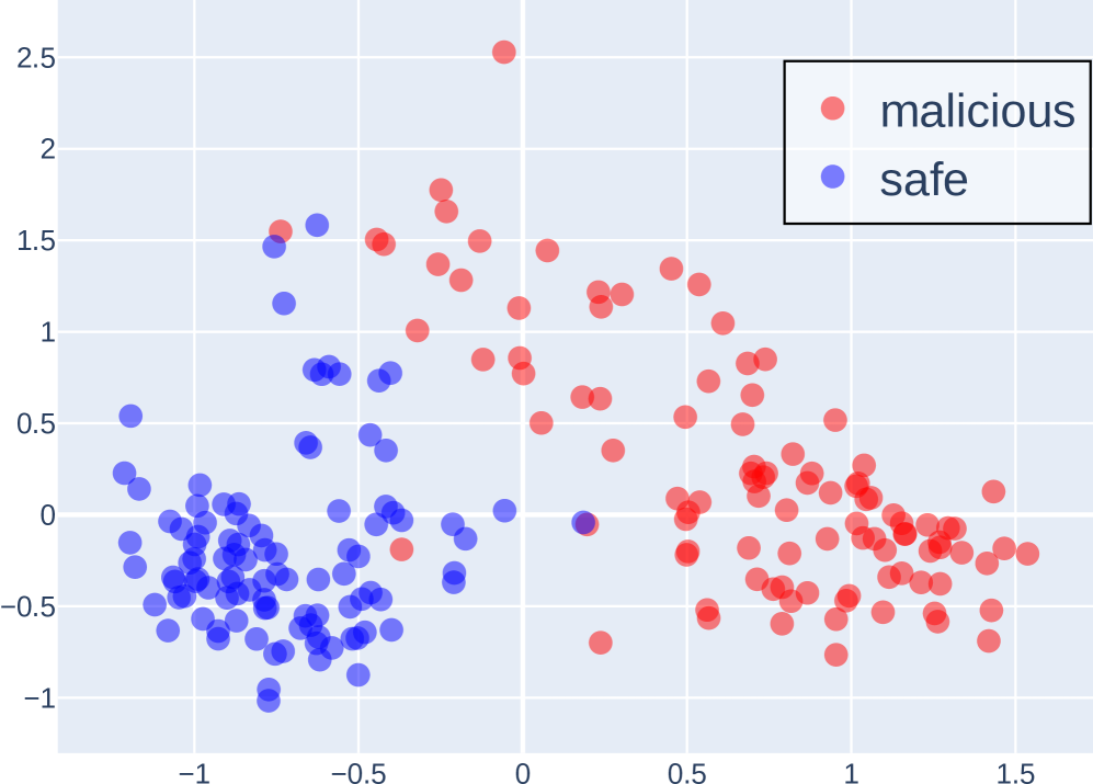
The image is a scatter plot displaying two distinct clusters of data points, labeled as "malicious" (red) and "safe" (blue). The plot visualizes the distribution of these data points across a two-dimensional space, with the x-axis ranging from approximately -1.5 to 1.5 and the y-axis ranging from approximately -1 to 2.5. The plot aims to show the separation or overlap between malicious and safe data points.
### Components/Axes
* **X-axis:** Ranges from -1.5 to 1.5, with gridlines at intervals of 0.5. No explicit label is provided.
* **Y-axis:** Ranges from -1 to 2.5, with gridlines at intervals of 0.5. No explicit label is provided.
* **Data Points:** Represented as red (malicious) and blue (safe) circles.
* **Legend:** Located in the top-right corner, enclosed in a black border. It identifies the red data points as "malicious" and the blue data points as "safe".
### Detailed Analysis
* **Malicious (Red) Data Points:**
* Trend: The red data points are primarily clustered on the right side of the plot.
* Distribution: The cluster extends from approximately x = 0 to x = 1.5 and y = -0.5 to y = 2.5.
* Specific Points: There is a red data point at approximately (0, 2.5).
* **Safe (Blue) Data Points:**
* Trend: The blue data points are primarily clustered on the left side of the plot.
* Distribution: The cluster extends from approximately x = -1.5 to x = 0 and y = -1 to y = 1.5.
* Specific Points: There are several blue data points near (-1, -0.5).
### Key Observations
* **Cluster Separation:** The plot shows a clear separation between the "malicious" and "safe" data points, with minimal overlap.
* **Outliers:** There is one blue data point near (0.2, -0.1) that is located within the "malicious" cluster. There is one red data point near (-0.2, 0) that is located within the "safe" cluster.
* **Density:** The "safe" cluster appears denser than the "malicious" cluster.
### Interpretation
The scatter plot suggests that the two features represented by the x and y axes are effective in distinguishing between "malicious" and "safe" data points. The clustering indicates that these features have different values for malicious and safe data. The outliers suggest that the separation is not perfect, and some data points may be misclassified based on these two features alone. The density difference between the clusters could indicate that there are more "safe" data points than "malicious" data points in the dataset. Further analysis with more features or different classification methods might improve the accuracy of distinguishing between malicious and safe data.