\n
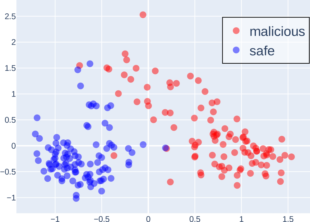
## Scatter Plot: Malicious vs. Safe Data Points
### Overview
This image presents a scatter plot visualizing the distribution of data points labeled as either "malicious" or "safe" across two dimensions. The plot appears to be used for classification or anomaly detection, separating data into two distinct clusters.
### Components/Axes
* **X-axis:** Ranges approximately from -1.5 to 1.5, with tick marks at -1, -0.5, 0, 0.5, and 1.
* **Y-axis:** Ranges approximately from -1 to 2.5, with tick marks at -0.5, 0, 0.5, 1, 1.5, 2, and 2.5.
* **Legend:** Located in the top-right corner.
* **malicious:** Represented by red circles.
* **safe:** Represented by blue circles.
### Detailed Analysis
The plot contains a large number of data points, approximately 150-200 in total. The data points are clustered into two main groups.
* **Safe (Blue) Cluster:** This cluster is located primarily in the bottom-left quadrant of the plot. The points are concentrated around x-values between -1.2 and -0.2, and y-values between -0.8 and 0.5. The distribution appears somewhat elongated along a diagonal axis.
* Approximate data points (x, y): (-1.1, -0.7), (-0.8, -0.3), (-0.3, 0.2), (-0.5, 0.1).
* **Malicious (Red) Cluster:** This cluster is located primarily in the top-right quadrant of the plot. The points are concentrated around x-values between 0.3 and 1.3, and y-values between 0.2 and 2.2. The distribution is more scattered than the "safe" cluster.
* Approximate data points (x, y): (0.6, 0.8), (1.0, 1.5), (0.4, 0.3), (1.2, 2.0).
There is some overlap between the two clusters, particularly around x-values between -0.5 and 0.5 and y-values between 0 and 1. This indicates some ambiguity in the classification.
### Key Observations
* The two clusters are relatively well-separated, suggesting that the two dimensions are effective in distinguishing between "malicious" and "safe" data.
* The "safe" cluster is more tightly grouped than the "malicious" cluster, indicating that "safe" data is more consistent in these two dimensions.
* The presence of overlapping points suggests that the classification is not perfect and that some data points are difficult to categorize.
* There is a single outlier in the "malicious" cluster with an approximate coordinate of (0, 2.5).
### Interpretation
The scatter plot suggests that the two dimensions used are useful features for distinguishing between malicious and safe data. The clear separation between the clusters indicates that these features can be used to build a classifier that accurately identifies malicious data. The overlap between the clusters suggests that the classifier will not be perfect and that some false positives and false negatives are to be expected. The outlier in the malicious cluster may represent an unusual or anomalous case that warrants further investigation.
The plot likely represents the output of a dimensionality reduction technique (like PCA or t-SNE) applied to a higher-dimensional dataset. The two axes represent the first two principal components or the embedded dimensions, capturing the most significant variance in the data. The goal is to visualize the separation between malicious and safe instances in a lower-dimensional space.