## Scatter Plot: Classification of Malicious vs. Safe Data Points
### Overview
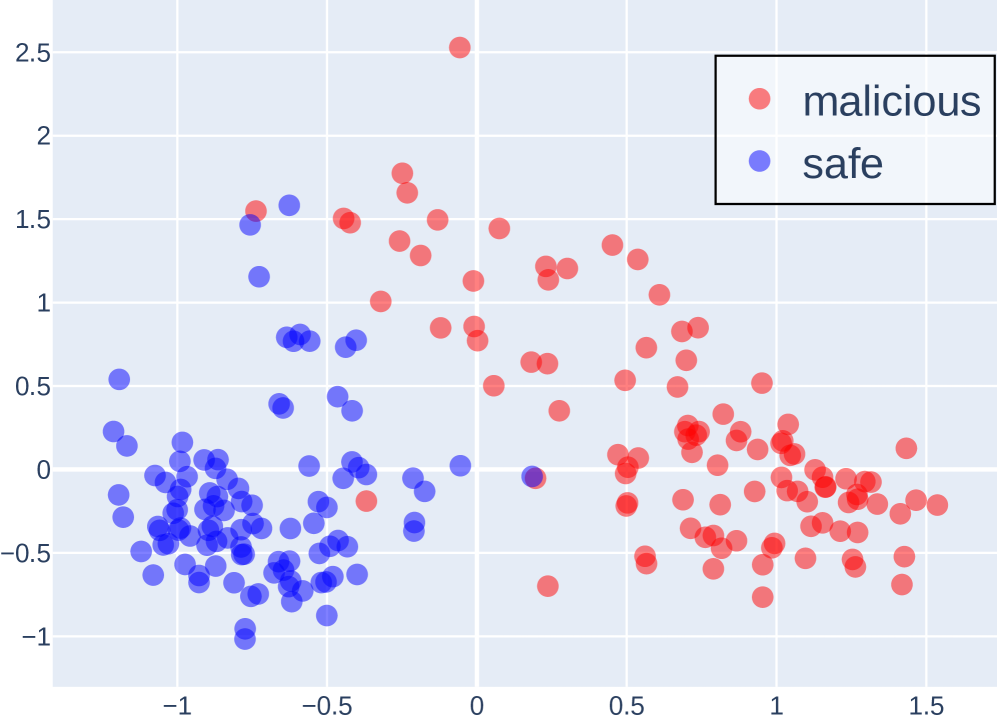
The image depicts a 2D scatter plot comparing two categories: "malicious" (red dots) and "safe" (blue dots). The plot uses a Cartesian coordinate system with X and Y axes ranging from -1 to 2.5. The legend is positioned in the top-right corner, confirming the color coding. The data points exhibit spatial clustering, with notable overlap in the central region.
### Components/Axes
- **X-axis**: Labeled "X" with grid lines spanning -1 to 2.5.
- **Y-axis**: Labeled "Y" with grid lines spanning -1 to 2.5.
- **Legend**: Located in the top-right corner, explicitly mapping:
- Red circles → "malicious"
- Blue circles → "safe"
- **Grid**: White grid lines on a light gray background for reference.
### Detailed Analysis
1. **Malicious (Red) Data Points**:
- **Distribution**: Primarily concentrated in the upper-right quadrant (X > 0, Y > 0).
- **Trend**: Higher density between X=0.5–1.5 and Y=0.5–2.0.
- **Outliers**:
- A single red dot at (X=2.5, Y=2.5), isolated from other clusters.
- A cluster near X=1.2, Y=0.3, overlapping with blue points.
- **Density**: Approximately 40–50 red points, with 20% overlapping with blue points near the origin.
2. **Safe (Blue) Data Points**:
- **Distribution**: Dominant in the lower-left quadrant (X < 0, Y < 0).
- **Trend**: Dense cluster between X=-1 to -0.5 and Y=-1 to -0.5.
- **Overlap**: Approximately 15–20 blue points intrude into the central region (X=0–0.5, Y=-0.5–0.5).
### Key Observations
- **Separation**: The two categories are partially separable, with red points generally having higher X and Y values.
- **Overlap**: Significant overlap occurs near the origin (X=0, Y=0), where 10–15% of points are mixed.
- **Outliers**: The red point at (2.5, 2.5) is an extreme outlier, far from other clusters.
- **Density Gradient**: Blue points show higher density in the lower-left, while red points are more dispersed in the upper-right.
### Interpretation
The data suggests a classification boundary skewed toward higher X and Y values for malicious instances. However, the overlap near the origin indicates potential misclassification risks for points with moderate X/Y values. The outlier at (2.5, 2.5) may represent an anomalous case requiring further investigation. The spatial distribution implies that a linear classifier (e.g., SVM) might struggle with accuracy due to the mixed regions, while a non-linear model (e.g., decision trees) could better capture the separation. The red cluster near X=1.2, Y=0.3 highlights a potential edge case where malicious and safe instances are indistinguishable, suggesting the need for additional features or refinement of the classification criteria.