\n
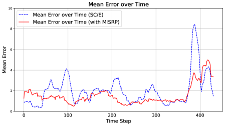
## Line Chart: Mean Error over Time
### Overview
This image presents a line chart illustrating the mean error over time for two different conditions: one without MISRP (denoted as (SC/E)) and one with MISRP. The chart displays how the mean error fluctuates across time steps, allowing for a comparison of the performance of the two conditions.
### Components/Axes
* **Title:** "Mean Error over Time" (centered at the top)
* **X-axis:** "Time Step" (ranging from approximately 0 to 450, with gridlines at intervals of 50)
* **Y-axis:** "Mean Error" (ranging from 0 to 10, with gridlines at intervals of 2)
* **Legend:** Located in the top-left corner.
* "Mean Error over Time (SC/E)" - represented by a dashed blue line.
* "Mean Error over Time (with MISRP)" - represented by a solid red line.
### Detailed Analysis
The chart shows two fluctuating lines representing the mean error over time.
**Line 1: Mean Error over Time (SC/E) - Dashed Blue Line**
This line generally fluctuates between approximately 1 and 5, with several peaks and valleys.
* At Time Step 0, the mean error is approximately 1.2.
* Around Time Step 50, the mean error rises to a peak of approximately 4.5.
* Around Time Step 150, the mean error is approximately 2.5.
* Around Time Step 250, the mean error is approximately 2.0.
* Around Time Step 350, the mean error is approximately 2.2.
* Around Time Step 400, the mean error spikes dramatically to approximately 8.0.
* At Time Step 450, the mean error decreases to approximately 3.5.
**Line 2: Mean Error over Time (with MISRP) - Solid Red Line**
This line also fluctuates, but generally remains lower than the blue line, especially after Time Step 200.
* At Time Step 0, the mean error is approximately 2.0.
* Around Time Step 50, the mean error is approximately 2.2.
* Around Time Step 150, the mean error is approximately 1.8.
* Around Time Step 250, the mean error is approximately 1.5.
* Around Time Step 350, the mean error is approximately 1.7.
* Around Time Step 400, the mean error begins to increase, reaching approximately 4.5 at Time Step 450.
### Key Observations
* The "with MISRP" condition (red line) generally exhibits lower mean error values than the "SC/E" condition (blue line) for most of the time steps.
* Both conditions show significant fluctuations in mean error over time.
* A major outlier occurs around Time Step 400, where the "SC/E" condition experiences a substantial spike in mean error.
* The red line shows a clear upward trend in the final portion of the chart, while the blue line fluctuates more erratically.
### Interpretation
The data suggests that incorporating MISRP generally leads to a reduction in mean error compared to the "SC/E" condition. The significant spike in mean error for the "SC/E" condition around Time Step 400 indicates a potential instability or issue specific to that condition at that point in time. The increasing trend of the red line towards the end of the chart suggests that the benefits of MISRP might diminish or become less effective as time progresses, or that a new factor is influencing the error. The fluctuations in both lines indicate that the system is sensitive to changes over time, and that the mean error is not consistently stable. Further investigation is needed to understand the cause of the spike at Time Step 400 and the increasing trend of the red line. The chart demonstrates the effectiveness of MISRP in reducing error, but also highlights the need for ongoing monitoring and potential adjustments to maintain optimal performance.