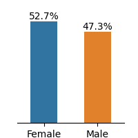
## Bar Chart: Gender Distribution
### Overview
The image is a bar chart showing the distribution of gender, with two categories: Female and Male. The chart displays the percentage of each gender.
### Components/Axes
* **X-axis:** Categorical axis with two labels: "Female" and "Male".
* **Y-axis:** Implicit percentage scale, represented by the height of the bars.
* **Bars:**
* Blue bar representing "Female".
* Orange bar representing "Male".
* **Values:**
* "52.7%" is displayed above the "Female" bar.
* "47.3%" is displayed above the "Male" bar.
### Detailed Analysis
* **Female:** The blue bar representing "Female" has a value of 52.7%.
* **Male:** The orange bar representing "Male" has a value of 47.3%.
### Key Observations
* The percentage of females (52.7%) is slightly higher than the percentage of males (47.3%).
* The total percentage adds up to 100% (52.7% + 47.3% = 100%).
### Interpretation
The bar chart illustrates a gender distribution where females slightly outnumber males. The difference is relatively small, indicating a near-equal distribution between the two genders.