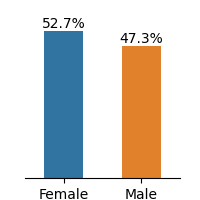
## Bar Chart: Gender Distribution Comparison
### Overview
The image displays a simple vertical bar chart comparing two categories: "Female" and "Male." The chart presents percentage values for each group, showing a slight majority for the "Female" category. The visual is clean, with no title, y-axis label, or grid lines, focusing solely on the two data points.
### Components/Axes
* **Chart Type:** Vertical Bar Chart.
* **X-Axis (Categories):** Two categorical labels are present at the bottom of the chart:
* Left Bar: **"Female"**
* Right Bar: **"Male"**
* **Y-Axis (Scale):** No explicit y-axis title or numerical scale markers are visible. The values are provided directly as data labels.
* **Data Labels:** Numerical percentage values are placed directly above each bar.
* **Legend:** There is no separate legend box. The category labels ("Female", "Male") are positioned directly beneath their corresponding bars, serving as the legend.
* **Colors:**
* The bar for "Female" is a solid **blue**.
* The bar for "Male" is a solid **orange**.
### Detailed Analysis
* **Data Series 1 (Female):**
* **Color:** Blue.
* **Position:** Left side of the chart.
* **Value:** **52.7%** (displayed above the bar).
* **Visual Trend:** This bar is the taller of the two.
* **Data Series 2 (Male):**
* **Color:** Orange.
* **Position:** Right side of the chart.
* **Value:** **47.3%** (displayed above the bar).
* **Visual Trend:** This bar is the shorter of the two.
* **Relationship:** The two values sum to exactly 100.0% (52.7% + 47.3% = 100.0%), indicating this chart represents a complete binary distribution between these two categories.
### Key Observations
1. **Near-Equal Distribution:** The difference between the two groups is relatively small, at 5.4 percentage points (52.7% - 47.3%).
2. **Female Majority:** The "Female" category holds a slight majority over the "Male" category.
3. **Minimalist Design:** The chart lacks contextual elements like a main title, source attribution, or a defined y-axis, which limits understanding of what the percentages specifically measure (e.g., population, survey respondents, user base).
4. **Precise Labeling:** Despite the minimalist design, the exact percentage values are clearly and accurately labeled on each bar.
### Interpretation
The data presents a demographic or categorical split that is nearly balanced but leans slightly towards the "Female" group. The 52.7% to 47.3% split suggests a scenario where one group has a marginal but clear majority.
**What the data suggests:** This could represent a variety of real-world distributions, such as:
* The gender composition of a specific population, organization, or customer base.
* The results of a binary-choice survey or poll.
* The breakdown of participants in a study or event.
**Why the lack of context matters:** Without a chart title or axis labels, the precise subject matter is ambiguous. The key takeaway is the *relationship* between the two numbers—a near-parity with a slight female skew—rather than the absolute values in a specific context. The chart effectively communicates a comparative proportion but requires external information to define what is being compared.
**Notable Anomaly:** The primary anomaly is the absence of contextual metadata. In a technical document, this chart would be incomplete without a caption or surrounding text explaining what population or metric these percentages describe.