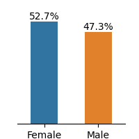
## Bar Chart: Gender Distribution Comparison
### Overview
The image displays a bar chart comparing the percentage distribution of two gender categories: Female and Male. The chart uses two vertical bars with distinct colors to represent each category.
### Components/Axes
- **X-Axis**: Labeled with two categories: "Female" (left) and "Male" (right).
- **Y-Axis**: Represents percentages, ranging from 0% to 100% (implied scale).
- **Legend**: Located on the right side of the chart, associating colors with categories:
- **Blue**: Female (52.7%)
- **Orange**: Male (47.3%)
### Detailed Analysis
- **Female Bar**:
- Height corresponds to **52.7%** of the total.
- Color: Blue (matches legend).
- **Male Bar**:
- Height corresponds to **47.3%** of the total.
- Color: Orange (matches legend).
### Key Observations
1. The Female category exceeds the Male category by **5.4 percentage points** (52.7% vs. 47.3%).
2. The percentages sum to **100%**, indicating a binary, mutually exclusive distribution.
3. No additional categories or sub-categories are present.
### Interpretation
The data suggests a gender disparity in the measured metric, with females comprising a larger share than males. The stark contrast (5.4% difference) may indicate systemic biases, sampling imbalances, or contextual factors influencing the distribution. However, the chart lacks contextual details (e.g., sample size, demographic scope, or the specific metric being measured), limiting conclusions about causality or representativeness. The binary split implies the data excludes non-binary or other gender identities, which could introduce sampling bias if the population includes such groups.