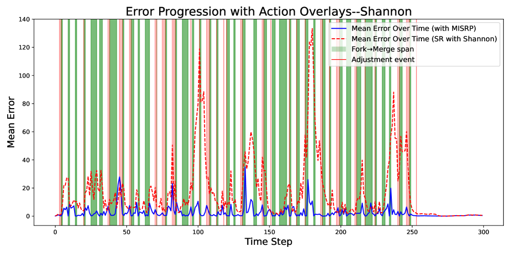
## [Line Chart with Overlays]: Error Progression with Action Overlays--Shannon
### Overview
This is a line chart illustrating the **mean error over time steps** for two methods, with additional overlays indicating operational events (fork→merge spans and adjustment events). The chart compares error performance between “Mean Error Over Time (with MISRP)” (blue solid line) and “Mean Error Over Time (SR with Shannon)” (red dashed line), while green vertical spans mark “Fork→Merge span” and red vertical lines mark “Adjustment event.”
### Components/Axes
- **X-axis**: Labeled “Time Step,” with major ticks at 0, 50, 100, 150, 200, 250, 300 (range: 0–300).
- **Y-axis**: Labeled “Mean Error,” with major ticks at 0, 20, 40, 60, 80, 100, 120, 140 (range: 0–140).
- **Legend** (top-right):
- Blue solid line: *“Mean Error Over Time (with MISRP)”*
- Red dashed line: *“Mean Error Over Time (SR with Shannon)”*
- Green vertical spans: *“Fork→Merge span”* (vertical green bars)
- Red vertical lines: *“Adjustment event”* (vertical red lines)
### Detailed Analysis
#### Data Series Trends:
- **Blue line (MISRP)**:
- Overall lower mean error (peaks rarely exceed 40).
- Peaks occur around time steps ~50, 100, 150, 200, 250 (e.g., ~25 at 50, ~30 at 100, ~35 at 150, ~25 at 200, ~20 at 250).
- After time step 250, error stabilizes near 0.
- **Red dashed line (SR with Shannon)**:
- Higher mean error (peaks often exceed 80, reaching ~120–140 at ~100, 150, 200, 250).
- Peaks are more pronounced and frequent than the blue line.
- After time step 250, error also stabilizes near 0.
#### Overlays:
- **Green spans (Fork→Merge)**: Frequent vertical green bars (e.g., 0–50, 50–100, 100–150, 150–200, 200–250), indicating periods of fork→merge activity.
- **Red lines (Adjustment event)**: Scattered vertical red lines (e.g., ~25, 75, 125, 175, 225, 275), likely marking discrete adjustment actions.
### Key Observations
1. **Method Comparison**: The blue line (MISRP) consistently has lower mean error than the red line (SR with Shannon), suggesting MISRP is more effective at minimizing error.
2. **Event Correlation**: Green fork→merge spans and red adjustment events are frequent in the early-to-mid time steps (0–250), coinciding with error spikes (especially for the red line).
3. **Stabilization**: After time step 250, both lines flatten near 0, indicating the process reaches a steady state with minimal error.
### Interpretation
The chart demonstrates that the “MISRP” method outperforms “SR with Shannon” in terms of mean error over time. The overlays (fork→merge spans, adjustment events) suggest operational actions (e.g., system adjustments, structural changes) occur during periods of higher error, potentially influencing performance. The stabilization after 250 implies the system converges to a low-error state, regardless of the method. This data could inform decisions about which method to use for error-sensitive tasks, or how to optimize operational events (e.g., timing adjustments) to reduce error.
(Note: All text is in English; no other languages are present.)