## Line Charts: Training Performance Comparison
### Overview
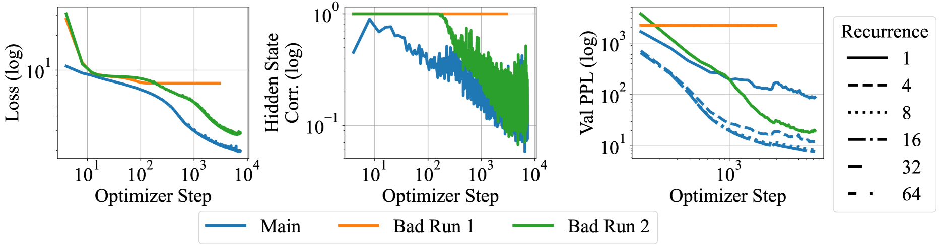
The image presents three line charts comparing the performance of a "Main" training run against two "Bad Run" scenarios, and the impact of recurrence on validation perplexity. The charts display Loss, Hidden State Correlation, and Validation Perplexity (Val PPL) as a function of Optimizer Step. All axes are on a logarithmic scale.
### Components/Axes
**Chart 1: Loss vs. Optimizer Step**
* **Y-axis:** Loss (log) - logarithmic scale, ranging from approximately 0.1 to 10.
* **X-axis:** Optimizer Step - logarithmic scale, ranging from 10^1 to 10^4.
* **Data Series:**
* Main (blue): Starts around 10, decreases to approximately 0.2 by step 10^4.
* Bad Run 1 (orange): Remains relatively constant at approximately 5.
* Bad Run 2 (green): Starts around 10, decreases to approximately 0.5 by step 10^4.
**Chart 2: Hidden State Corr. vs. Optimizer Step**
* **Y-axis:** Hidden State Corr. (log) - logarithmic scale, ranging from 10^-1 to 10^0 (0.1 to 1).
* **X-axis:** Optimizer Step - logarithmic scale, ranging from 10^1 to 10^4.
* **Data Series:**
* Main (blue): Starts around 0.3, fluctuates, and decreases to approximately 0.05 by step 10^4.
* Bad Run 1 (orange): Remains relatively constant at approximately 1.
* Bad Run 2 (green): Starts around 1, decreases to approximately 0.05 by step 10^4.
**Chart 3: Val PPL vs. Optimizer Step**
* **Y-axis:** Val PPL (log) - logarithmic scale, ranging from 10^1 to 10^3 (10 to 1000).
* **X-axis:** Optimizer Step - logarithmic scale, ranging from 10^2 to 10^4 (100 to 10000).
* **Data Series (Recurrence):**
* 1 (black, solid line): Starts around 2000, decreases to approximately 100 by step 10^4.
* 4 (black, dashed line): Starts around 500, decreases to approximately 10 by step 10^4.
* 8 (black, dotted line): Starts around 300, decreases to approximately 10 by step 10^4.
* 16 (black, dash-dot line): Starts around 200, decreases to approximately 10 by step 10^4.
* 32 (black, long dash line): Starts around 100, decreases to approximately 10 by step 10^4.
* 64 (black, dash-dot-dot line): Starts around 100, decreases to approximately 10 by step 10^4.
* Bad Run 1 (orange, solid line): Remains relatively constant at approximately 2000.
* Bad Run 2 (green, solid line): Starts around 2000, decreases to approximately 20 by step 10^4.
**Legend:**
* Located at the bottom of the first two charts, and on the right side of the third chart.
* Identifies the data series by color and line style.
* Main: Blue line
* Bad Run 1: Orange line
* Bad Run 2: Green line
* Recurrence: Black lines with varying styles (solid, dashed, dotted, etc.)
### Detailed Analysis
**Chart 1: Loss**
* The "Main" run (blue) shows a significant decrease in loss as the optimizer step increases, indicating successful training.
* "Bad Run 1" (orange) shows a consistently high loss, suggesting a failure to learn.
* "Bad Run 2" (green) shows a decrease in loss, but not as significant as the "Main" run.
**Chart 2: Hidden State Correlation**
* The "Main" run (blue) shows a fluctuating but generally decreasing hidden state correlation.
* "Bad Run 1" (orange) maintains a high correlation, indicating a lack of diversity in the hidden state.
* "Bad Run 2" (green) shows a decreasing correlation, similar to the "Main" run, but with more noise.
**Chart 3: Validation Perplexity**
* The "Main" run (represented by various black lines for different recurrence values) shows a decrease in validation perplexity as the optimizer step increases. Lower perplexity indicates better model performance.
* Higher recurrence values (e.g., 32, 64) generally start with lower perplexity.
* "Bad Run 1" (orange) shows a consistently high perplexity, indicating poor generalization.
* "Bad Run 2" (green) shows a decrease in perplexity, but not as significant as the "Main" run with higher recurrence values.
### Key Observations
* "Bad Run 1" consistently performs poorly across all metrics (high loss, high hidden state correlation, high perplexity).
* "Bad Run 2" shows some improvement compared to "Bad Run 1" but is still significantly worse than the "Main" run.
* Higher recurrence values lead to lower validation perplexity, suggesting improved model performance.
### Interpretation
The charts demonstrate the importance of proper training and hyperparameter tuning. "Bad Run 1" likely represents a scenario where the model failed to learn due to issues such as incorrect initialization, inappropriate learning rate, or vanishing gradients. "Bad Run 2" might represent a partially successful training run, but still not optimal. The validation perplexity chart highlights the impact of recurrence on model performance, with higher recurrence values generally leading to better generalization. The data suggests that recurrence is a crucial hyperparameter for achieving optimal performance.