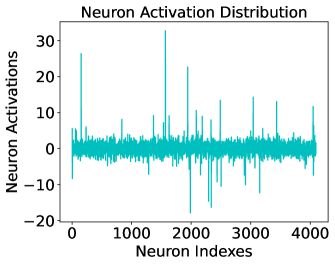
## Chart Type: Line Graph
### Overview
The image is a line graph titled "Neuron Activation Distribution". It displays the distribution of neuron activations across a range of neuron indexes. The y-axis represents neuron activations, and the x-axis represents neuron indexes. The graph shows fluctuations in neuron activation levels, with some notable spikes and dips.
### Components/Axes
* **Title:** Neuron Activation Distribution
* **X-axis:** Neuron Indexes, ranging from 0 to 4000.
* **Y-axis:** Neuron Activations, ranging from -20 to 30.
* **Data Series:** A single teal line representing the neuron activation distribution.
### Detailed Analysis
The data series (teal line) shows the following trends:
* The baseline activation level fluctuates around 0.
* There are several positive spikes, indicating high activation levels at specific neuron indexes.
* There are also negative dips, indicating suppressed activation levels.
* The most prominent positive spikes occur around neuron indexes 200, 1750, and 3800.
* The most prominent negative dips occur around neuron indexes 2200 and 3200.
Specific data points (approximate):
* At Neuron Index 0, Neuron Activation is approximately 2.
* At Neuron Index 200, Neuron Activation peaks at approximately 28.
* At Neuron Index 1000, Neuron Activation is approximately -2.
* At Neuron Index 1750, Neuron Activation peaks at approximately 32.
* At Neuron Index 2000, Neuron Activation is approximately 2.
* At Neuron Index 2200, Neuron Activation dips to approximately -15.
* At Neuron Index 3000, Neuron Activation is approximately 1.
* At Neuron Index 3200, Neuron Activation dips to approximately -12.
* At Neuron Index 3800, Neuron Activation peaks at approximately 15.
* At Neuron Index 4000, Neuron Activation is approximately 2.
### Key Observations
* The neuron activation distribution is highly variable.
* There are distinct peaks and dips in activation levels, suggesting specific neurons or groups of neurons are more or less active.
* The majority of neurons have activation levels close to zero.
### Interpretation
The graph illustrates the activation patterns of neurons within a neural network or biological system. The spikes indicate neurons that are strongly activated, potentially responding to specific stimuli or features. The dips indicate neurons that are suppressed, possibly due to inhibitory signals or lack of relevant input. The overall distribution provides insights into the network's activity and how it processes information. The variability suggests that different neurons play different roles in the network's function. The presence of both positive and negative activations indicates a balance between excitatory and inhibitory processes.