\n
## Diagram and Chart: Spiking Neural Network Processing and Training Accuracy
### Overview
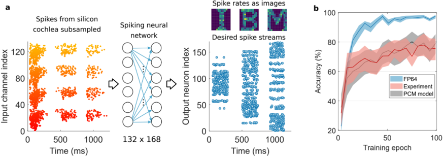
The image is a two-panel technical figure (labeled **a** and **b**) illustrating a neuromorphic computing pipeline and its performance. Panel **a** is a schematic diagram showing the flow of data from a silicon cochlea through a spiking neural network to produce desired output spike streams. Panel **b** is a line chart comparing the training accuracy over epochs for three different computational models.
### Components/Axes
**Panel a: Schematic Diagram**
* **Left Section (Input):** A scatter plot titled "Spikes from silicon cochlea subsampled".
* **Y-axis:** "Input channel index" (Range: 0 to ~130).
* **X-axis:** "Time (ms)" (Range: 0 to ~1200 ms).
* **Data:** Clusters of colored dots (gradient from red at low indices to yellow at high indices) representing spike events across channels over time.
* **Middle Section (Processing):** A diagram of a "Spiking neural network".
* Depicted as a fully connected layer of circles (neurons) with arrows (synaptic connections).
* Text below: "132 x 168", likely indicating the network's weight matrix dimensions (132 input channels by 168 output neurons).
* **Right Section (Output):** Two sub-plots.
1. **Top:** Three small heatmaps titled "Spike rates as images". These are 2D representations (likely spatial or spectro-temporal) of spike rate data.
2. **Bottom:** A scatter plot titled "Desired spike streams".
* **Y-axis:** "Output neuron index" (Range: 0 to ~160).
* **X-axis:** "Time (ms)" (Range: 0 to ~1200 ms).
* **Data:** Clusters of blue dots representing the target spike patterns for the output neurons.
**Panel b: Line Chart**
* **Title:** None explicit, but the content is "Accuracy vs. Training epoch".
* **Y-axis:** "Accuracy (%)" (Range: 20% to 100%).
* **X-axis:** "Training epoch" (Range: 0 to 100).
* **Legend (Bottom-right corner):**
* **FP64:** Blue line with light blue shaded variance region.
* **Experiment:** Red line with light red shaded variance region.
* **PCM model:** Gray line with light gray shaded variance region.
### Detailed Analysis
**Panel a: Data Flow**
1. **Input Spike Data:** The "Spikes from silicon cochlea subsampled" plot shows non-uniform, bursty spiking activity across ~130 input channels over a 1.2-second window. The color gradient (red to yellow) correlates with the input channel index.
2. **Network Transformation:** This spike data is fed into a spiking neural network with a 132x168 connectivity structure.
3. **Output Target:** The network's goal is to produce the "Desired spike streams," which are distinct, structured patterns of blue spikes across ~160 output neurons over the same time window. The "Spike rates as images" likely provide an alternative, condensed view of these target patterns.
**Panel b: Training Performance Trends**
* **FP64 (Blue Line):** Shows the highest and most stable performance. It rises steeply from ~30% accuracy at epoch 0, surpasses 80% by epoch ~10, and plateaus near 95-98% accuracy from epoch ~40 onward. The shaded variance region is relatively narrow.
* **Experiment (Red Line):** Shows the lowest and most variable performance. It starts near 20%, rises to ~60% by epoch ~10, and then fluctuates between approximately 65% and 80% for the remainder of training. The shaded variance region is very wide, indicating high run-to-run variability.
* **PCM model (Gray Line):** Performs between the other two. It follows a similar initial rise to the FP64 line but plateaus at a lower level, around 80-85% accuracy. Its variance region is wider than FP64's but narrower than the Experiment's.
### Key Observations
1. **Performance Hierarchy:** There is a clear and consistent hierarchy in final accuracy: FP64 (best) > PCM model > Experiment (worst).
2. **Convergence Speed:** The FP64 model converges to its high accuracy plateau fastest. The PCM model converges to a lower plateau at a similar initial rate. The Experiment model shows slower and less stable convergence.
3. **Stability/Variance:** The "Experiment" data series exhibits significantly higher variance (wider shaded area) compared to the computational models (FP64 and PCM), suggesting less reproducible results in the physical experimental setup.
4. **Diagram Flow:** Panel **a** establishes a clear cause-and-effect pipeline: biological-inspired input (silicon cochlea) -> computational core (SNN) -> desired functional output (spike streams).
### Interpretation
This figure demonstrates the implementation and benchmarking of a neuromorphic system. Panel **a** details the specific task: training a spiking neural network to transform realistic, asynchronous input spike patterns (from a silicon cochlea sensor) into structured, desired output spike patterns. This is a common paradigm in sensory processing or pattern recognition for neuromorphic hardware.
Panel **b** provides a critical performance comparison. The **FP64** line likely represents a software "gold standard" simulation using high-precision (64-bit floating-point) math, showing the algorithm's theoretical potential. The **PCM model** likely represents a simulation incorporating the non-ideal characteristics of Phase-Change Memory (PCM) devices used to implement the network's synapses in hardware. Its lower accuracy shows the performance cost of device-level non-idealities. The **Experiment** line represents results from the actual physical hardware chip. Its lower accuracy and high variance highlight the compounded challenges of real-world implementation, including device variability, noise, and circuit imperfections beyond those captured in the PCM model.
**The key takeaway** is the quantification of the "reality gap": moving from an ideal algorithm (FP64) to a device-aware simulation (PCM model) and finally to physical hardware (Experiment) results in progressive degradation of accuracy and stability. This underscores the challenges in translating neuromorphic algorithms to efficient, reliable hardware.