## Histogram: Principal Curvatures Distribution
### Overview
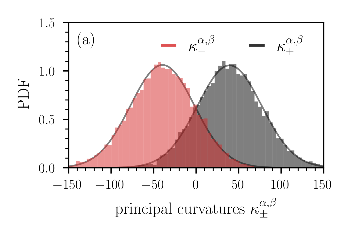
The image is a histogram displaying the distribution of principal curvatures, denoted as κ, with two distinct distributions represented by red and gray bars. Each distribution is overlaid with a smoothed curve. The x-axis represents the principal curvatures (κ), and the y-axis represents the probability density function (PDF). The plot includes a legend in the top-center, identifying the red distribution as κ<sup>α,β</sup><sub>-</sub> and the gray distribution as κ<sup>α,β</sup><sub>+</sub>. The plot is labeled with "(a)" in the top-left corner.
### Components/Axes
* **X-axis:** "principal curvatures κ<sup>α,β</sup><sub>±</sub>" with scale from -150 to 150, incrementing by 50.
* **Y-axis:** "PDF" (Probability Density Function) with scale from 0.0 to 1.5, incrementing by 0.5.
* **Legend:** Located at the top-center of the plot.
* Red line: κ<sup>α,β</sup><sub>-</sub>
* Black line: κ<sup>α,β</sup><sub>+</sub>
* **Title/Label:** "(a)" in the top-left corner.
### Detailed Analysis
* **Red Distribution (κ<sup>α,β</sup><sub>-</sub>):**
* Trend: The red distribution is a bell-shaped curve, peaking around -50.
* Approximate Values: The distribution ranges from approximately -150 to 50. The peak PDF value is approximately 1.1.
* **Gray Distribution (κ<sup>α,β</sup><sub>+</sub>):**
* Trend: The gray distribution is a bell-shaped curve, peaking around 50.
* Approximate Values: The distribution ranges from approximately -50 to 150. The peak PDF value is approximately 1.1.
* **Overlaid Curves:** Both distributions have smoothed curves overlaid, closely following the shape of the histograms. These curves are dark gray.
### Key Observations
* The two distributions are approximately symmetrical and bell-shaped.
* The red distribution (κ<sup>α,β</sup><sub>-</sub>) is centered around a negative value, while the gray distribution (κ<sup>α,β</sup><sub>+</sub>) is centered around a positive value.
* The peak PDF values for both distributions are approximately equal.
* There is some overlap between the two distributions around 0.
### Interpretation
The plot illustrates the distribution of principal curvatures, showing two distinct populations with opposing signs. The symmetrical bell-shaped distributions suggest a balanced presence of positive and negative curvatures. The overlap indicates that some data points exhibit both positive and negative curvatures. The plot likely represents a characteristic of a surface or material where both concave and convex features are present. The "a" label suggests this is part of a larger series of plots.