## Bar Chart: Model Component Distribution (LLaMA3 70B vs Qwen3 30B_A3B)
### Overview
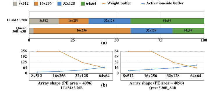
The bar chart compares the distribution of array shapes and buffers for two models: LLaMA3 70B and Qwen3 30B_A3B. The x-axis represents a normalized scale (0–100), while the y-axis lists the models. The legend defines six categories: array shapes (8x512, 16x256, 32x128, 64x64) and buffers (Weight buffer, Activation-side buffer).
### Components/Axes
- **X-axis**: Normalized scale (0–100)
- **Y-axis**: Models (LLaMA3 70B, Qwen3 30B_A3B)
- **Legend**:
- 8x512 (gray)
- 16x256 (orange)
- 32x128 (blue)
- 64x64 (green)
- Weight buffer (orange)
- Activation-side buffer (blue)
### Detailed Analysis
- **LLaMA3 70B**:
- 8x512 (gray): ~25% of the bar
- 16x256 (orange): ~40% of the bar
- 32x128 (blue): ~20% of the bar
- 64x64 (green): ~15% of the bar
- **Qwen3 30B_A3B**:
- 16x256 (orange): ~70% of the bar
- 32x128 (blue): ~20% of the bar
- 64x64 (green): ~10% of the bar
### Key Observations
- LLaMA3 70B uses a more balanced distribution of array shapes, with 8x512 being the largest segment.
- Qwen3 30B_A3B heavily relies on 16x256, with minimal use of 8x512 and 64x64.
- The Weight buffer and Activation-side buffer are not explicitly shown in the bar chart but are referenced in the legend.
### Interpretation
The bar chart highlights differences in how the two models allocate computational resources across array shapes. LLaMA3 70B’s broader distribution suggests flexibility, while Qwen3 30B_A3B’s focus on 16x256 may optimize for specific performance metrics. The absence of explicit buffer data in the bar chart implies these components are either negligible or integrated into the array shape allocations.
---
## Line Graphs: PE Area vs Array Shape (LLaMA3 70B and Qwen3 30B_A3B)
### Overview
Two line graphs compare the PE (Processing Element) area (4096) for different array shapes (8x512, 16x256, 32x128, 64x64) across two models. The x-axis lists array shapes, and the y-axis shows PE area. The legend distinguishes Weight buffer (orange) and Activation-side buffer (blue).
### Components/Axes
- **X-axis**: Array shapes (8x512, 16x256, 32x128, 64x64)
- **Y-axis**: PE area (4096)
- **Legend**:
- Weight buffer (orange)
- Activation-side buffer (blue)
### Detailed Analysis
- **LLaMA3 70B**:
- **Weight buffer (orange)**:
- 8x512: 256
- 16x256: 192
- 32x128: 128
- 64x64: 64
- **Activation-side buffer (blue)**:
- 8x512: 0
- 16x256: 0
- 32x128: 0
- 64x64: 64
- **Qwen3 30B_A3B**:
- **Weight buffer (orange)**:
- 8x512: 256
- 16x256: 192
- 32x128: 128
- 64x64: 64
- **Activation-side buffer (blue)**:
- 8x512: 0
- 16x256: 0
- 32x128: 0
- 64x64: 64
### Key Observations
- Both models show a **decreasing trend** in Weight buffer PE area as array shape increases (e.g., 256 → 64).
- The Activation-side buffer PE area remains **zero for smaller array shapes** but increases to 64 for 64x64.
- The trends are identical for both models, suggesting similar architectural optimizations.
### Interpretation
The line graphs reveal that larger array shapes reduce the Weight buffer’s PE area, likely due to more efficient memory utilization. The Activation-side buffer’s PE area only becomes significant at the largest array shape (64x64), indicating a trade-off between computational efficiency and memory overhead. This pattern may reflect design choices to balance speed and resource constraints.
---
## Additional Notes
- **Language**: All text is in English.
- **Spatial Grounding**:
- Legend is positioned at the top of the bar chart and left of the line graphs.
- Axis labels are centered below (x-axis) and beside (y-axis) the plots.
- **Trend Verification**:
- Weight buffer lines slope downward for both models.
- Activation-side buffer lines slope upward only for 64x64.
- **Component Isolation**:
- Bar chart (a) focuses on model-specific distributions.
- Line graphs (b) compare PE area trends across array shapes.
This analysis provides a comprehensive view of how array shapes and buffers influence model performance, with implications for hardware-software co-design.