## Line Chart: AI Model Performance Across Various Benchmarks
### Overview
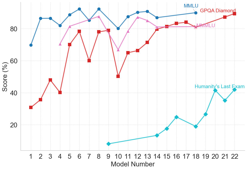
This image is a line chart displaying the performance scores of various numbered models across four different evaluation benchmarks. The chart illustrates a general upward trend in model capabilities, while highlighting the stark difficulty differences between established benchmarks and a newer, significantly harder benchmark.
### Components/Axes
**1. Y-Axis (Left):**
* **Label:** "Score (%)"
* **Scale:** Ranges from 0 to 100 (implied), with visible major tick marks and labels at 20, 40, 60, and 80.
* **Gridlines:** Faint horizontal dashed lines appear at intervals of 10 (e.g., 10, 20, 30, 40...).
**2. X-Axis (Bottom):**
* **Label:** "Model Number"
* **Scale:** Discrete integer values from 1 to 22.
* **Gridlines:** Faint vertical dashed lines align with each integer.
**3. Legend / Data Series Labels (Inline):**
Instead of a traditional legend box, labels are placed directly on the chart area, pointing to the final or near-final data point of their respective series.
* **Top-Right (Blue text):** "MMLU" points to the blue line with circle markers.
* **Top-Right (Red text):** "GPQA Diamond" points to the red line with square markers.
* **Center-Right (Pink text):** "MMMLU" points to the pink line with triangle markers.
* **Middle-Right (Cyan text):** "Humanity's Last Exam" points to the cyan line with diamond markers.
---
### Detailed Analysis
*Note: All numerical values extracted below are approximate based on visual alignment with the y-axis gridlines.*
#### Series 1: MMLU (Blue Line, Circle Markers)
* **Visual Trend:** This series starts at a high baseline, experiences a quick initial jump, and remains relatively stable at the top of the chart with minor fluctuations. It represents the highest overall scores on the chart.
* **Data Points:**
* Model 1: ~70%
* Model 2: ~86%
* Model 3: ~86%
* Model 4: ~82%
* Model 5: ~89%
* Model 6: ~92%
* Model 7: ~85%
* Model 8: ~92%
* Model 9: *No data point*
* Model 10: ~80%
* Model 11: ~87%
* Model 12: ~90%
* Model 13: ~91%
* Model 14: ~87%
* Models 15-17: *No data points*
* Model 18: ~90% (Label "MMLU" is attached here)
#### Series 2: GPQA Diamond (Red Line, Square Markers)
* **Visual Trend:** This series exhibits high volatility in the earlier models (1-10), featuring sharp peaks and deep valleys. From Model 10 onward, it shows a strong, consistent upward slope, eventually converging with the MMLU scores by Model 22.
* **Data Points:**
* Model 1: ~31%
* Model 2: ~36%
* Model 3: ~48%
* Model 4: ~40%
* Model 5: ~70%
* Model 6: ~78%
* Model 7: ~60%
* Model 8: ~78%
* Model 9: ~79%
* Model 10: ~50%
* Model 11: ~65%
* Model 12: ~66%
* Model 13: ~71%
* Model 14: ~80%
* Model 15: ~81%
* Model 16: ~83%
* Model 17: ~84%
* Models 18-20: *No data points*
* Model 21: ~87%
* Model 22: ~89% (Label "GPQA Diamond" is attached here)
#### Series 3: MMMLU (Pink Line, Triangle Markers)
* **Visual Trend:** This series begins later (at Model 4). It generally tracks slightly below the MMLU line, sharing a similar sharp dip at Model 10, before recovering and flattening out in the low 80s.
* **Data Points:**
* Model 4: ~70%
* Model 5: ~81%
* Model 6: ~84%
* Model 7: *No data point*
* Model 8: ~87%
* Model 9: *No data point*
* Model 10: ~67%
* Model 11: ~78%
* Model 12: ~87%
* Model 13: ~85%
* Model 14: ~81%
* Model 15: ~81%
* Models 16-17: *No data points*
* Model 18: ~81% (Label "MMMLU" is attached here)
#### Series 4: Humanity's Last Exam (Cyan Line, Diamond Markers)
* **Visual Trend:** This series starts much later (Model 9) and significantly lower than all other benchmarks. It slopes upward gradually, experiences a sharp spike at Model 20, dips, and recovers. It remains the lowest scoring benchmark by a wide margin.
* **Data Points:**
* Model 9: ~8%
* Model 14: ~13%
* Model 15: ~18%
* Model 16: ~25%
* Model 17: *No data point*
* Model 18: ~19%
* Model 19: ~27%
* Model 20: ~41%
* Model 21: ~35%
* Model 22: ~42% (Label "Humanity's Last Exam" is attached here)
---
### Key Observations
1. **Missing Data:** Not all models were tested on all benchmarks. For example, Models 1-3 lack MMMLU data, Models 1-8 lack "Humanity's Last Exam" data, and several models in the late teens are missing data across multiple series.
2. **Model 10 Anomaly:** There is a distinct, sharp drop in performance across all three active benchmarks (MMLU, GPQA, MMMLU) specifically at Model 10.
3. **Convergence:** By the later models (18-22), MMLU, GPQA Diamond, and MMMLU are all converging in the 80%-90% range.
4. **Difficulty Gap:** "Humanity's Last Exam" is vastly more difficult for these models than the other three benchmarks, never exceeding ~42%, while the others routinely score above 80%.
### Interpretation
This chart visually demonstrates the progression of AI model capabilities against standardized testing benchmarks. The x-axis ("Model Number") likely represents a chronological release order or a scaling progression of model size/compute.
The data suggests that older or more established benchmarks like MMLU and MMMLU are reaching a point of saturation; the models are scoring so high (near 90%) that these tests may no longer effectively differentiate between the capabilities of the newest models. GPQA Diamond shows that models struggled initially but have rapidly "solved" or adapted to this benchmark over time.
The introduction of "Humanity's Last Exam" represents a paradigm shift in evaluation. Because the models are scoring exceptionally low on it (starting below 10% and struggling to break 40%), it serves as a new "frontier" benchmark designed to test advanced reasoning or knowledge that current models have not yet mastered. The chart effectively communicates the necessity of creating harder tests as AI models rapidly conquer existing ones.