## Line Chart: Model Performance Comparison
### Overview
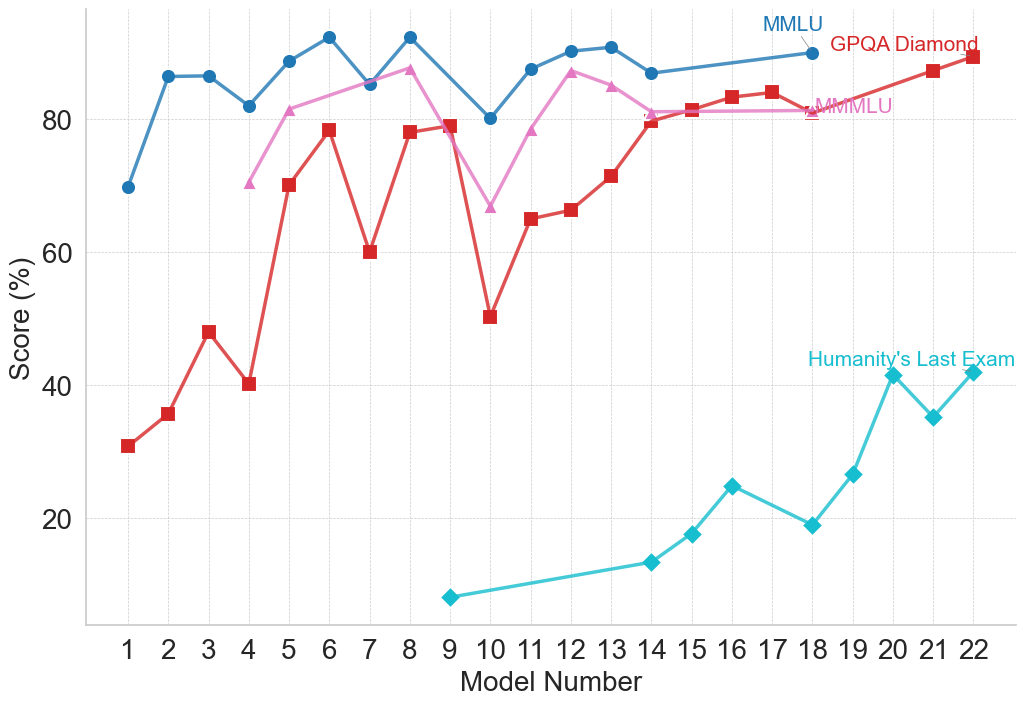
This line chart compares the performance of several models (numbered 1 to 22) across four different benchmarks: MMLU, GPQA Diamond, MMLU (again, with a different line), and Humanity's Last Exam. The performance is measured as a score in percentage (%).
### Components/Axes
* **X-axis:** Model Number (ranging from 1 to 22).
* **Y-axis:** Score (%) (ranging from 0 to 100, with increments of 20).
* **Data Series:**
* MMLU (represented by a blue line)
* GPQA Diamond (represented by a red line)
* MMLU (represented by a light purple line)
* Humanity's Last Exam (represented by a teal line)
* **Legend:** Located in the top-right corner, labeling each line with its corresponding benchmark.
### Detailed Analysis
Let's analyze each data series individually:
* **MMLU (Blue Line):** The blue line starts at approximately 88% at Model 1, dips to around 84% at Model 3, then rises to a peak of approximately 92% at Model 6. It then fluctuates between 82% and 90% until Model 14, after which it remains relatively stable around 88-90% until Model 22.
* **GPQA Diamond (Red Line):** The red line begins at approximately 33% at Model 1, increases to around 48% at Model 3, then rises to a peak of approximately 84% at Model 6. It then declines to around 75% at Model 8, and fluctuates between 75% and 85% until Model 14. From Model 15 to 18, it shows a decline to approximately 80%, then stabilizes around 82-84% until Model 22.
* **MMLU (Light Purple Line):** The light purple line starts at approximately 78% at Model 1, rises to a peak of approximately 88% at Model 5, then declines to around 65% at Model 8. It then increases to around 82% at Model 13, and fluctuates between 78% and 85% until Model 22.
* **Humanity's Last Exam (Teal Line):** The teal line starts at approximately 30% at Model 1, increases to around 52% at Model 5, then declines to approximately 48% at Model 7. It then shows a significant increase to around 85% at Model 19, and stabilizes around 84-86% until Model 22.
Here's a table summarizing approximate values at key points:
| Model Number | MMLU (Blue) | GPQA Diamond (Red) | MMLU (Purple) | Humanity's Last Exam (Teal) |
|--------------|-------------|--------------------|---------------|-----------------------------|
| 1 | 88% | 33% | 78% | 30% |
| 3 | 84% | 48% | 82% | 42% |
| 5 | 91% | 84% | 88% | 52% |
| 6 | 92% | 84% | 85% | 68% |
| 8 | 88% | 75% | 65% | 48% |
| 13 | 86% | 82% | 82% | 64% |
| 19 | 88% | 82% | 84% | 85% |
| 22 | 90% | 84% | 84% | 86% |
### Key Observations
* The "Humanity's Last Exam" benchmark shows the most significant improvement across models, starting with the lowest scores and ending with scores comparable to the other benchmarks.
* MMLU (blue line) consistently achieves the highest scores across most models.
* GPQA Diamond shows a substantial increase in performance from Model 1 to Model 6, then plateaus.
* There is a noticeable dip in performance for all benchmarks around Model 8.
### Interpretation
The chart demonstrates the performance evolution of different models across various benchmarks. The consistent high scores of MMLU (blue line) suggest that these models excel in tasks related to that benchmark. The significant improvement in "Humanity's Last Exam" indicates that the models are becoming increasingly capable of handling more complex or nuanced tasks. The dip around Model 8 could represent a period of instability or a change in the model architecture. The convergence of scores towards the end of the chart suggests that the models are approaching a performance ceiling on these benchmarks. The presence of two MMLU lines suggests either a different version of the benchmark or a different evaluation methodology. Further investigation would be needed to clarify the distinction. The data suggests a general trend of improving model performance, but also highlights the varying strengths and weaknesses of models across different benchmarks.