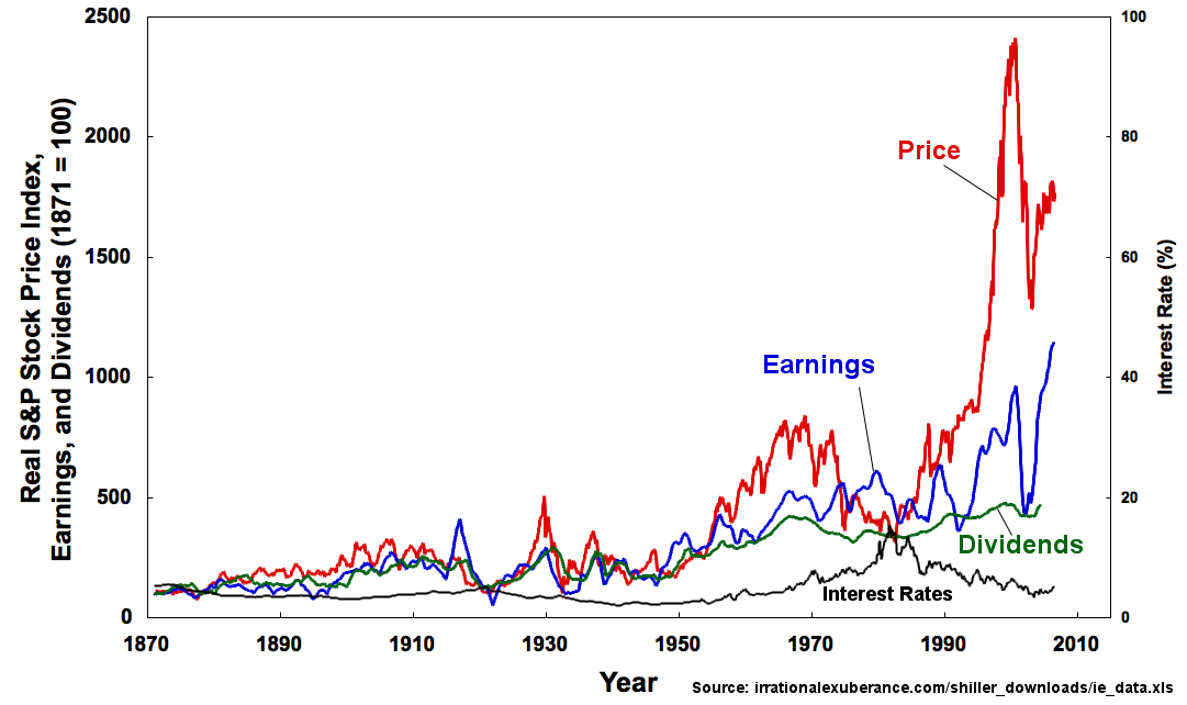
## Line Chart: Real S&P Stock Price Index, Earnings, and Dividends
### Overview
The image is a line chart comparing the trends of the Real S&P Stock Price Index, Earnings, Dividends, and Interest Rates from 1870 to 2010. The chart uses a dual y-axis, with the left axis representing the index, earnings, and dividends (1871 = 100), and the right axis representing the interest rate (%).
### Components/Axes
* **X-axis:** Year, ranging from 1870 to 2010, with markers every 20 years (1870, 1890, 1910, 1930, 1950, 1970, 1990, 2010).
* **Left Y-axis:** Real S&P Stock Price Index, Earnings, and Dividends (1871 = 100), ranging from 0 to 2500, with markers every 500 units (0, 500, 1000, 1500, 2000, 2500).
* **Right Y-axis:** Interest Rate (%), ranging from 0 to 100, with markers every 20 units (0, 20, 40, 60, 80, 100).
* **Legend:**
* **Price:** Red line
* **Earnings:** Blue line
* **Dividends:** Green line
* **Interest Rates:** Black line
* **Source:** Located at the bottom-right of the chart: irrationalexuberance.com/shiller\_downloads/ie\_data.xls
### Detailed Analysis
* **Price (Red Line):** The price index shows a general upward trend over the period. It remains relatively low and stable until around 1950, after which it begins to increase more significantly. There is a notable peak around the year 2000, followed by a sharp decline and subsequent recovery.
* 1870-1950: Approximately between 0 and 500.
* 2000: Peaks at approximately 2400.
* 2010: Approximately 1500.
* **Earnings (Blue Line):** The earnings also show an upward trend, generally following the price index but with more volatility. The earnings line is consistently below the price line, except for brief periods.
* 1870-1950: Approximately between 0 and 500.
* 2000: Peaks at approximately 1000.
* 2010: Approximately 500.
* **Dividends (Green Line):** The dividends show a gradual upward trend, with less volatility compared to the price and earnings. The dividends line remains relatively low for most of the period, with a more noticeable increase after 1950.
* 1870-1950: Approximately between 0 and 200.
* 2010: Approximately 500.
* **Interest Rates (Black Line):** The interest rates fluctuate over the period, with several peaks and troughs. The interest rates remain relatively low until around 1970, after which they become more volatile.
* 1870: Approximately 4%.
* 1920: Approximately 6%.
* 1980: Approximately 15%.
* 2010: Approximately 2%.
### Key Observations
* The Price and Earnings lines show a strong correlation, with both experiencing significant growth after 1950.
* The Dividends line shows a more gradual and stable growth compared to the Price and Earnings lines.
* The Interest Rates line shows significant fluctuations, with no clear long-term trend.
* The peak in the Price line around the year 2000 is a notable outlier, followed by a sharp decline.
### Interpretation
The chart illustrates the historical trends of the S&P Stock Price Index, Earnings, Dividends, and Interest Rates. The data suggests that stock prices and earnings have generally increased over time, with periods of significant growth and volatility. Dividends have also increased, but at a more gradual pace. Interest rates have fluctuated, reflecting changes in monetary policy and economic conditions. The peak in stock prices around the year 2000, followed by a sharp decline, may reflect the dot-com bubble and its subsequent burst. The relationship between these variables can provide insights into the factors that drive stock market performance and the overall health of the economy.