\n
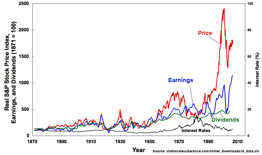
## Line Chart: Real S&P Stock Price Index, Earnings, Dividends, and Interest Rates (1871=100)
### Overview
The image presents a line chart depicting the historical trends of the Real S&P Stock Price Index, Earnings, Dividends, and Interest Rates from 1870 to 2010. The chart aims to visually compare the fluctuations of these four financial indicators over time. The Price and Earnings are plotted on the primary y-axis (left), while Dividends and Interest Rates are plotted on the secondary y-axis (right).
### Components/Axes
* **X-axis:** Year, ranging from 1870 to 2010, with major tick marks at 1870, 1890, 1910, 1930, 1950, 1970, 1990, and 2010.
* **Primary Y-axis (left):** Real S&P Stock Price Index and Earnings (1871=100), ranging from 0 to 2500.
* **Secondary Y-axis (right):** Interest Rate (%), ranging from 0 to 100.
* **Data Series:**
* **Price:** Red line.
* **Earnings:** Dark red dotted line.
* **Dividends:** Blue line.
* **Interest Rates:** Green line.
* **Source:** "source: irrationalexuberance.com/shiller_downloads/ie_data.xls" located in the bottom-right corner.
### Detailed Analysis
**Price (Red Line):** The Price line begins at approximately 20 in 1870 and exhibits significant fluctuations over the period. It generally trends upward, with periods of relative stability and sharp increases. Around 1920, the price reaches approximately 300. A significant dip occurs around 1930, falling to around 100. The price then recovers and experiences a period of growth, reaching approximately 800 by 1960. From 1980 to 2000, the price experiences exponential growth, peaking at approximately 2300 in 2000. After 2000, the price declines and then recovers, ending at approximately 1400 in 2010.
**Earnings (Dark Red Dotted Line):** The Earnings line starts at approximately 20 in 1870 and also shows fluctuations. It generally follows the trend of the Price line, but with more volatility. Around 1920, earnings reach approximately 350. A sharp decline occurs around 1930, falling to around 50. The earnings then recover and grow, reaching approximately 600 by 1960. From 1980 to 2000, earnings experience substantial growth, peaking at approximately 1000 in 2000. After 2000, earnings decline and then recover, ending at approximately 700 in 2010.
**Dividends (Blue Line):** The Dividends line begins at approximately 10 in 1870 and exhibits less dramatic fluctuations compared to the Price and Earnings lines. It generally trends upward, but at a slower pace. Around 1920, dividends reach approximately 100. A decline occurs around 1930, falling to around 20. The dividends then recover and grow, reaching approximately 300 by 1960. From 1980 to 2000, dividends experience moderate growth, peaking at approximately 400 in 2000. After 2000, dividends decline and then recover, ending at approximately 300 in 2010.
**Interest Rates (Green Line):** The Interest Rates line starts at approximately 2% in 1870 and shows significant volatility. It fluctuates between 0% and 80% throughout the period. There are several peaks and troughs, with a notable peak around 1980, reaching approximately 80%. The interest rates end at approximately 20% in 2010.
### Key Observations
* The Price and Earnings lines exhibit a strong correlation, suggesting that stock prices are closely tied to corporate earnings.
* The Dividends line is relatively stable compared to the Price and Earnings lines, indicating that dividends provide a more consistent return to investors.
* The Interest Rates line is highly volatile, reflecting changes in monetary policy and economic conditions.
* The period from 1980 to 2000 shows a particularly strong growth in both Price and Earnings, potentially indicating a period of economic expansion and market exuberance.
* The sharp decline in Price and Earnings around 1930 corresponds to the Great Depression.
### Interpretation
The chart demonstrates the complex relationship between stock prices, corporate earnings, dividends, and interest rates over a long period. The strong correlation between Price and Earnings suggests that stock prices are fundamentally driven by the profitability of companies. However, the chart also highlights the influence of external factors, such as interest rates, on market performance. The volatility of the Interest Rates line suggests that monetary policy plays a significant role in shaping economic cycles and market fluctuations. The period of rapid growth from 1980 to 2000 may be attributed to factors such as globalization, technological innovation, and deregulation. The chart serves as a historical record of financial market behavior and can be used to inform investment decisions and economic analysis. The data suggests that while earnings drive price, external factors like interest rates can significantly impact market stability and growth. The large spike in price around 1990-2000, coupled with high earnings, could indicate a speculative bubble.