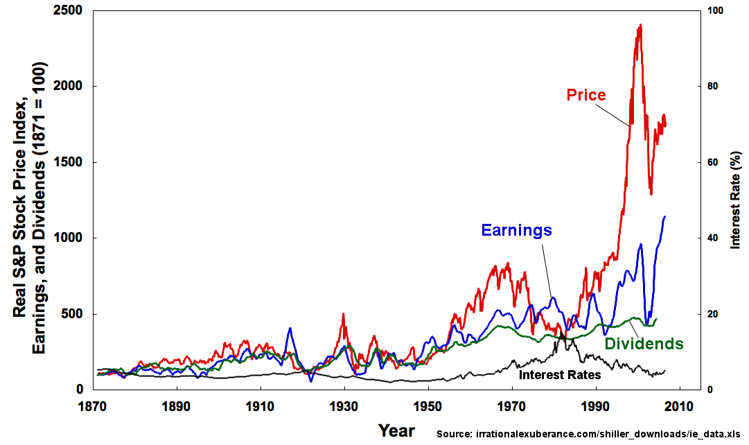
## Line Chart: Real S&P Stock Price Index, Earnings, and Dividends (1871 = 100)
### Overview
The chart visualizes four economic metrics over time:
1. **Price** (red line)
2. **Earnings** (blue line)
3. **Dividends** (green line)
4. **Interest Rates** (black line)
The x-axis spans 1870–2010, while the y-axis for Price/Earnings/Dividends ranges from 0 to 2,500 (base year 1871 = 100), and Interest Rates from 0% to 100%. The legend is positioned on the right, with labels matching line colors. The source is cited as `irrationalexuberance.com/shiller_downloads/ie_data.xls`.
---
### Components/Axes
- **X-axis (Year)**:
- Labels: 1870, 1890, 1910, 1930, 1950, 1970, 1990, 2010.
- Scale: Linear progression from 1870 to 2010.
- **Y-axis (Real S&P Stock Price Index, Earnings, and Dividends)**:
- Labels: 0, 500, 1,000, 1,500, 2,000, 2,500.
- Base year: 1871 = 100.
- **Secondary Y-axis (Interest Rate %)**:
- Labels: 0%, 20%, 40%, 60%, 80%, 100%.
- **Legend**:
- Position: Right side of the chart.
- Labels:
- Red = Price
- Blue = Earnings
- Green = Dividends
- Black = Interest Rates
---
### Detailed Analysis
#### Price (Red Line)
- **Trend**:
- Starts near 0 in 1870, fluctuates modestly until ~1990.
- Sharp upward spike from ~1995 to 2000 (peak ~2,000).
- Plummets to ~1,500 in 2002 (post-dot-com crash).
- Recovers to ~2,000 by 2008, then drops sharply during the 2008 financial crisis.
- **Key Data Points**:
- 1995: ~1,000
- 2000: ~2,000 (peak)
- 2002: ~1,500
- 2008: ~2,000 (pre-crash)
- 2010: ~1,800
#### Earnings (Blue Line)
- **Trend**:
- Mirrors Price but with less volatility.
- Gradual rise from ~100 in 1870 to ~800 in 2000.
- Drops to ~500 in 2002, recovers to ~1,000 by 2008.
- **Key Data Points**:
- 1995: ~300
- 2000: ~800
- 2002: ~500
- 2008: ~1,000
#### Dividends (Green Line)
- **Trend**:
- Slow, steady growth from ~50 in 1870 to ~400 in 2008.
- Sharp drop to ~200 in 2002, partial recovery to ~400 by 2008.
- **Key Data Points**:
- 1995: ~100
- 2000: ~300
- 2002: ~200
- 2008: ~400
#### Interest Rates (Black Line)
- **Trend**:
- Peaks at ~15% in 1980, then declines to ~5% by 2000.
- Drops to ~2% in 2008, then rises slightly to ~4% by 2010.
- **Key Data Points**:
- 1980: ~15%
- 2000: ~5%
- 2008: ~2%
- 2010: ~4%
---
### Key Observations
1. **Price Volatility**:
- Price exhibits extreme volatility, with a 100%+ surge from 1995–2000 and a 25% drop during the 2008 crisis.
2. **Earnings-Dividend Correlation**:
- Earnings and Dividends track Price but with dampened amplitude, suggesting corporate profitability lags behind market speculation.
3. **Interest Rate Inversion**:
- Interest Rates peak in 1980 (15%) and decline inversely with Price until 2008, then rise again.
4. **2008 Crisis Impact**:
- All metrics collapse in 2008, but Price recovers faster than Earnings/Dividends.
---
### Interpretation
- **Economic Bubbles and Crashes**:
- The 1995–2000 Price surge aligns with the dot-com bubble, while the 2008 crash reflects the global financial crisis.
- **Corporate Profitability vs. Market Speculation**:
- Earnings and Dividends grow steadily but remain subordinate to speculative Price movements, highlighting a disconnect between fundamentals and market sentiment.
- **Monetary Policy Influence**:
- Falling Interest Rates (post-1980) correlate with rising Price, suggesting accommodative monetary policy fueled asset inflation.
- **Anomalies**:
- The 2002 Price drop (post-dot-com) outpaces Earnings/Dividends, indicating market overreaction.
- The 2008–2010 Interest Rate rebound contradicts typical post-crisis easing, possibly reflecting quantitative easing effects.
The chart underscores the S&P 500’s transformation from a stable index (1870–1990) to a highly volatile, speculation-driven asset (post-1990), with earnings and dividends struggling to keep pace.