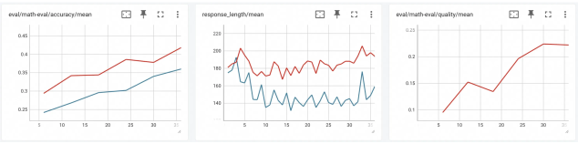
# Technical Data Extraction: Performance Metrics Dashboard
This document provides a comprehensive extraction of data from three line charts representing machine learning evaluation metrics. The charts are presented in a horizontal layout, sharing a common X-axis representing training steps or epochs (ranging from approximately 5 to 35).
---
## 1. Chart: `eval/math-eval/accuracy/mean`
**Description:** This chart tracks the mean accuracy of a mathematical evaluation over time. It contains two data series.
### Metadata
* **Title:** `eval/math-eval/accuracy/mean`
* **Y-Axis (Accuracy):** Scale from 0.25 to 0.45 with increments of 0.05.
* **X-Axis (Steps):** Markers at 5, 10, 15, 20, 25, 30, 35.
### Data Series Analysis
* **Red Line (Upper Series):**
* **Trend:** Shows a consistent upward trajectory with minor plateaus.
* **Key Points:** Starts at ~0.29 (Step 6), rises to ~0.34 (Step 12), plateaus until Step 18, then climbs to a peak of ~0.42 at Step 36.
* **Blue Line (Lower Series):**
* **Trend:** Shows a steady, linear upward trend, maintaining a gap below the red line.
* **Key Points:** Starts at ~0.24 (Step 6) and ends at ~0.36 (Step 36).
---
## 2. Chart: `response_length/mean`
**Description:** This chart tracks the average length of the model's responses. It is characterized by high volatility (noise) in both series.
### Metadata
* **Title:** `response_length/mean`
* **Y-Axis (Length):** Scale from 140 to 220 with increments of 20.
* **X-Axis (Steps):** Markers at 5, 10, 15, 20, 25, 30, 35.
### Data Series Analysis
* **Red Line (Upper Series):**
* **Trend:** Highly oscillatory but maintains a mean between 170 and 190. It experiences an initial spike near Step 4 before stabilizing into a jagged horizontal pattern.
* **Key Points:** Peak of ~205 (Step 4), low of ~168 (Step 16), ending at ~195.
* **Blue Line (Lower Series):**
* **Trend:** Highly volatile with significant downward spikes. It consistently stays below the red line after Step 5.
* **Key Points:** Initial peak of ~195 (Step 4), followed by a sharp drop. Frequently fluctuates between 135 and 160. Ends with a sharp spike to ~175 (Step 33) before settling at ~160.
---
## 3. Chart: `eval/math-eval/quality/mean`
**Description:** This chart tracks the mean quality score of the mathematical evaluation. It contains a single data series.
### Metadata
* **Title:** `eval/math-eval/quality/mean`
* **Y-Axis (Quality Score):** Scale from 0.1 to 0.25 with increments of 0.05.
* **X-Axis (Steps):** Markers at 5, 10, 15, 20, 25, 30, 35.
### Data Series Analysis
* **Red Line:**
* **Trend:** Strong upward trend with one notable dip.
* **Key Points:**
* Starts at ~0.09 (Step 6).
* Rises to ~0.15 (Step 12).
* Dips slightly to ~0.13 (Step 18).
* Sharp increase to ~0.20 (Step 24).
* Reaches a plateau/peak of ~0.22 from Step 30 to Step 36.
---
## Summary Table of Final Values (Approximate)
| Metric | Series Color | Final Value (Step ~36) | Overall Trend |
| :--- | :--- | :--- | :--- |
| **Accuracy** | Red | ~0.42 | Increasing |
| **Accuracy** | Blue | ~0.36 | Increasing |
| **Response Length** | Red | ~195 | Volatile / Stable |
| **Response Length** | Blue | ~160 | Volatile / Stable |
| **Quality** | Red | ~0.22 | Increasing |
**Language Declaration:** The text in this image is entirely in **English**. No other languages were detected.